Annex 15. Selection of graphs and maps for reporting inequality
The graphs and maps featured in this annex are a selection of those commonly used in health inequality reporting. They are not comprehensive of all possible graphs and maps that may be used, or of all possible applications.
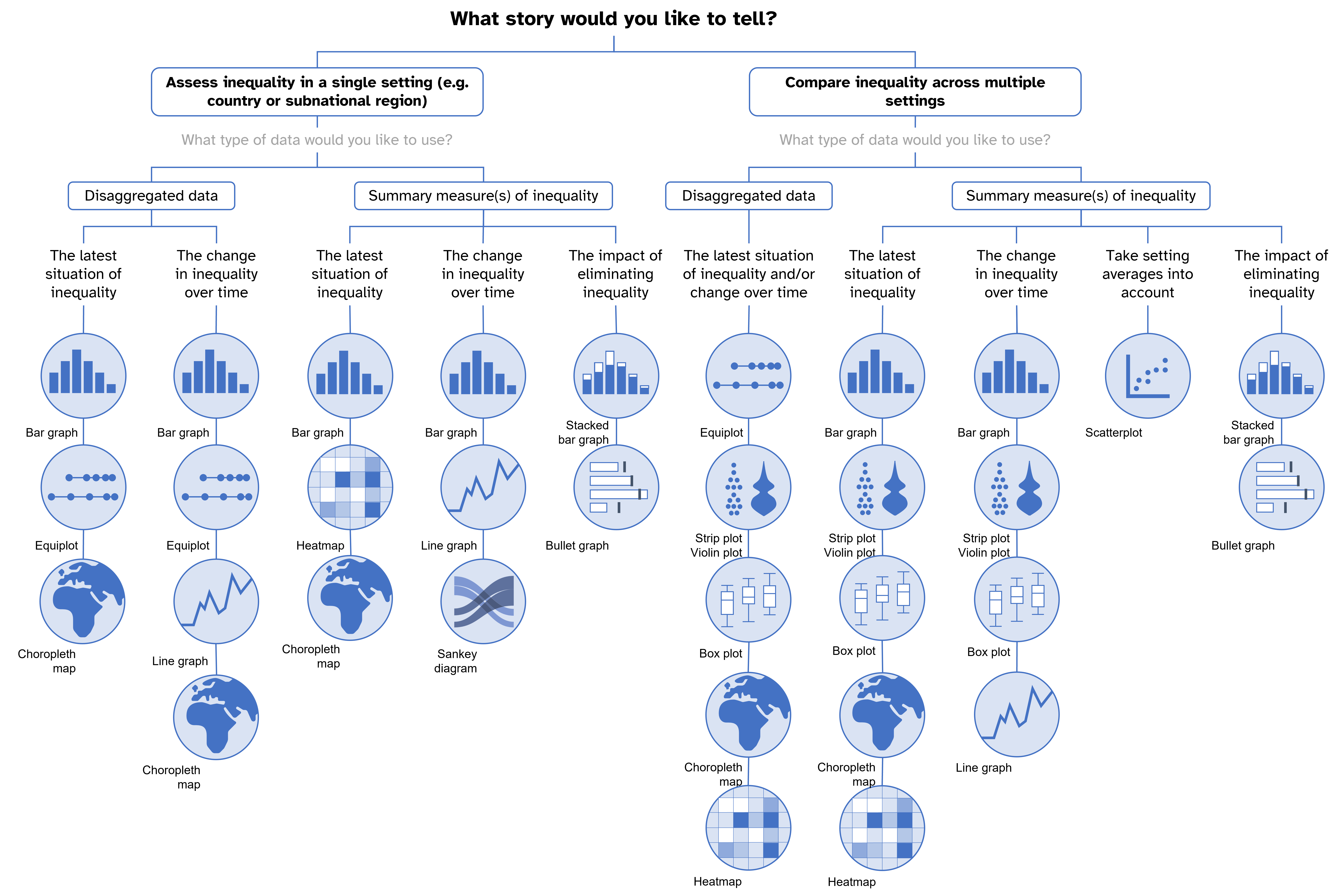
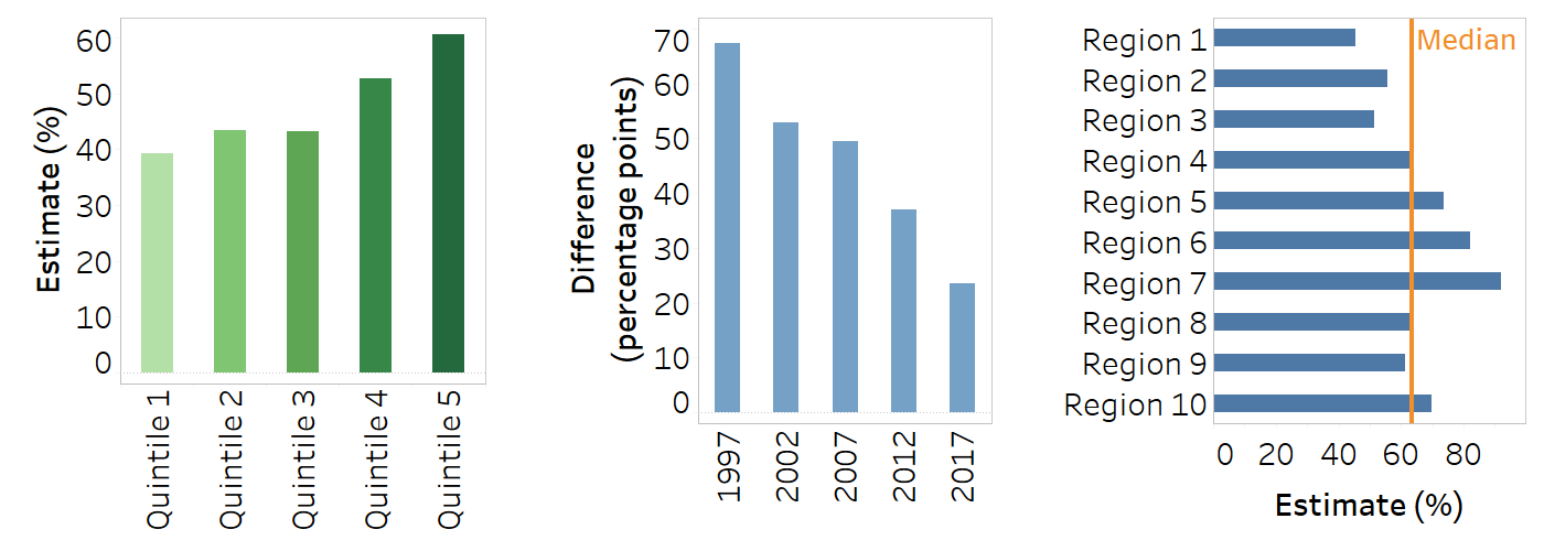
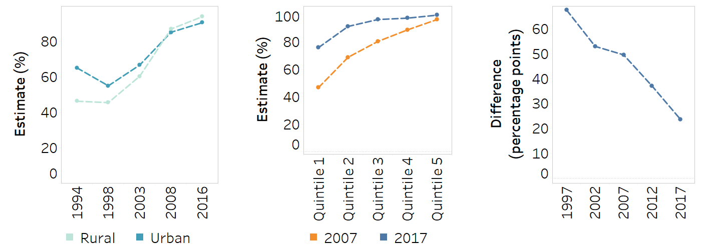
Bar graph
A bar graph can be vertical or horizontal. The height or width of each bar is proportional to the value it represents. Common applications in inequality monitoring include:
showing the latest situation of inequality in a given setting, displaying disaggregated data for one or more dimensions;
showing the change in inequality over time in a given setting, displaying either disaggregated data or a summary measure of inequality for a single dimension across multiple time points;
comparing inequality across multiple indicators, time periods or settings using a summary measure of inequality.
Use horizontal bar graphs when there are long labels (e.g. indicator names) or many groups (e.g. regions of a country).
Sorting bars can add insight (e.g. arranging in ascending or descending order) or aid interpretation (e.g. arranging subgroups from the least to most advantaged).
Colours can be used to aid interpretation (e.g. to differentiate between different dimensions of inequality).
Labels can be added to bars if having precise estimates would be helpful for the audience.
A line across the bars can be used to show the average across all groups.
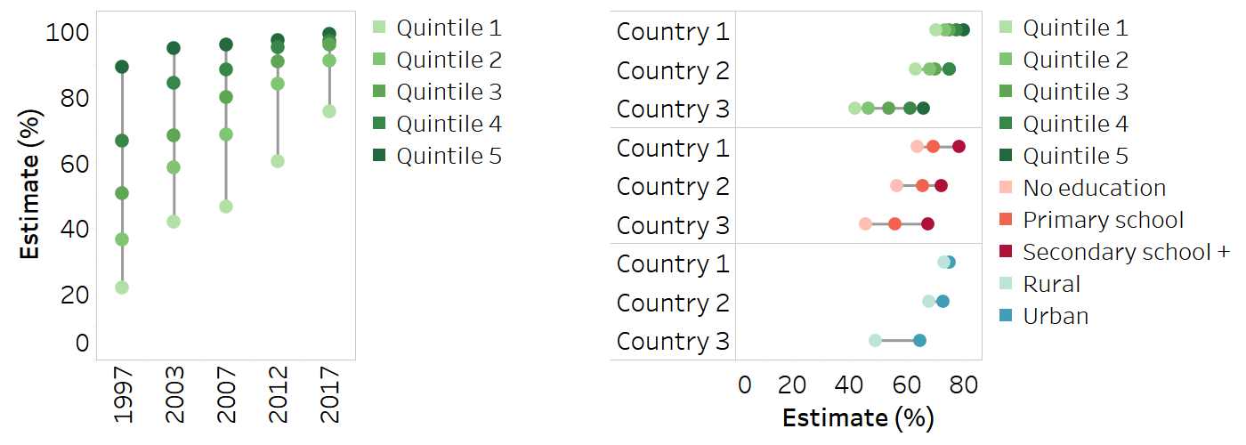
Equiplot
An equiplot (also known as a dot plot) presents disaggregated data points in a line, corresponding to a specified date and/or setting. A solid line connects the two extreme data points. An equiplot can help to identify patterns in disaggregated data, such as mass deprivation, a queuing pattern, universal coverage or marginal exclusion. Common applications in inequality monitoring include:
showing the latest situation of inequality in a given setting;
showing the change in inequality over time in a given setting for a single dimension;
comparing the latest situation of inequality or change over time across multiple settings.
Equiplots can be horizontal or vertical.
Subgroup colours can be used to aid interpretation. A colour legend should be included.
A line across the equiplot can be used to show the average across all groups.
Line graph
A line graph shows time trend data. Data points for different time periods are connected chronologically by a line. Common applications in inequality monitoring include:
showing the change in inequality using disaggregated data;
showing the change in inequality using a summary measure of inequality;
comparing changes in inequality across multiple indicators or settings using a summary measure of inequality.
The number of lines on the graph should be limited to make the graph readable.
Data should be presented for indicators or summary measures with the same measurement units that can be shown on the same axis – that is, avoid using a dual axis.
Consistent axis spacing for time periods should be ensured.
A colour legend should be included.
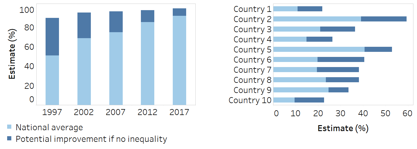
Stacked bar graph
A stacked bar graph can be vertical or horizontal. It can show the impact of eliminating inequality, using the summary measure of inequality population attributable risk (PAR), where the lower section of the bar shows the current setting average for an indicator and the upper section of the bar shows the value of PAR. The total length of the bar shows the potential setting average if there was no inequality. Common applications in inequality monitoring include:
showing PAR data for multiple time periods or indicators within a single setting;
showing PAR data for a single indicator across multiple settings.
Stacked bar graphs should be avoided when presenting data for adverse indicators, because PAR will be negative, indicating a decrease in the setting average. Instead, bullet graphs should be used to present these data.
For long labels (e.g. indicator names) or many groups, horizontal stacked bar graphs should be used.
If comparing inequality across multiple indicators, indicators should have the same unit of measurement.
A single colour should be used for the lower section of the bar (the current setting average) and for the upper section of the bar (PAR). A colour legend should be included.
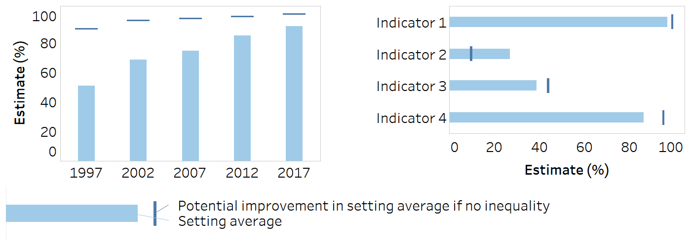
Bullet graph

A bullet graph can be vertical or horizontal. It combines bars and lines. It can show the impact of eliminating inequality, using the summary measure of inequality population attributable risk (PAR), where the bar shows the current setting average for an indicator and the line shows the value of PAR. The gap between the bar and the line shows the potential increase (or decrease) in the setting average if there was no inequality. Common applications in inequality monitoring include:
showing PAR data for multiple time periods or indicators within a single setting;
showing PAR data for a single indicator, across multiple settings.
This type of graph is preferable for when some or all indicators are adverse, because PAR will be negative (i.e. it will cross the bar) and it will be easier to interpret that this means a decrease in the setting average.
For long labels (e.g. indicator names) or many groups, horizontal bullet graphs should be used.
If comparing inequality across multiple indicators, the indicators should have the same unit of measurement. A colour legend should be included.
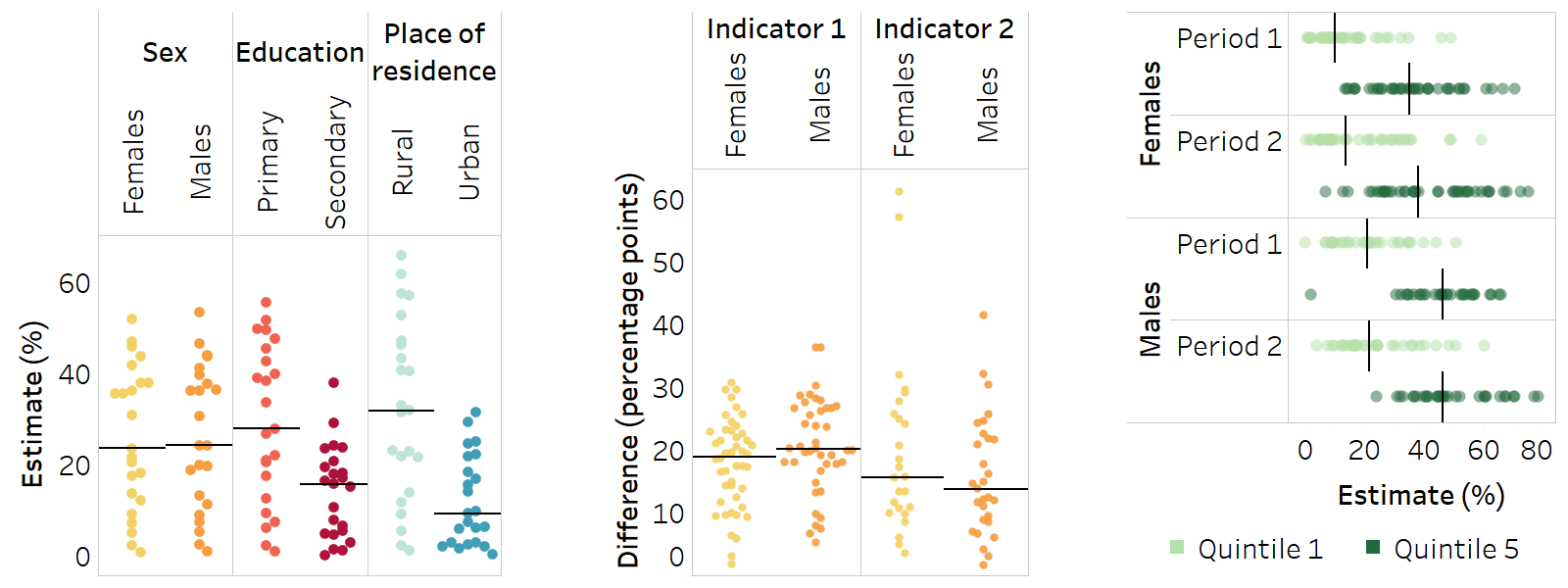
Strip plot
A strip plot (also referred to as a jitter plot) can be vertical or horizontal. It shows the distribution of data points. Data are organized in columns or rows, with each being a population subgroup in the case of disaggregated data, or a dimension of inequality, indicator or time period in the case of summary measures. Each data point represents a value in one setting. Common applications in inequality monitoring include:
showing the latest situation of inequality using either disaggregated data or a summary measure of inequality, across multiple settings;
showing the change in inequality over time using either disaggregated data or a summary measure of inequality, across multiple settings.
When presenting disaggregated data, there must be no subgroups with missing data (i.e. each column or row must contain a data point for each setting).
This graph type is useful for identifying clusters, outliers, and minimum and maximum values across settings.
A solid line can be used to show the median across the settings in each column or row.
Colours can be used to aid interpretation – for example, to differentiate between different dimensions of inequality, or between high and low levels of inequality. A colour legend should be included.
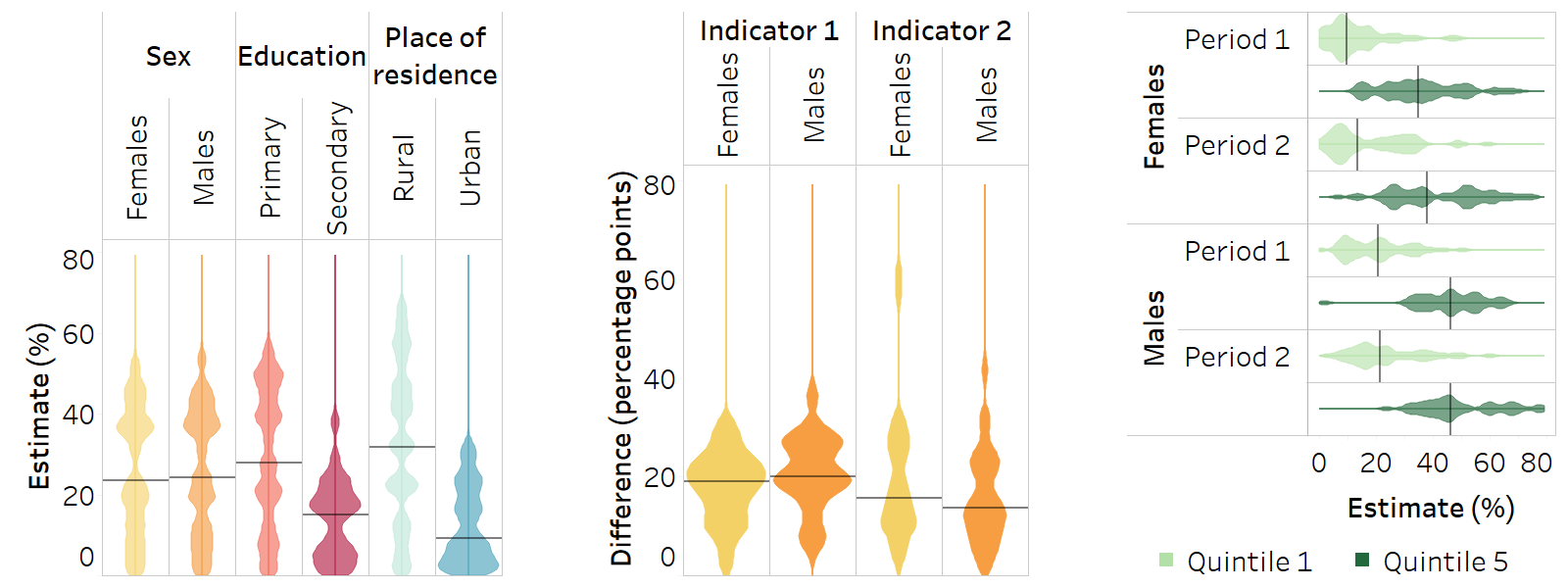
Violin plot

A violin plot shows the distribution of data points at different values and can be vertical or horizontal. Data are organized in columns (or rows), with each column (or row) being a population subgroup in the case of disaggregated data, or a dimension of inequality, indicator or time period in the case of summary measures. The density of the data points is shown using a shaded area. Common applications in inequality monitoring include:
showing the latest situation of inequality using either disaggregated data or a summary measure of inequality, across multiple settings;
showing the change in inequality over time using either disaggregated data or a summary measure of inequality, across multiple settings.
When using disaggregated data, there must be no subgroups with missing data (i.e. each column or row must contain a data point for each setting).
This graph type is useful for identifying patterns in the distribution across settings.
Violin plots can be overlaid to compare inequality across indicators, time periods and settings.
Colours can be used to aid interpretation – for example, to differentiate between different dimensions of inequality, or high and low levels of inequality. A colour legend should be included.
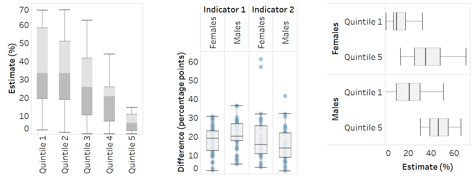
Box plot
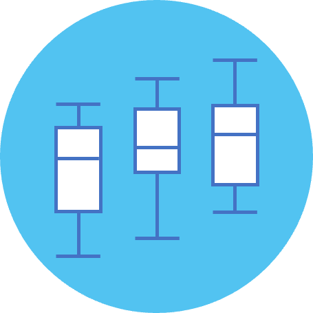
A box plot (or box-and-whisker plot) uses boxes and lines to show the distribution of data points. Data are organized in columns or rows, with each being a population subgroup in the case of disaggregated data, or a dimension of inequality, indicator or time period in the case of summary measures. The top and bottom lines indicate minimum and maximum values; the central line indicates the median (middle point of estimate); and the boxes indicate the interquartile range (central 50% of estimates). Common applications in inequality monitoring include:
showing the latest situation of inequality using either disaggregated data or a summary measure of inequality, across multiple settings;
showing the change in inequality over time using either disaggregated data or a summary measure of inequality, across multiple settings.
When using disaggregated data, there must be no subgroups with missing data (i.e. each column or row must contain a data point for each setting).
This graph type is useful for communicating minimum, maximum and median values across settings, without showing individual country estimates.
If desired, country data points can be shown alongside the box plot (e.g. to highlight outliers).
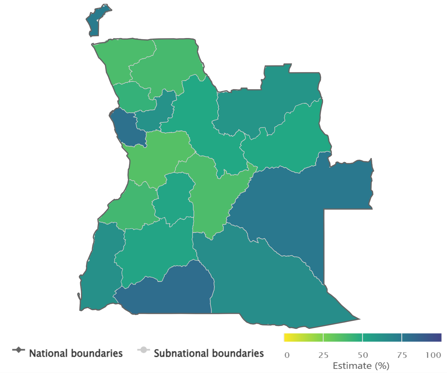
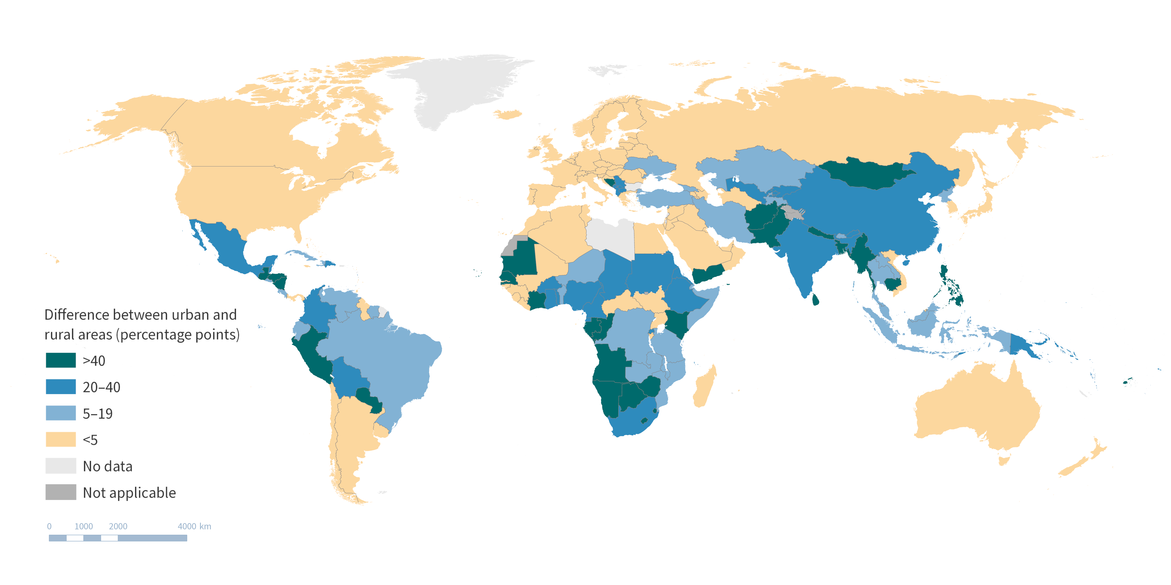
Choropleth map

A choropleth map displays geographical areas or regions that are coloured in relation to a data value. It allows the study of how a variable (e.g. an indicator estimate or a summary measure of inequality) differs across areas. Common applications in inequality monitoring include:
showing subnational inequality (e.g. within one or more countries), using data disaggregated by subnational region;
comparing subnational inequality (within one or more settings), using multiple maps;
comparing inequality across settings using a summary measure.
The size of an area on the map does not correspond to the population size or density.
It is important to indicate where data are not available or not applicable.
Contested borders or areas should be noted.
Comparisons between multiple maps should be limited to where the interpretation is very apparent. To avoid using multiple maps to show disaggregated data for subgroups, a summary measure of inequality could be presented on a single map.
Colours can be used to aid interpretation. A colour legend should be included.
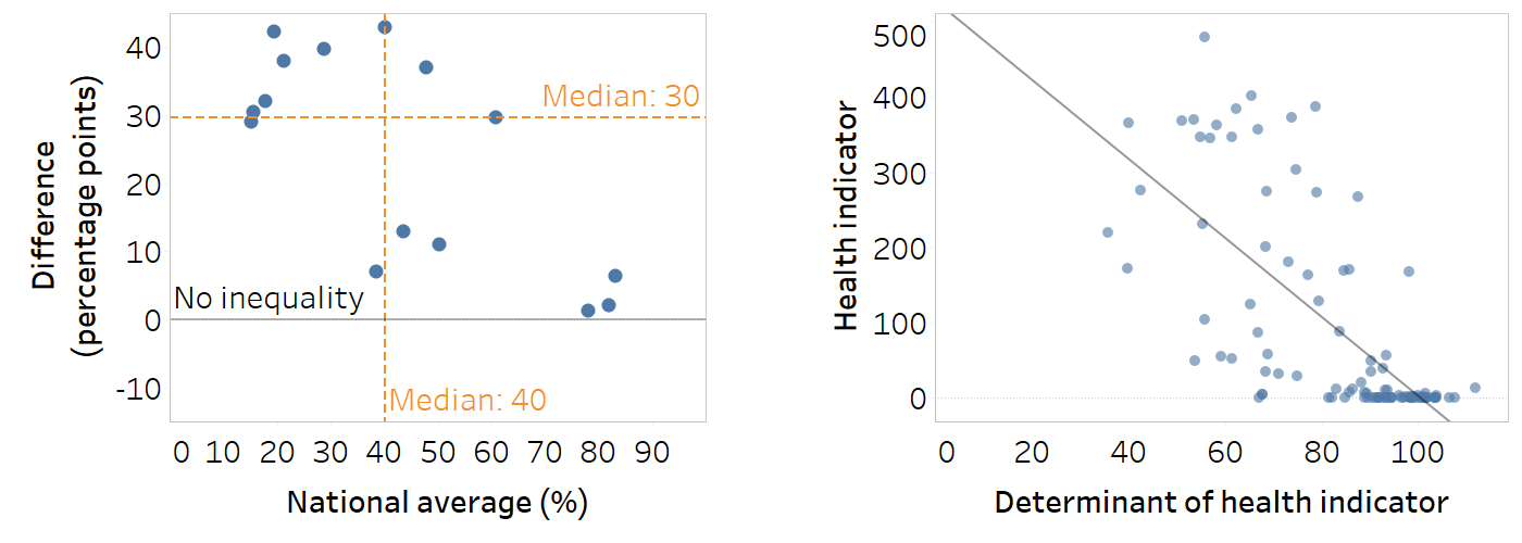
Scatterplot

A scatterplot contains information about two variables, one variable on each axis. It can help to visualize patterns or associations between the two variables. Common applications in inequality monitoring include:
comparing inequality across multiple settings for a given indicator and time period by plotting a summary measure of inequality alongside the setting average – this can help benchmarking of inequality across settings and identify clusters of settings with common situations (e.g. high inequality amid low setting average);
exploring associations between health indicators and determinants of health (using a regression line).
Median lines can be added to the x- and y-axes to separate settings by four quadrants – lower inequality and lower setting average; lower inequality and higher setting average; higher inequality and lower setting average; and higher inequality and higher setting average.
Labels should be added to the data points to identify certain (or all) settings.
The line of no inequality for the summary measure should be shown clearly to aid interpretation.
Be aware that, depending on the summary measure, values may be above or below the line of no inequality, affecting interpretation (i.e. inequality favouring the advantaged groups versus inequality favouring disadvantaged groups).
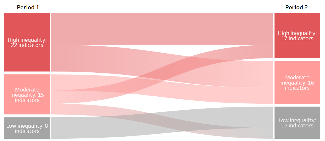
Sankey diagram

A Sankey diagram displays a flow or change from one set of values to another. Groups being connected are called nodes and the connections are called links. Links are represented with arrows or arcs that have a width proportional to the size of the flow. The number of nodes reflects the number of indicators within different thresholds of inequality (e.g. low, moderate and high inequality). Common applications in inequality monitoring include:
- showing the change in inequality over time in a given setting using a summary measure of inequality.
Logical thresholds of inequality should be identified to serve as the base for the groups (nodes).
The nodes should be ordered to aid interpretation.
Colours can be used to aid interpretation.
The graph should be simple, with a limited number of nodes and time points.
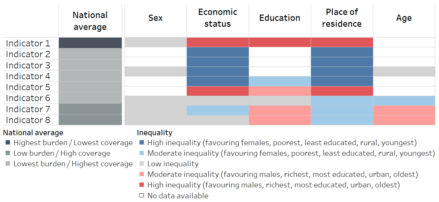
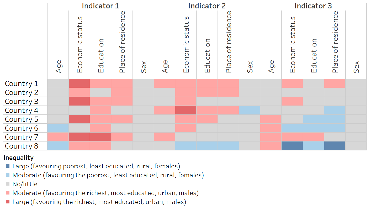
Heatmap

A heatmap is formatted similarly to a table, applying colour that corresponds to data values. A heatmap is useful to support rapid approximate comparisons of inequality across indicators or dimensions, make patterns in the data visible and help unusual values stand out. Common applications in inequality monitoring include:
comparing the latest situation of inequality in a given setting across multiple indicators and/or dimensions using disaggregated data or a summary measure of inequality;
comparing the situation of inequality across multiple settings for a given indicator and/or dimension using disaggregated data or a summary measure of inequality.
Logical thresholds of inequality should be identified for the colour scheme.
Colours should be used to support intuitive interpretation of the level of inequality.
A colour legend should be included.
Diverging colour scales are appropriate when there is a meaningful middle point and values at opposing sides of the middle are to be emphasized (e.g. when there is a directionality of inequality).
The same summary measure of inequality should be used to measure inequality throughout the heatmap.