Chapter 23. Reporting disaggregated data and summary measures of health inequality
Overview
Disaggregated data and summary measures of health inequality can yield an abundance of information about the state of inequality in a given iteration of monitoring. This can include disaggregated data for multiple health indicators and dimensions of inequality, across multiple time periods and settings, and as numerous corresponding summary measures of health inequality that capture absolute and relative inequality. Calculating and comparing the results of inequality analyses allows a thorough assessment of this information. Reporting usually features a curated selection of these results, with adequate accompanying information to aid understanding of their interpretation and limitations. Reporting should aim to convey sufficient data to portray the state of inequality and support recommendations and conclusions, but it should avoid presenting redundant or irrelevant information that is not matched to the needs and interests of the intended audience.
Reporting disaggregated data and summary measures of health inequality requires familiarity with data sources, analysis approaches and inequality measures. The selection of information for inclusion in inequality reporting entails technical considerations such as the scope of reporting (i.e. latest status, time trend or benchmarking) that can be supported, given the available results; details about the background context and data that should be included to ensure reporting is complete and transparent; how results can be conveyed most effectively using text, tables, graphs, maps and interactive data visuals; and reporting checklists and tools that can be used to promote completeness in reporting. These issues are addressed in this chapter.
The aim of this chapter is to enable technically rigorous, complete and visually impactful reporting of health inequality data and measurements. The chapter focuses primarily on the technical considerations for reporting the results of inequality analysis (acknowledging that strong examples of inequality reporting also attend to characteristics of the context and affected population, and the intended purpose and audience for a given reporting activity, which are addressed further in (Chapter 7). The chapter begins with a discussion about the scope of monitoring, followed by an overview of components of complete reporting. Techniques for presenting inequality data are discussed, including text, tables, graphs, maps and interactive visualizations. It concludes by outlining examples of reporting checklists and tools.
Scope of reporting
The scope of reporting reflects the decisions about the relevant aspects of inequality analyses, considering the purpose of reporting and the characteristics of the intended audience (see Chapter 7). The scope of reporting generally refers to latest status, change over time and benchmarking. A running example of HIV testing in Liberia is used in this chapter to illustrate these components.
Latest status
As a minimum, reporting should include the latest status of inequality. Reporting the latest status of inequality uses the most current available disaggregated data and/or summary measures to address issues such as the current level of the health indicator across population subgroups; where inequalities are more and less pronounced, and for which subgroups; how the health of population subgroups compares with targets and policy priorities; and the priority areas for further action. Box 23.1 contains an example from Liberia, showing the latest status of inequality in HIV testing in females and males.
BOX 23.1. Example of latest status of inequality in HIV testing among females and males in Liberia
The indicator of HIV testing measures the percentage of people who have ever tested for HIV and received test results. The most recent data available are from the 2019 Demographic and Health Surveys (DHS). Figure 23.1 shows disaggregated data estimates for economic status (five subgroups), education level (four subgroups), place of residence (two subgroups) and subnational regions (five subgroups).
The use of bar graphs permits simple comparison of disaggregated data across the population subgroups for each inequality dimension, with the national average displayed as a vertical line. The choice of a horizontal bar graph to display subnational regions allows for the region labels to be displayed in a readable orientation. In both sexes, testing tends to be higher among subgroups that are richer, subgroups with higher education, and subgroups in urban compared with rural areas. The variation across subnational regions is larger in males (ranging from 17% in South Eastern B to above 34% in South Central and South Eastern A) than in females (ranging from about 47% in North Central to 56% in South Eastern A).
FIGURE 23.1. People ever tested for HIV and received test results, females and males, by economic status, education level, place of residence and subnational region, Liberia
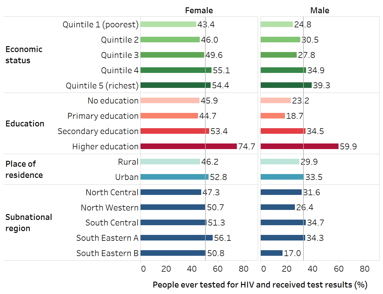
The vertical lines show the overall averages for females and males. The names for subnational regions recorded in Demographic and Health Survey datasets were retained.
Source: derived from the WHO Health Inequality Data Repository HIV/AIDS dataset (1), with data sourced from the 2019 Demographic and Health Surveys.
Change over time
Changes in inequality over time can be reported if data are available from more than one time point. This compares the latest status of inequality with data from a single previous period or trends across multiple periods. This is often included in reporting because it gives a sense of how inequalities have changed and whether the situation is improving, staying the same or getting worse. Summary measures of health inequality may be useful when reporting change over time, especially if data are presented for several time points and span multiple indicators, inequality dimensions and settings.
Alongside other evidence, data about change over time can provide initial insight into whether actions to address inequalities have been accompanied by reductions in inequality. It can also act as a warning system because situations of increasing inequality may warrant further investigation. When reporting change over time, any discrepancies in measurements between time points should be noted, such as differences in data collection methods, differences in how health indicators or dimensions of inequality are defined and prepared, or differences related to the affected population. Box 23.2 demonstrates change over time reporting for HIV testing among females and males in Liberia.
BOX 23.2. Example of change in inequality over time in HIV testing among females and males in Liberia
Continuing the example of HIV testing in Liberia from Box 23.1, change over time results show trends in inequality using comparable data from the 2007, 2013 and 2019 DHS. Using equiplots, Figure 23.2 displays data for females and males disaggregated by four inequality dimensions, for each point in time. Alongside increases in the national level of HIV testing in females and males over the three time points, there were increases in all the subgroups, especially between 2007 and 2013.
FIGURE 23.2. People ever tested for HIV and received test results, by economic status, education, place of residence and subnational region, females and males, Liberia
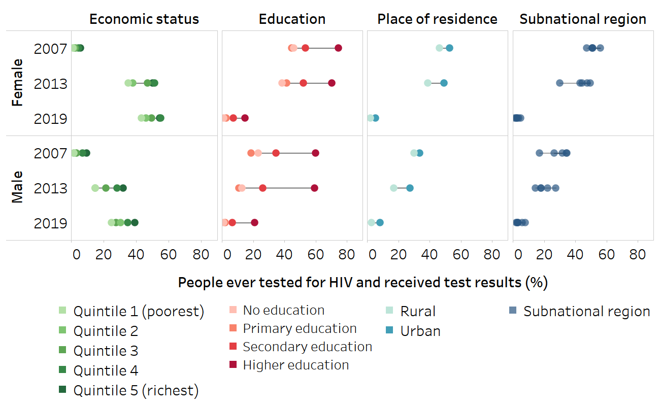
Source: derived from the WHO Health Inequality Data Repository HIV/AIDS dataset (1), with data sourced from the 2007, 2013 and 2019 Demographic and Health Surveys.
Line charts can be used to illustrate trends of how difference and ratio have changed over time for each of the four inequality dimensions. Absolute inequality related to education measured using difference tended to be higher in males than females; in both sexes, it was higher in 2013 compared with 2007 and 2019 (Figure 23.3). Absolute inequality related to economic status and place of residence was similar in females and males. Subnational regional inequality showed mixed patterns across the three time points.
FIGURE 23.3. Difference: people ever tested for HIV and received test results, by economic status, education, place of residence and subnational region, females and males, Liberia
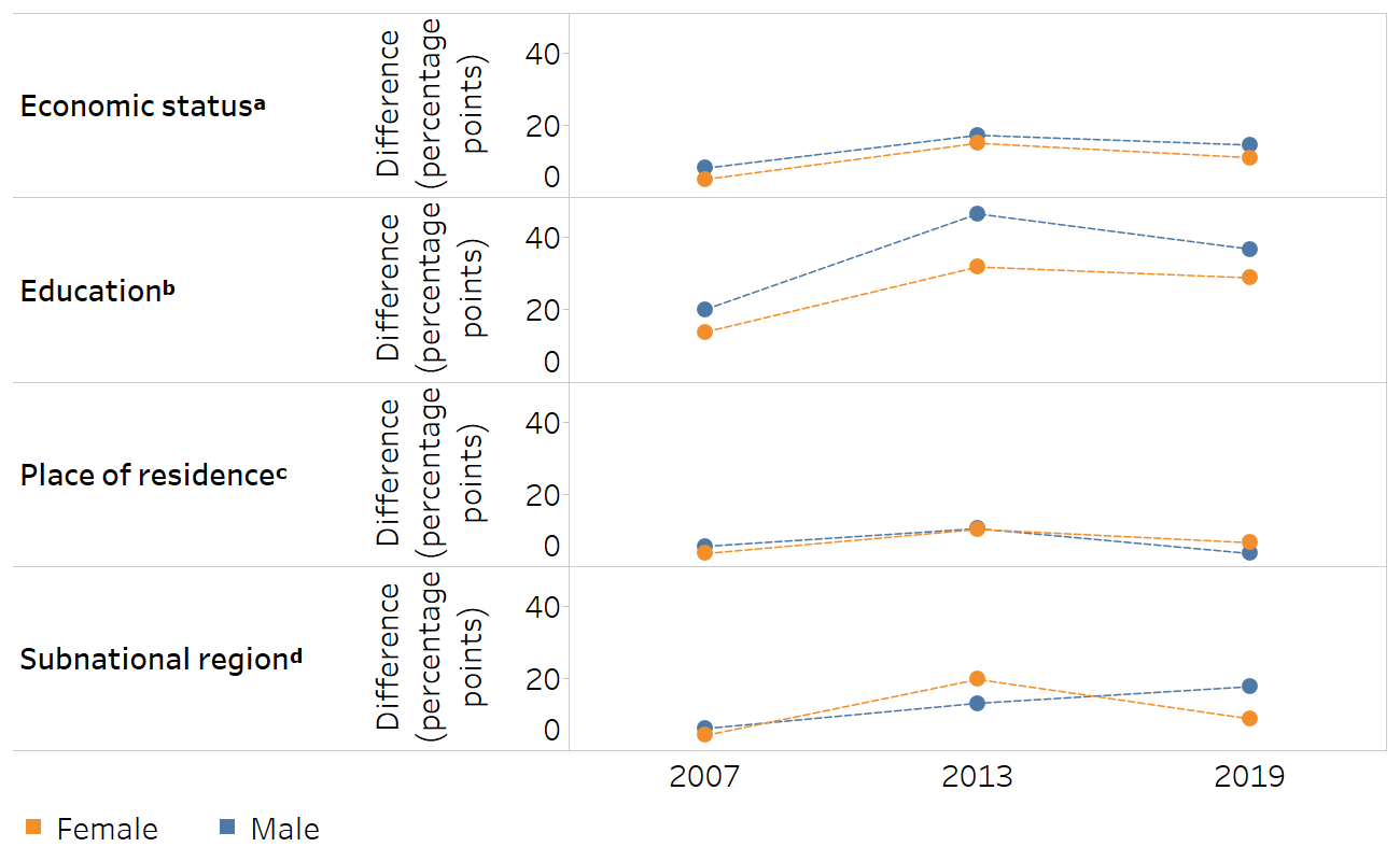
a Economic status is categorized as five subgroups (quintiles), and the difference is calculated as the richest minus the poorest.
b Education level is categorized as four subgroups, and the difference is calculated as the most educated (higher education) minus the least educated (no education).
c The difference for place of residence is calculated as urban minus rural.
d Subnational region is categorized as five subgroups, and the difference is calculated based on the subgroup with the highest estimate minus the subgroup with the lowest estimate.
Source: derived from the WHO Health Inequality Data Repository HIV/AIDS dataset (1), with data sourced from the 2007, 2013 and 2019 Demographic and Health Surveys.
Relative inequality, measured using ratio, decreased between 2007 and 2013 for all four inequality dimensions in both sexes (Figure 23.4). Between 2013 and 2019, relative inequality tended to remain about the same or narrow slightly.
FIGURE 23.4. Ratio: people ever tested for HIV and received test results, by economic status, education, place of residence and subnational region, females and males, Liberia
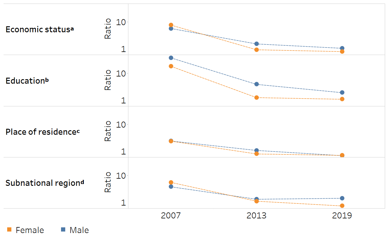
a Economic status is categorized as five subgroups (quintiles), and the ratio is calculated as the richest divided by the poorest.
b Education level is categorized as four subgroups, and the ratio is calculated as the most educated (higher education) divided by the least educated (no education).
c The ratio for place of residence is calculated as urban divided by rural.
d Subnational region is categorized as five subgroups, and the ratio is calculated as the subgroup with the highest estimate divided by the subgroup with the lowest estimate.
Source: derived from the WHO Health Inequality Data Repository HIV/AIDS dataset (1), with data sourced from the 2007, 2013 and 2019 Demographic and Health Surveys.
Benchmarking
Benchmarking compares the level of inequality across similar settings. Often, benchmarking is conducted between countries, showing how the level of inequality varies for a given health indicator and dimension of inequality. It can also be conducted between subnational regions of a country – for example, to compare the level of socioeconomic-related inequality in mortality among children aged under five years across provinces of a country. Like change over time, benchmarking may involve the use of summary measures of inequality, especially if capturing more than one time point or variable (such as showing inequality alongside national average).
Benchmarking between settings requires that the underlying data are reasonably comparable – that is, collected around the same time and using similar methods. When reporting benchmarking, the criteria used to determine what constitutes “reasonably comparable” should be included in accompanying methods documentation to justify the selection of comparator settings. Box 23.3 shows benchmarking for the example of HIV testing in Liberia.
BOX 23.3. Example of benchmarking HIV testing among females in Liberia
This example demonstrates benchmarking of economic-related inequality in HIV testing and receiving test results among females in Liberia. The situation in Liberia is benchmarked with 15 other low-income countries in the WHO African Region whose most recent available data were from 2010 or later.
The use of a scatterplot presents economic-related inequality, measured as difference, alongside national average (Figure 23.5). Countries in the lower right quadrant have the highest national average alongside the lowest difference. In this group of countries, Liberia (highlighted in orange) reported a national average above the median and was one of seven countries that reported a rich–poor difference below 15 percentage points. The best-performing countries in this group, with national averages above 75% and absolute economic-related inequality below 2 percentage points, were Malawi and Rwanda.
FIGURE 23.5. Difference and national average: people ever tested for HIV and received test results, by economic status, females, Liberia and 15 other low-income African countries
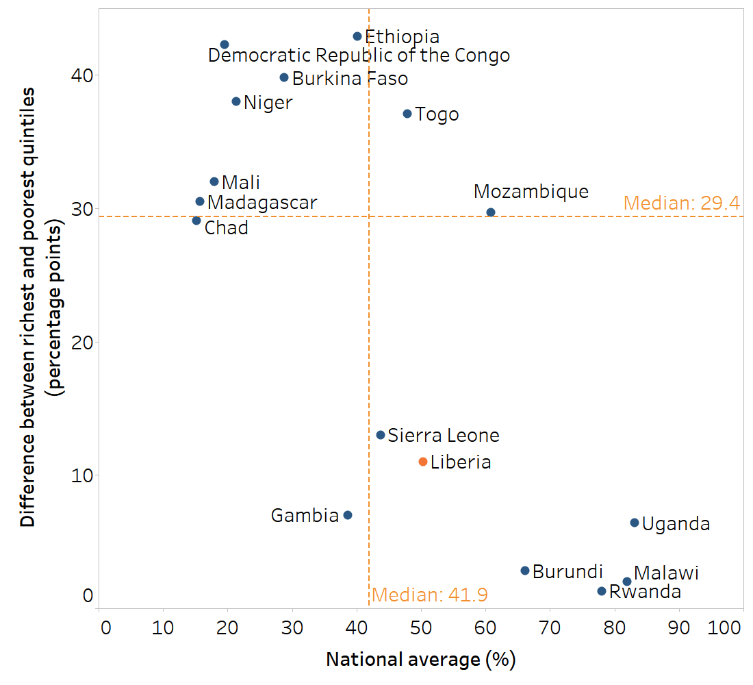
Source: derived from the WHO Health Inequality Data Repository HIV/AIDS dataset (1), with data sourced from the most recent AIDS Indicator Survey or Demographic and Health Survey conducted between 2010 and 2021.
Components of complete reporting
Within the established scope of reporting, the content, including technical content, can be determined. Health inequality monitoring reporting should contain sufficient information for audiences to understand the main messages, recommendations and conclusions. In general, reporting includes information about the background and context, the methods for assessing data, the analysis results or main findings, and the implications of the findings (see Chapter 24). Depending on the audience and reporting output, these components may be featured with varying degrees of detail and emphasis.
Maintaining detailed notes across all steps of the inequality monitoring cycle can make reporting easier by compiling relevant information and considerations.
Background information
Background information about the setting and population of interest and findings from qualitative sources provide context for reporting and help to set the scene. Background information situates the purpose of monitoring – that is, why monitoring was undertaken and what it is setting out to accomplish. The specific type of background information may vary, depending on the reporting output and audience. In some cases, the inclusion of photos or personal stories can make the report context more relatable and compelling and enhance its impact. See Box 23.4 for descriptions of the type of background information included in the WHO State of Inequality reports (1–4).
BOX 23.4. Examples of background information presented in WHO State of Inequality reports
The background section of the WHO State of inequality: reproductive, maternal, newborn and child health report describes key issues related to health inequality in the topic area. It includes an overview of the major global policies and initiatives related to the topic since the year 2000, and how they address equity (1).
The first chapter of the WHO State of health inequality: Indonesia report provides information about demographic and health trends in the country, the political landscape and development process, and an overview of relevant aspects of the health sector (2).
The WHO State of inequality: childhood immunization report gives an overview of the global context for advancing equity in childhood immunization, highlighting past, current and emerging immunization-related milestones and initiates (3).
The WHO State of inequality: HIV, tuberculosis and malaria report presents data about the epidemiological profile of each disease, global commitments, information about key and underserved populations, and a literature review about current state of knowledge pertaining to inequalities (4).
Technical content
The technical content refers to the results of the inequality analysis that are reported to support the major findings and conclusions. Technical content includes results of analyses derived from disaggregated data and summary measures of health inequality. It also includes other details related to the analysis, such as overall average, population size or share, and uncertainty measures (Box 23.5), and metadata describing specifics about the data source, variables and calculation methods.
BOX 23.5. Descriptive statistics to report alongside inequality analysis results
Overall average: the level of the health indicator in the population, such as the national average, gives a sense of the overall situation. For example, the national average may be presented alongside disaggregated data using a horizontal line across a vertical bar chart or alongside a summary measure of inequality (e.g. using a scatterplot).
Population size or share: the population size (number of affected people represented by each population subgroup) and population share (percentage of the total affected population represented by each population subgroup) are key pieces of information to report alongside the findings. Population size or share statistics are particularly important to report if there is a large variation across population subgroups or a major shift over time.
Subgroup sample size: if using data from household surveys, results based on small sample sizes should be flagged or suppressed. See Chapter 17 for a discussion of sample size considerations.
Uncertainty measures: reporting uncertainty measures for disaggregated estimates, such as 95% confidence intervals or standard errors, is an important part of transparency in reporting. This can help audiences understand the extent of sampling errors when comparing estimates between population subgroups, and guide assessments about how conclusions can be drawn from the data. This level of detail, however, may not always be suitable for the intended audience. See Chapter 18 for more on measures of uncertainty and significance.
As with all reporting decisions, technical content should be selected with the intended reporting purpose and audience in mind. In particular, the needs, interests and technical abilities of the audience should guide decisions about the technical information so the content is appropriately transparent, accurate and easy to understand.
Reporting requires that data and results are curated and interpreted. It is not simply a comprehensive collection of all underlying data and analysis results.
Although there are many possible reporting outputs from health inequality monitoring (see Chapter 7), the presentation of technical content in reports often shares common components. These include a summary of results, main content, appendices of detailed results, and technical appendices. These may be made available in different ways, such as printed reports, downloadable PDFs and web content, or platforms such as GitHub. Increasingly, there is a trend for greater transparency and sharing of information, such as datasets, source codes and detailed results, as supplementary materials to the main content. Reporting this information facilitates its availability for inclusion in subsequent systematic reviews and meta-analyses.
Disaggregated data
Disaggregated data are a good starting point for reporting results because they present information in a straightforward and intuitive manner that is appropriate for diverse audiences with variable levels of technical expertise. In particular, describing patterns across ordered population subgroups can be a powerful way to report disaggregated data (see Chapter 18). In some cases, reporting disaggregated data may be sufficient to present inequality analysis, especially if the scope of reporting is confined to the latest status of inequality in a limited number of indicators.
Summary measures of health inequality
In many reporting applications, summary measures of health inequality are useful, keeping in mind their interpretation and limitations (see Chapters 19–22). Summary measures can concisely convey information about the level of inequality in a single number, facilitating comparisons over time and across settings and indicators. Pairwise summary measures of health inequality (i.e. difference and ratio measures) tend to be easier to comprehend than complex summary measures. Therefore, if pairwise and complex measures of inequality support the same conclusions, it is generally preferable to report pairwise measures, especially for audiences with less technical knowledge. If pairwise and complex measures do not support the same conclusions, a closer look at the data is needed to determine the reason for the discrepancy. The reporting of complex measures may be warranted to present a more nuanced depiction of the situation, if appropriate for the audience and the purpose of reporting. For example, it may be appropriate to include several complex measures of inequality in reporting targeted to academic audiences with high levels of technical expertise. This may be the case for an output such as a peer-reviewed journal article. If complex summary measures of inequality are reported, the underlying methods and their interpretation should be explained as clearly as possible.
If reporting summary measures (whether pairwise or complex), both absolute and relative measures should be included. This helps to ensure the reporting provides a balanced perspective on the state of inequality, capturing both the absolute magnitude of inequality and the relative inequality between subgroups. In addition, to facilitate a more complete understanding of the results of summary measures, the underlying disaggregated data and national (or overall) average should be reported, along with other pertinent information. For more on interpreting summary measures of health inequality, see Chapter 22.
Methods and metadata
Information about the methods and approaches used for health inequality analyses should be provided in an upfront and accurate manner. This includes descriptions of the data sources, health indicators and inequality dimensions, analysis methods and interpretation approaches. Reporting may also provide information about the selection of settings, populations and variables. If appropriate, the reason behind the choice of methods should be explained, and any pertinent limitations should be acknowledged. This information is important to establish the parameters of monitoring and add clarity to how the data support or do not support certain conclusions. In some cases, it may be appropriate to provide links to resources such as data repositories, software code or background methods papers. Box 23.6 describes how methods were reported in the WHO State of inequality reports (1–4).
BOX 23.6. Example of methods reporting in WHO State of Inequality reports
The WHO State of inequality reports contain an overview of the methods in the main report (1–4). This includes information about the data, such as data sources, definitions and country selection, and information about the analysis, such as data disaggregation and summary measures of health inequality. More detailed information is provided in technical appendices and indicator compendiums. The data featured in these reports are available through the Health Inequality Data Repository (5). The level of detail about the methods is sufficient such that the analysis approach could be replicated.
Metadata are data that describe and give information about other data. In the context of inequality monitoring, metadata often include detailed information related to data collection protocols, data sources, and definitions and calculation of indicators and dimensions of inequality. When reporting metadata for multiple variables, adopting a standard format to present the data enables audiences to readily access information of interest. Box 23.7 demonstrates the fields of metadata reported for all indicators included in the WHO State of inequality: HIV, tuberculosis and malaria report (4).
BOX 23.7. Metadata fields reported for indicators featured in the WHO State of inequality: HIV, tuberculosis and malaria report
The WHO State of inequality: HIV, tuberculosis and malaria report included 32 health indicators across the three diseases (4). In the report annex, indicator metadata for each indicator were reported in tables, according to the following fields: indicator name, data unit, data source, definition, numerator, denominator, method of estimation, disaggregation and comments (e.g. links to where estimates were obtained or caveats in the data). A snapshot of the metadata entry for HIV incidence (new infections per 1000 population) is provided as an example in Figure 23.6.
FIGURE 23.6. Snapshot of metadata entry
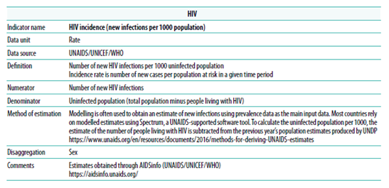
Source: WHO State of inequality: HIV, tuberculosis and malaria report (4).
Although it is important to have a sound justification for the conclusions derived from inequality analyses, the level of detail about methods and metadata that is reported should reflect the intended purpose and audience of reporting. In cases where reporting is of a less technical nature, much of the relevant metadata and methods may be made available as supplementary material or annexes. In cases where reporting is targeted to an audience with high levels of expertise, it may be relevant to put more emphasis on such details, and to discuss their merits and limitations in detail.
Presenting inequality data
The presentation of inequality data should aim to clearly and accurately show the analysis results that support key findings. Ideally, it also incites the audience’s interest in and engagement with the data. Therefore, decisions about how to present inequality data require a close understanding of the technical content underlying the major messages, the reporting context and the intended audience. To the extent possible, consulting members of the intended audience to get feedback on data presentation can help to further refine reporting approaches and enhance their impact.
The main approaches for presenting inequality data include text (or narration), tables, graphs and maps. Interactive data visualization through a digital format enables tailored engagement with the data. Text and tables are commonly used in inequality reports to provide a description of findings using words and numbers. Text is useful to explain nuances and patterns in results narratively, and to describe their significance. Tables are useful to present a set of data values in a consistent, precise and comprehensive way.
Graphs and maps show data in a manner that conveys meaning through visual presentation, relying on graphics to illustrate patterns in the underlying dataset. When designed well, they support rapid comparisons among values and make outliers visible. Graphs can be effective in simplifying complex messages and associations in the data and facilitating interpretation of large datasets. Several graph types are useful when presenting inequality data. Maps are useful for showing data with a geographical component.
Interactive visualization technology offers possibilities for audiences to explore data digitally and dynamically.
These approaches are not mutually exclusive. For example, tables, graphs and maps often contain text, or their interpretation may be facilitated by accompanying text. Tables may contain visual elements typical of graphs (e.g. colour-coding). Graphs and maps sometimes integrate tabular presentations of data. Many applications of interactive data visualization rely on several of these approaches.
Text
The text featured in inequality reporting typically presents information about the context, data, analysis methods, findings and implications. It is better to avoid writing out all information presented in tables or graphs, and instead to provide a summary of what is described, highlighting the most salient findings. Effective text is descriptive, concise and targeted at a reading level at or below that of the intended audience (acknowledging there may be a range of abilities within an audience). Jargon and technical terms should be limited and used only when writing for audiences with advanced levels of expertise, where such terms are required for precision and technical clarity. Text should be written and formatted in a deliberate and logical way, avoiding common pitfalls in inequality reporting (Box 23.8). Text may be sufficient as a standalone approach to present data when the key messages contain few numerical values or when the patterns in the data do not require visualization.
BOX 23.8. Common issues in inequality texts
Reporting text should ensure terminology is clearly defined and used consistently throughout the text. Some of the common issues encountered in inequality texts include the following:
Health inequality and health inequity are commonly understood as a measurable difference in health (in the case of inequality) or an unfair, avoidable or remediable difference in health (in the case of inequity). Related terms such as health disparity have variable meanings, depending on the context (see Chapter 1). Reports should aim for clarity and consistency in the use of language.
Wealth inequality measures, such as the Gini coefficient, are common economic measures that compare the extent of the difference or variation in economic status across a population. Wealth-related inequality in health describes and compares how subgroups with different economic status experience health. Health inequality reporting as described in this book typically focuses on wealth-related inequality in health, although wealth inequality may be included as part of the background context. In some cases, data analysis may explore wealth inequality as a determinant of health (see Annex 1).
The median represents the middle value in a dataset. The mean is the average, calculated from adding all values and dividing by the number of values.
Per cent expresses a rate out of 100. Percentage points are used when comparing percentages. For example, an increase from 50% to 55% represents a gain of 10%
\[\frac{55\% - 50\%}{50\%} = 0.1 \times 100 = 10\%\]
or a gain of 5 percentage points
\[55\% - 50\% = 5 \text{ percentage points}\]
Statistical and public health significance provide different ways of assessing whether a result is meaningful. Statistical significance is a mathematical calculation, but public health significance is a determination that accounts for the importance of the result from a public health perspective (see Chapter 18).
Sex and gender are distinct but related concepts. Sex refers to the different biological and physiological characteristics of females and males. Gender reflects the norms, behaviours and roles associated with a particular identity (6).
Causation versus correlation: texts should avoid making claims of causation unless they are supported by the underlying data.
Determinants of health are factors that combine together to affect the health of individuals and communities. Dimensions of inequality refer to the criteria upon which population subgroups are categorized for monitoring (see Chapter 3). An understanding of relevant determinants of health in a population can inform the selection of dimensions of inequality for monitoring.
Tables
Tables often provide the most efficient and effective way for many variables and a mixture of both disaggregated data and summary measures of inequality to be presented together. For example, tables can present summary measure values alongside disaggregated data estimates and overall averages and confidence intervals. In this way, tables may serve as a reference with more comprehensive and detailed information across multiple settings, health indicators and inequality dimensions. With the purpose of the table in mind, the design of tables should facilitate simple navigation by the intended audience (Box 23.9).
BOX 23.9. Effective table design
Although tables may be designed to serve different purposes, there are certain general recommendations that promote greater usability by the intended audience:
Tables should have descriptive titles and headers that are easy to read.
The use of gridlines should be limited to those that are essential to facilitate reading and interpreting the table.
The alignment of the column headers should be consistent with the contents of the cells below.
Where applicable, the numbers in a column should be aligned at the decimal point position so they can be compared easily.
Numbers should be rounded in a consistent way – for example, rounding to one decimal point for percentages tends to ensure readability.
If using colour-coding, colours should be selected that conform to general perceptions, such as green/blue for desirable and red for undesirable. The selection of colour combinations should be made in consideration of individuals having varying abilities to see certain colours (in particular, green–red colour combinations should be avoided).
Notes and footnotes can be used to indicate additional information about the data, such as cases of small sample size, or to explain the special use of symbols or dashes. Abbreviations should be spelled out in full in the footnotes, and data sources should be specified (where applicable).
If multiple tables are used in a single report, the design should be consistent throughout.
Tables tend to demand effort from the reader to interpret and derive conclusions because patterns in the data may not be immediately apparent. Some tables may facilitate quicker interpretation by, for example, containing only key information, rounding to whole values, and incorporating the use of colour-coding of cells (see Box 23.10 for an example). Formatting tables as heatmaps or introducing other such modifications may facilitate visual interpretation of results, but this may sacrifice the precision of more detailed tables.
BOX 23.10. Heatmaps and use of sequential and diverging colour scales
Heatmaps may be formatted as tables, applying colour-coding that corresponds to data values. They enable rapid approximate comparisons. Figure 23.7 shows an example of a heatmap with data for nine malaria indicators in Togo. This heatmap applies two types of colour scales: sequential (ranging from light to dark grey for national average) and diverging (ranging from light to dark across red and blue above and below a centre grey value for inequality). Thresholds in the data were established to define each colour assignment.
FIGURE 23.7. Country heatmap of selected malaria indicators and dimensions of inequality in Togo
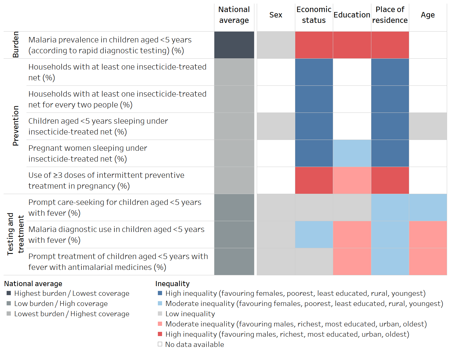
Source: derived from the WHO State of inequality: HIV, tuberculosis and malaria report (4), with data sourced from the 2017 Malaria Indicator Surveys.
The sequential scale applied in the national average column uses dark grey to indicate the least desirable scenario – high malaria burden or low intervention coverage – and light grey to indicate more desirable situations. Sequential scales tend to be intuitive to interpret and are appropriate when the data values have no defined middle point. In addition to the example shown in Figure 23.7, sequential scales can also be useful to present disaggregated data about health service coverage, expressed as percentages.
On the right, a diverging colour scale is applied to show the level of inequality according to five dimensions of inequality. Diverging colour scales are appropriate when there is a meaningful middle point and values at opposing sides of the middle are to be emphasized. Here, the colour of each cell corresponds to a particular threshold of inequality (high, moderate or low) and directionality of inequality, as indicated in the legend. After becoming familiar with the colour legend, the trends from this data are evident from a quick inspection of the table. The red cells indicate inequality favouring groups that are traditionally considered to be advantaged (or in the case of sex, in the context of this report, males), whereas blue cells indicate inequality in the opposite direction. Darker shading indicates higher inequality. Low inequality – the middle point – is evident by the grey shading.
Data visualization using graphs and maps
The following sections describe graphs and maps that are frequently used when reporting inequality (acknowledging that this chapter does not comprehensively cover all types of graphs and maps that may have applicability to health inequality monitoring). Annex 15 contains descriptions of additional types of graphs and maps, guidance on selecting an appropriate graph or map for different uses, and tips for preparing them.
Graphs and maps can be created using software applications, including the WHO Health Equity Assessment Toolkit (HEAT and HEAT Plus) (7).
Graphs
Many graph types can be used to show inequality data. In general, it is recommended to choose the type of graph that is the least cognitively demanding – that is, easy to understand and uncluttered. Depending on the intended audience and the level of technical detail that is appropriate, graphs may incorporate elements that show the level of uncertainty around estimates. Some of the most common graphs, which are featured in the WHO HEAT and HEAT Plus (7) and State of Inequality reports (1–4), include bar graphs, equiplots, dot plots, scatter plots and line graphs. As described below, these graphs are suitable for different applications within inequality reporting. Technical practices for creating graphs that are accurate and non-distorted are highlighted in Box 23.11.
BOX 23.11. Best practices for accurately presenting data using graphs
The following best practices should be followed when creating health inequality graphs:
If charting data across multiple time periods, ensure consistent axis spacing for time, especially when data are available at irregular intervals.
Use a logarithmic scale for multiplicative measures such as ratio and relative index of inequality, so the results are displayed in accordance with the extent of inequality they represent. Keep in mind that the baseline value for no inequality for these measures is 1.
Avoid distorting or misrepresenting data by elongating or inverting axes. Truncation of the axes should be avoided with graphs that use the height or length of objects to encode values, such as bar graphs.
Include clear and appropriate captions to ensure graphs are as self-explanatory as possible.
For further reading about data presentation using graphs, see the following:
Asada Y, Abel H, Skedgel C, Warner G. On effective graphic communication of health inequality: considerations for health policy researchers. Milbank Q. 2017;95(4):801–835. doi:10.1111/1468-0009.12300.
Cleveland WS. Graphical methods for data presentation: full scale breaks, dot charts, and multibased logging. Am Stat. 1984;38(4):270–280. doi:10.2307/2683401.
Cleveland WS, McGill R. Graphical perception: theory, experimentation, and application to the development of graphical methods. J Am Stat Assoc. 1984;79(387): 531–554. doi:10.1080/01621459.1984.10478080.
Few S. Now you see it: simple visualization techniques for quantitative analysis. Berkeley, CA: Analytics Press; 2009.
Few S. Show me the numbers. Berkeley, CA: Analytics Press. 2004.
Kosslyn SM. Graph design for the eye and mind. New York: Oxford University Press; 2006.
Tools for making good data visualizations: the art of charting. Copenhagen: World Health Organization Regional Office for Europe; 2021 (https://iris.who.int/handle/10665/342568, accessed 14 June 2024).
Bar graphs provide versatile options for different presentations of inequality (Figure 23.8). They may be vertical or horizontal. If the data need to be subdivided into smaller sets, they may be stacked. For example, a vertical bar graph can be used to show country data for one health indicator, disaggregated by one dimension of inequality for a single time point. Vertical bar graphs are commonly used to show country data for multiple indicators and across multiple dimensions of inequality. They can also be used to show summary measures of inequality such as difference and ratio (ensuring the use of logarithmic scales for multiplicative measures).
FIGURE 23.8. Snapshots of vertical, horizontal and stacked bar graphs
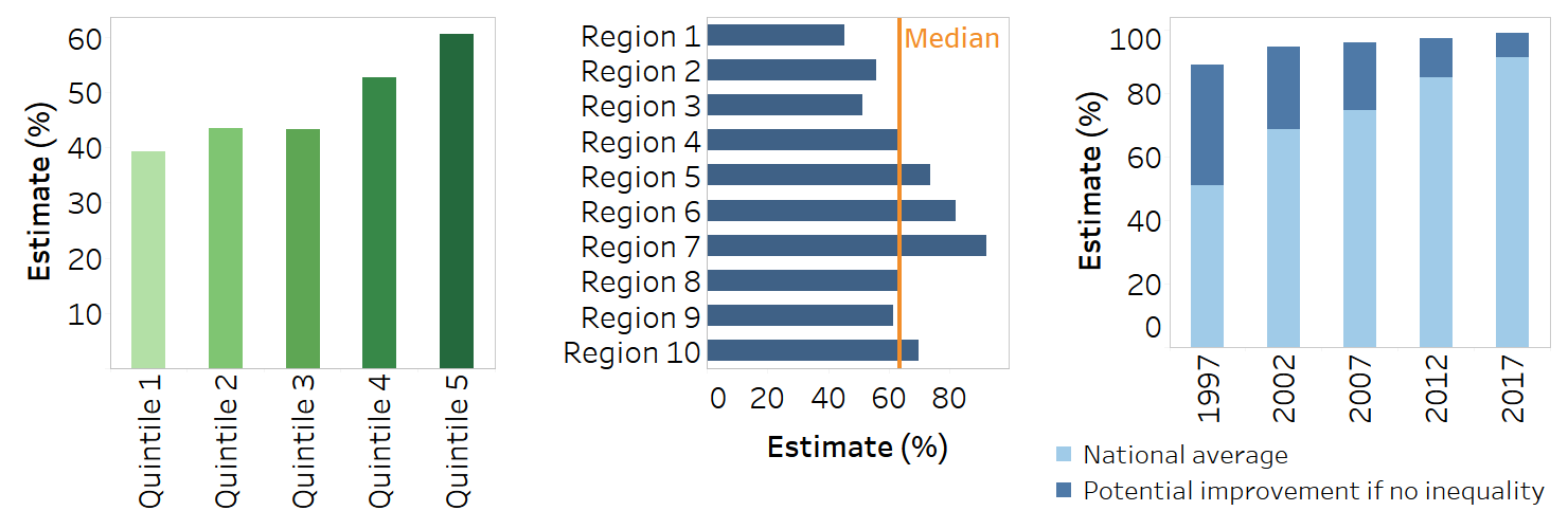
Horizontal bar graphs are useful to present disaggregated data across large numbers of subgroups, such as districts of a country. The horizontal orientation ensures the subgroup names can be written in full to the left of the bars, and bars can be arranged in ascending or descending order.
Stacked bar graphs, either vertical or horizontal, are useful when reporting the summary measure population attributable risk (PAR) because the stacked bars can illustrate the current and potential national average that could be achieved by eliminating inequality. Proportional stacked bar graphs are appropriate for indicators measured as a proportion, where the sum of the data across subgroups makes a whole.
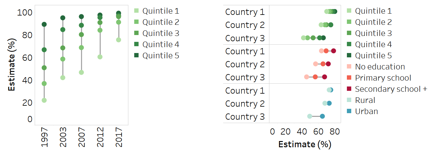
Dot plots serve the same function as bar graphs, but they allow for the quantitative scale to start at a value above zero. Equiplots, which are a type of dot plot, have special applicability when comparing sets of disaggregated data across multiple countries, settings or time points (Figure 23.9) (8). Dots (or other shapes) representing disaggregated data points are plotted in a line corresponding to a specified date and/or setting. A solid line connects the dots (data points) at either extreme, representing the range between the minimum and maximum values. Equiplots that contain two dots per line (or column, if oriented vertically) are sometimes called dumbbell plots. Various tools for creating equiplots are available (7, 9, 10).
FIGURE 23.9. Snapshots of vertical and horizontal equiplots
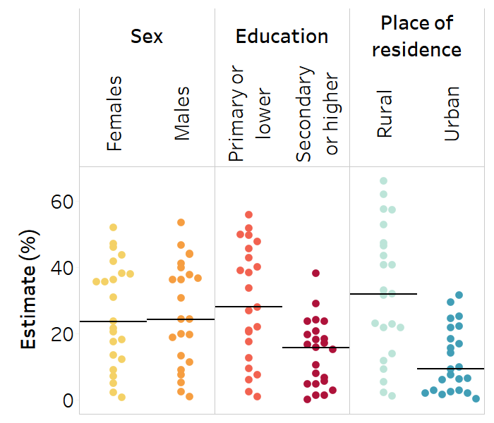
Strip plots are useful when showing the distribution of multiple data points across several populations (Figure 23.10). They can be used to show disaggregated data or summary measures. Using one column per subgroup, strip plots illustrate how a set of data points are clustered and distributed. Dots in a strip plot can be jittered – that is, slightly offset to avoid overlapping – to enhance their visibility. A strip plot could be used, for example, to show the level of a health indicator in females versus males for multiple countries. For data to be reported in this way, there must be no subgroups with missing data – that is, each column must contain a data point for each country. A solid horizontal line can be used to show the median across the countries for each subgroup. Note that strip plots can also be oriented horizontally, with each row containing data for a given subgroup.
FIGURE 23.10. Snapshot of a strip plot
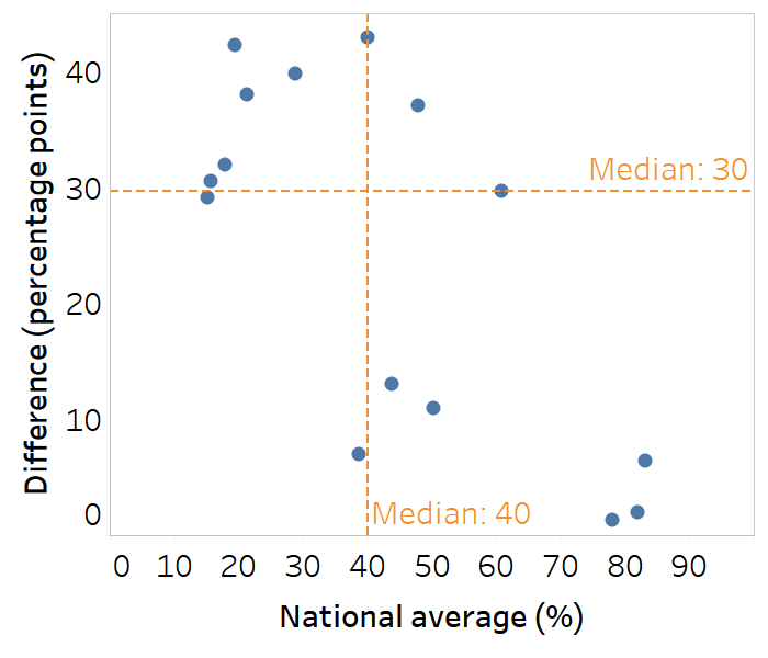
Scatterplots contain information about two variables, plotted together on the same graph to show the relationship between them. In the context of presenting health inequality data, scatterplots are commonly used to show summary measure results alongside setting averages (Figure 23.11). For example, a scatterplot might show difference or ratio plotted on the y-axis against national average plotted on the x-axis for all countries within a particular region (see Box 23.3). In this application, a scatterplot can help to quickly group countries according to the magnitude of inequality and their overall situation (noting countries to the left or right side of the graph). Scatterplots can also be used to illustrate the relationship between a health indicator and a determinant of health (see Chapter 25 for more on ecological analysis).
FIGURE 23.11. Snapshot of a scatterplot
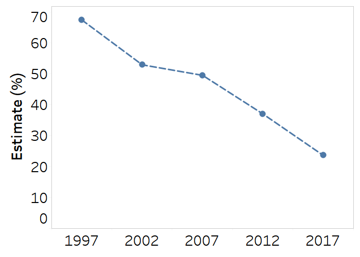
Line or slope plots are useful for showing time trend data and making comparisons across subgroups, indicators or settings (Figure 23.12). Line graphs with multiple lines require labels or legends to identify the data represented by each line. Although they have some similar applications as vertical bar graphs and equiplots, line graphs are only appropriate for displaying data across an interval scale, such as time.
FIGURE 23.12. Snapshot of a line plot
Maps
Choropleth maps display divided geographical areas or regions that are coloured or shaded in relation to a data variable, such as a health indicator or a summary measure of inequality. These maps tend to be visually impactful, highlighting areas of advantage and disadvantage, but there are important limitations in terms of their interpretation. For example, the area of a map does not correspond to population size or density – a limitation that should be acknowledged when guiding audiences through the interpretation of maps (e.g. a large rural province of a country occupies more space on a map than a densely populated capital city).
Apart from geographical information, maps generally only display one variable at a time. Defining the criteria to colour-code areas on a map (such as data thresholds or ranges) is not straightforward and limits the level of detail provided about the data. Maps tend to be most useful for showcasing approximate comparisons, although the chosen thresholds for colour-coding should allow for an assessment of the public health significance of the findings. Maps should indicate where data are not available or not applicable. Any contested borders or areas should be noted on the map, if applicable.
The use of thresholds facilitates quick data interpretation, but a drawback is that it lacks precision. For example, defining a threshold of high inequality as a difference of 20 percentage points or higher would mean that an inequality of 60 percentage points would be colour-coded the same, and therefore treated the same, as an inequality of 20 percentage points.
There are several ways that maps may be used when reporting inequality data. Maps may be used to provide background contextual information, such as national averages of relevant health indicators. Figure 23.13 is a snapshot of a map featured in the State of inequality: HIV, tuberculosis and malaria report (4). Maps of this type were used to present background information such as the overall HIV incidence across countries. Colour-coding corresponds to five defined thresholds, with the lowest incidence in lighter colour, and the highest incidence in darker colour. Light grey indicates no data, and dark grey indicates not applicable.
FIGURE 23.13. Snapshot of map providing contextual information about national averages: HIV incidence (new infections per 1000 population) in 130 countries
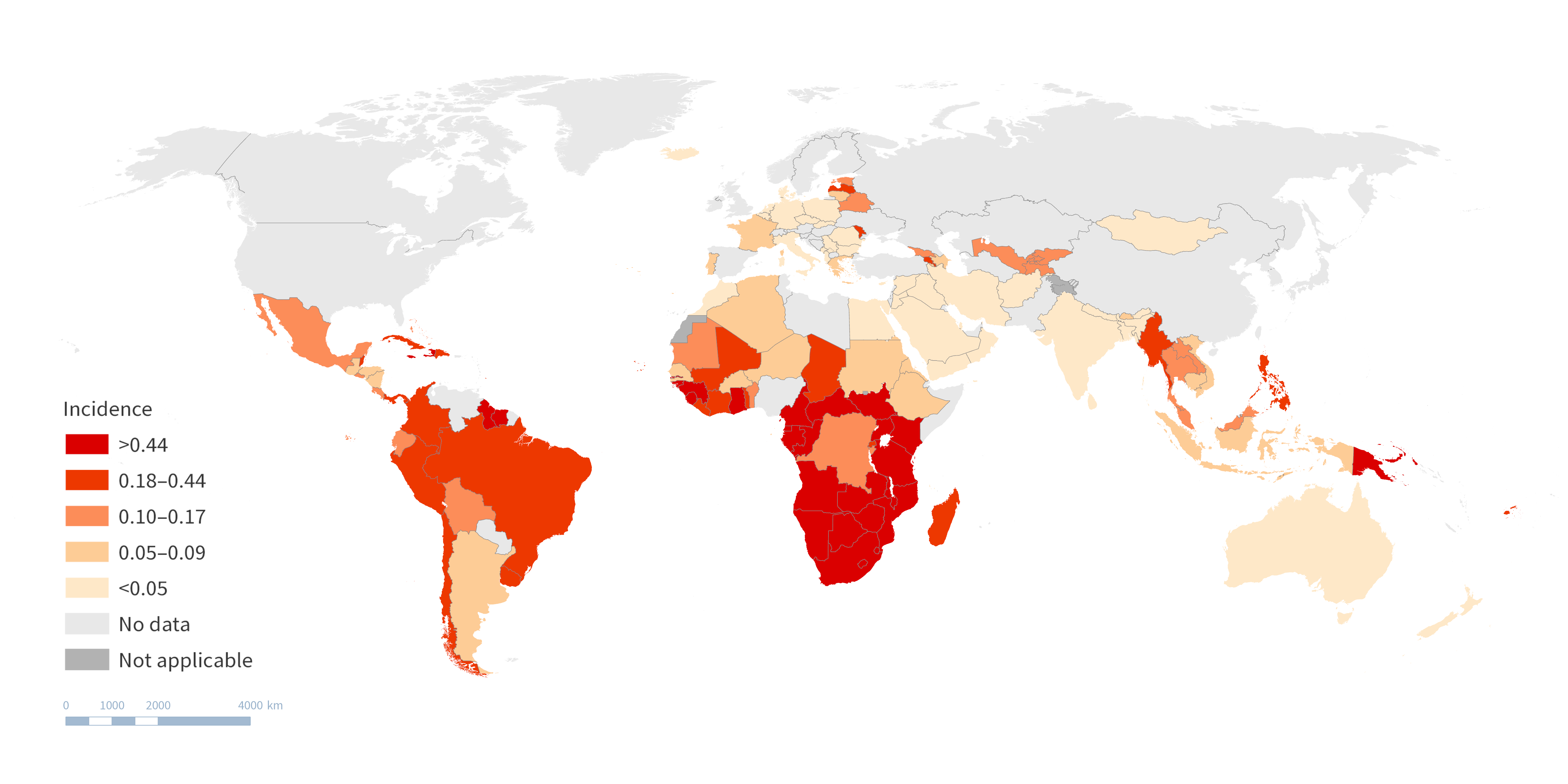
Source: derived from the WHO State of inequality: HIV, tuberculosis and malaria report (4), with data from 2021 sourced from the Joint United Nations Programme on HIV/AIDS, the United Nations Children’s Programme and WHO.
When using maps to show disaggregated data, they may present data disaggregated by a geographical dimension of inequality, such as subnational region. This is the most straightforward way of showing inequality on a map. The snapshot in Figure 23.14 is a map derived from the Health Equity Assessment Toolkit (HEAT), showing data about an indicator of accepting attitudes towards people with AIDS (would buy fresh vegetables from a shopkeeper with AIDS) among females in Angola, according to 18 subnational regions (provinces). The colours correspond to the level of coverage, ranging from around 36% in the central west province of Cuanza Sul to 80% in the southern province of Cunene.
FIGURE 23.14. Snapshot of map showing disaggregated data: accepting attitudes towards people with AIDS (would buy fresh vegetables from a shopkeeper with AIDS) by subnational region, Angola
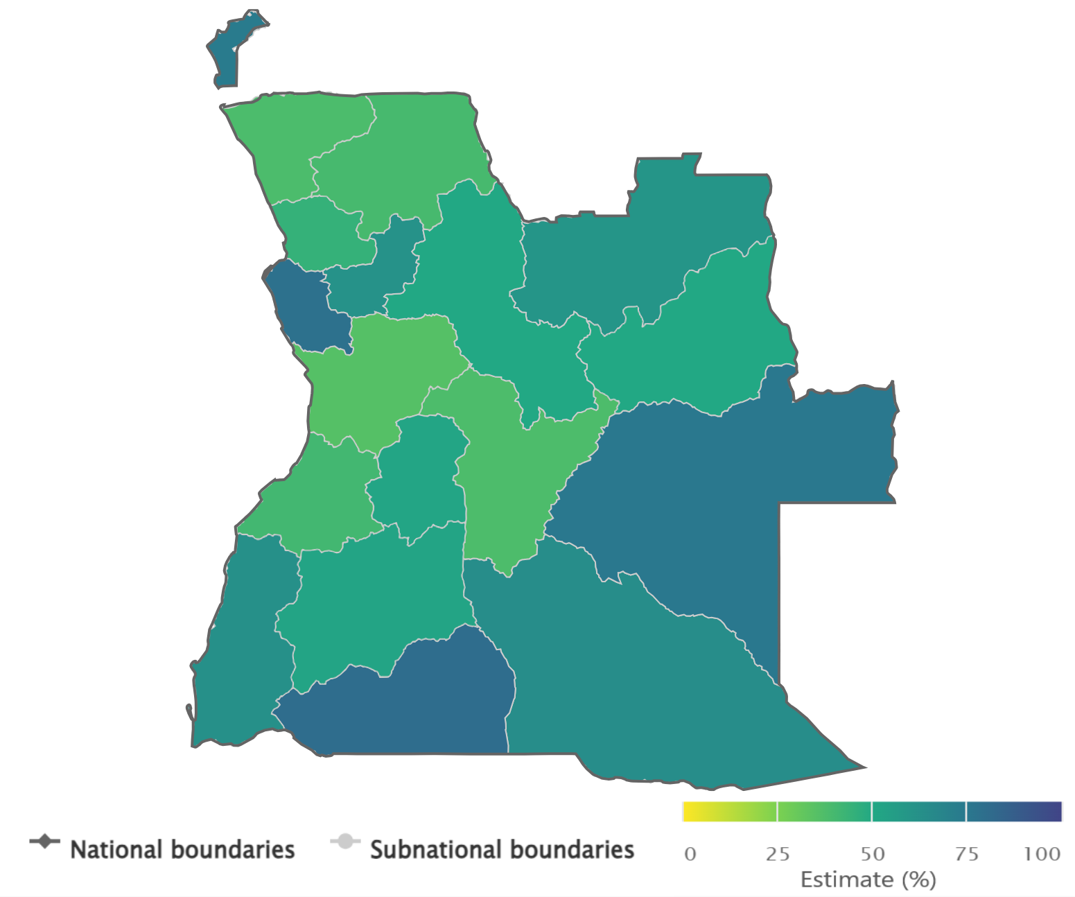
Source: derived from the WHO Health Inequality Data Repository HIV/AIDS dataset (1), with data sourced from the 2015 Demographic and Health Surveys.
To show data disaggregated by nongeographical dimensions, multiple maps may be used and compared. For example, disaggregated health data pertaining to the least educated subgroup may be shown on one map, and disaggregated health data pertaining to the most educated subgroup may be shown on another map. This use of multiple maps, however, requires substantial effort by users to compare between the images and interpret the findings. The technique should be used sparingly, and only when the intended interpretation is compelling.
For example, Figure 23.15 uses multiple maps to show data about household air pollution exposure, using the indicator “proportion of population with primary reliance on clean fuels and technologies for cooking”, disaggregated by urban and rural place of residence. The two maps portray data from urban and rural areas. A darker colour indicates higher coverage of clean fuels and technologies for cooking, and a lighter colour indicates lower coverage. Looking at the two maps, several countries reported lower coverage in rural compared with urban areas.
FIGURE 23.15. Snapshot of two maps presenting disaggregated data: household air pollution exposure (population with primary reliance on clean fuels and technologies for cooking) by place of residence
.png)
.png)
Source: derived from the WHO Health Inequality Data Repository Environmental Health dataset (1), with data from 2021 sourced from the WHO Global Health Observatory.
Maps may also be used to present the results of summary measures of health inequality across multiple settings, defining thresholds to colour-code different levels of inequality. For example, a summary measure of place of residence-related inequality could be calculated using data about urban and rural subgroups. The summary measure could then be portrayed on a map using colour-coded thresholds to show different levels of inequality.
Figure 23.16 shows place of residence-related inequality, calculated as difference between urban and rural areas, for the indicator “proportion of primary reliance on clean fuels and technologies for cooking” in 190 countries. Countries on the map are coloured according to defined thresholds of <5 percentage points, 5–19 percentage points, 20–40 percentage points and >40 percentage points.
FIGURE 23.16. Snapshot of map showing summary measure of health inequality: urban–rural difference in household air pollution exposure (population with primary reliance on clean fuels and technologies for cooking)
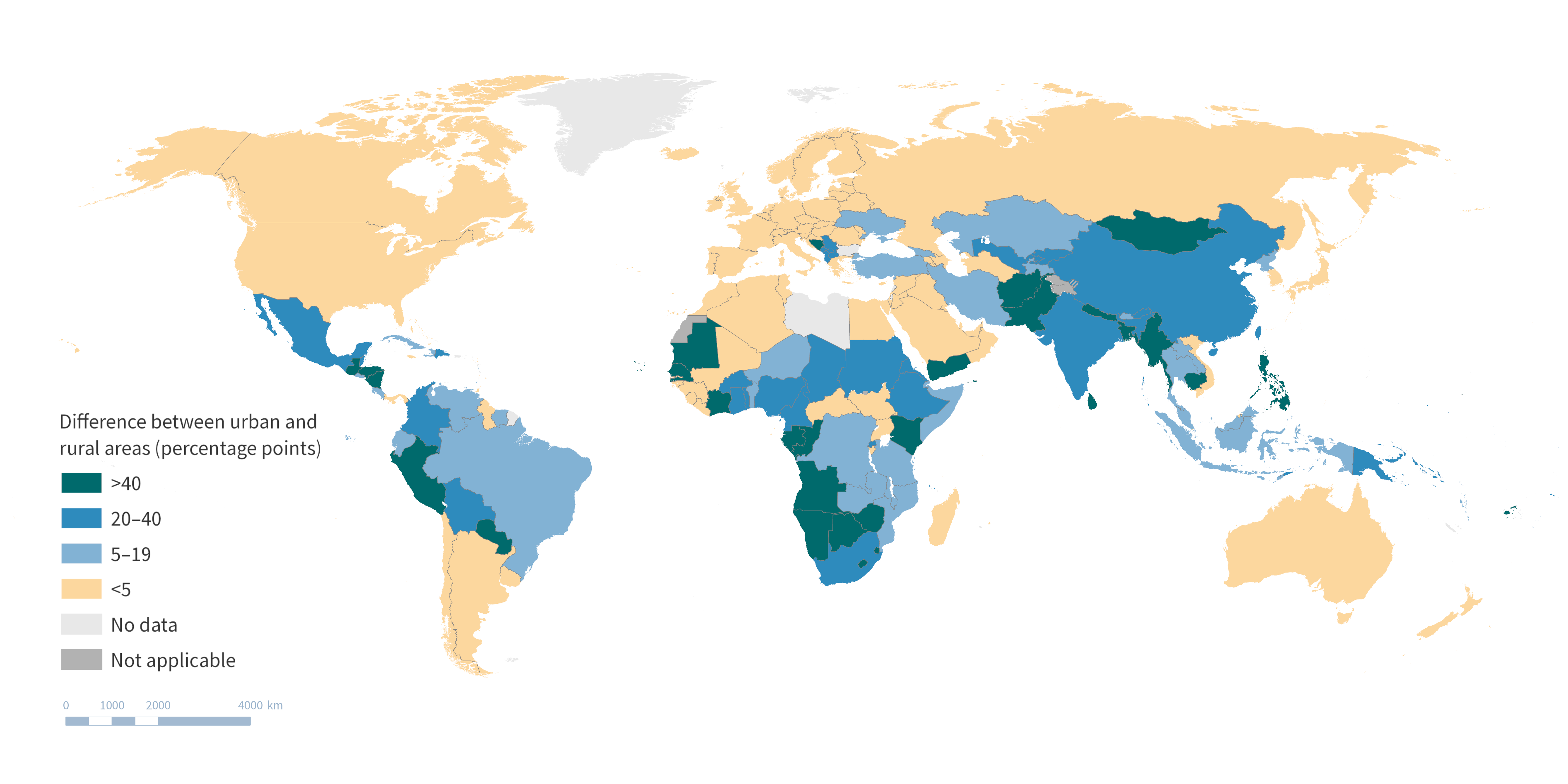
Source: derived from the WHO Health Inequality Data Repository Environmental Health dataset (1), with data from 2021 sourced from the WHO Global Health Observatory.
See Chapters 16 and 25 for examples of how maps may be used to present data used for geospatial analysis.
Interactive data visualizations
Interactive data visuals can present large amounts of data in an approachable and modifiable format, integrating text, tables, graphs and maps. Other interactive elements, such as tooltip boxes that appear when hovering over the data, may be used to provide additional information about the data. Often, interactive data visuals can be tailored by the user through the selection of health indicators, inequality dimensions and settings of interest, allowing for extensive data exploration. Interactive data visuals are particularly useful to help experienced users navigate large datasets because they make it possible to drill through levels of data to create a narrow view that fits the specific interests of the user.
Interactive data visuals may consist of a single view or multiple dashboards. In some cases, a series of connected interactive data visuals may be used to construct a storyline based on the data. This can be an impactful way for users to navigate across multiple dashboards. When designing interactive visuals, it is important to ensure they are appropriately matched to the skills and experience of the intended users. The use of multiple filters, visualization types and interactive components may add confusion for users that are not accustomed to in-depth data exploration. Various software programmes are available that can help to create and maintain interactive visuals, including open-source options. Certain programmes are tailored towards presenting geographical information using interactive maps. A hosting platform is required to make interactive visuals available online. The use of interactive data visuals requires audiences to have digital literacy and access. Depending on the audience and their circumstances, it may be preferable for interactive visuals to be downloadable or available offline.
Interactive data visuals related to HIV, tuberculosis and malaria are available for exploration on the State of inequality: HIV, tuberculosis and malaria report landing page on the Health Inequality Monitor (11). Elsewhere, interactive country profiles show inequality in reproductive, maternal, newborn and child health indicators (12).
Reporting checklists and tools
As part of its series of inequality monitoring step-by-step manuals, WHO has developed a collection of best practices for reporting inequality monitoring (13–15). The checklist below promotes high standards of inequality reporting and is a way to ensure the necessary technical and nontechnical information is considered when preparing reporting outputs. This checklist is widely applicable to reporting targeted to different audiences and to diverse reporting outputs:
Tailor the type of information and its presentation to the purpose of reporting and the needs, interests and abilities of the audience.
Review the results and reporting approaches with diverse stakeholder groups, including affected populations.
Provide background information to situate why inequality monitoring was done and what it aims to accomplish.
Include descriptions of the indicators, inequality dimensions, data sources, analysis methods and interpretation, highlighting any pertinent limitations.
Adopt a wide scope, where possible and appropriate, to present the state of inequality comprehensively, including the latest status, time trends and benchmarking.
Report findings using the most straightforward and simple measures of inequality possible, while ensuring the conclusions are accurate and supported by the underlying data.
Include key information about the results:
Report disaggregated data.
Report both absolute and relative summary measures of health inequality.
Indicate the overall value of the health indicator in the whole population.
Indicate the population share of subgroups.
Flag results based on small sample sizes, if applicable.
Assess whether to report measures of uncertainty and statistical significance.
The tools used to present key messages should complement each other and avoid simply repeating the same content in different formats.
Other reporting checklists with specific applications have been developed to define and standardize reporting practices. The widespread recognition and adoption of these practices promotes scientific rigour and reproducibility. It also helps to ensure relevant information is available in a manner that is consistent, transparent and comprehensive. The Guidelines for Accurate and Transparent Health Estimates Reporting (GATHER) (16), for example, are relevant to reporting quantitative estimates of health indicators (Box 23.12). The Preferred Reporting Items for Complex Sample Survey Analysis (PRICSSA) (18) are applicable to analyses using complex sample survey data (Box 23.13). The Sex and Gender Equity in Research (SAGER) guidelines encourage the complete and routine reporting of disaggregated data about sex and gender as part of research design, data analysis, results and interpretation (19).
BOX 23.12. GATHER checklist
GATHER is applicable when reporting quantitative estimates of health indicators at a population level (including global, regional, national and subnational estimates). GATHER pertains to indicators of health status, such as estimates of total and cause-specific mortality and incidence and prevalence of diseases and injuries; and indicators of some proximal health determinants, such as health behaviours and health exposures. The guidance is relevant to studies that calculate estimates from various information sources (and not indicators derived from a single study or source) (16).
The GATHER checklist consists of 18 items that should be included when reporting global health estimates. These include descriptions of the objectives and funding for the work, input data, data analysis methods, published estimates and uncertainty measures, interpretation and discussion of limitations (17).
BOX 23.13. PRICSSA checklist
PRICSSA was developed for survey data analysts and researchers, for use when publishing results derived from complex sample survey data (18). Recognizing that analytical and reporting errors are frequently made when reporting complex sample survey data, this itemized checklist aims to promote better quality analyses and reporting. PRICSSA consists of a checklist with items related to data collection dates, modes, response rate and sample selection process, and analytical information such as sample sizes for estimates, missing data rates and imputation methods. The guidance recommends that software code be made available to the public.
References
1. State of inequality: reproductive, maternal, newborn and child health. Geneva: World Health Organization; 2015 (https://iris.who.int/handle/10665/164590, accessed 12 June 2024).
2. State of health inequality: Indonesia. Geneva: World Health Organization; 2017 (https://iris.who.int/handle/10665/259685, accessed 12 June 2024).
3. State of inequality: childhood immunization. Geneva: World Health Organization; 2016 (https://iris.who.int/handle/10665/252541, accessed 12 June 2024).
4. State of inequality: HIV, tuberculosis and malaria. Geneva: World Health Organization; 2021 (https://iris.who.int/handle/10665/350198, accessed 5 June 2024).
5. Health Inequality Data Repository. Geneva: World Health Organization (https://www.who.int/data/inequality-monitor/data, accessed 29 May 2024).
6. Gender and health. Geneva: World Health Organization (https://www.who.int/health-topics/gender, accessed 28 May 2024).
7. Health Equity Assessment Toolkit. Geneva: World Health Organization (https://www.who.int/data/inequality-monitor/assessment_toolkit, accessed 29 May 2024).
8. Asada Y, Abel H, Skedgel C, Warner G. On effective graphic communication of health inequality: considerations for health policy researchers. Milbank Q. 2017;95(4):801–835. doi:10.1111/1468-0009.12300.
9. Equiplot creator tool. Pelotas, Brazil: International Centre for Equity in Health (https://equidade.org/equiplot_creator, accessed 29 May 2024).
10. Stata equiplot command. Pelotas, Brazil: International Centre for Equity in Health (https://equidade.org/equiplot, accessed 29 May 2024).
11. State of inequality: HIV, tuberculosis and malaria. Geneva: World Health Organization (https://www.who.int/data/inequality-monitor/publications/report_2021_hiv_tb_malaria, accessed 29 May 2024).
12. Equity dashboard. Pelotas, Brazil: International Centre for Equity in Health (https://equidade.org/dashboard, accessed 29 May 2024).
13. National health inequality monitoring: a step-by-step manual. Geneva: World Health Organization; 2017 (https://iris.who.int/handle/10665/255652, accessed 12 June 2024).
14. Inequality monitoring in immunization: a step-by-step manual. Geneva: World Health Organization; 2019 (https://iris.who.int/handle/10665/329535, accessed 12 June 2024).
15. Inequality monitoring in sexual, reproductive, maternal, newborn, child and adolescent health: a step-by-step manual. Geneva: World Health Organization; 2022 (https://iris.who.int/handle/10665/351192, accessed 12 June 2024).
16. Guidelines for accurate and transparent health estimates reporting. Geneva: World Health Organization (https://www.who.int/data/gather/statement, accessed 29 May 2024).
17. GATHER checklist. Geneva: World Health Organization; 2023 (https://www.who.int/publications/m/item/gather-checklist, accessed 29 May 2024).
18. Seidenberg AB, Moser RP, West BT. Preferred reporting items for complex sample survey analysis (PRICSSA). J Surv Stat Method. 2023;11(4):743–757. doi:10.1093/jssam/smac040.
19. Heidari S, Babor TF, De Castro P, Tort S, Curno M. Sex and gender equity in research: rationale for the SAGER guidelines and recommended use. Res Integr Peer Rev. 2016;1(1):2. doi:10.1186/s41073-016-0007-6.