Chapter 20. Pairwise summary measures of health inequality
Overview
Pairwise (or simple) summary measures of health inequality make comparisons between two population subgroups. There are two pairwise measures of inequality. Difference is an absolute measure of inequality that shows the gap between two subgroups. Ratio is a relative measure that shows proportional inequality (relative gap) between two subgroups. They are the most commonly used summary measures in inequality reporting.
A primary reason for using difference and ratio is to simplify patterns in disaggregated data in a manner that is easy to calculate and understand. A systematic approach to setting up the calculation of pairwise measures helps to ensure the results can be readily assessed and compared across settings, indicators and time. There are, however, a few initial considerations when setting up the calculations. Two subgroups must be selected for the calculation – this is straightforward for binary dimensions of inequality (e.g. rural and urban or female and male), but it is less straightforward for dimensions of inequality consisting of more than two subgroups (e.g. subnational regions or wealth quintiles). In this situation, how are the two subgroups selected? Attention must be paid to how advantaged and disadvantaged subgroups are positioned in the calculation, and navigating situations where subgroups cannot logically be assigned as advantaged or disadvantaged. Additionally, considerations arise when calculations are made for favourable or adverse health indicators.
This chapter provides in-depth descriptions of pairwise summary measures of health inequality (difference and ratio) calculations, with illustrative examples of their applications. The objectives are to use disaggregated data to calculate difference and ratio, to consider factors to promote a systematic approach to how they are calculated, and to understand the strengths and limitations of using these measures to assess health inequality.
Basic calculations
Difference and ratio are calculated from disaggregated data and can be used with ordered and non-ordered inequality dimensions. As they make pairwise comparisons, they can be used with binary dimensions of inequality (e.g. rural versus urban place of residence). They can be used with dimensions of inequality categorized as more than two subgroups, but they account for only two selected subgroups (e.g. richest and poorest wealth quintiles). Difference and ratio are typically unweighted, with both subgroups treated as equally sized. The key characteristics of difference and ratio, along with other summary measures of health inequality, are summarized in Annex 11.
Calculating difference
Difference shows the absolute gap between subgroups and is a measure of absolute inequality. To calculate difference, the health indicator estimate in one subgroup is subtracted from the indicator estimate in a second subgroup.
Difference = Subgroup A estimate − Subgroup B estimate
The difference value retains the same unit of measure as the health indicator. A difference of 0 indicates no inequality, meaning the two estimates are the same. A higher absolute value (i.e. negative or positive) indicates more inequality between the two subgroups. It is typically most intuitive to interpret a positive difference value, which is the result of calculating difference as the highest minus the lowest subgroup estimate.
Calculating ratio
Ratio is a measure of relative inequality. It is multiplicative, showing how much better or worse one subgroup is doing in relation to the other. To calculate ratio, the indicator estimate in one subgroup is divided by the estimate in a second subgroup, showing the proportional difference.
Ratio = Subgroup A estimate / Subgroup B estimate
Ratio values are unitless. A ratio of 1 is interpreted as no inequality. In most cases, ratio is calculated as the highest subgroup estimate divided by the lowest subgroup estimate. This convention ensures the resulting ratio value is greater than 1, which tends to be easier to interpret than a ratio value of less than 1 (Box 20.1). Because ratio is a multiplicative measure, graphical presentation of results should adopt a logarithmic rather than a linear scale. On a logarithmic scale, axis values larger than 1 hold the same magnitude as their reciprocal counterparts smaller than 1 (e.g. 2 is equivalent to 0.5) and a baseline of 1 indicates no inequality.
BOX 20.1. Deriving equivalent ratio values
Ratio values are calculated by dividing one subgroup estimate by another. Depending on how the calculation is set up, a situation of inequality will yield a value greater than 1 (if the higher estimate is divided by the lower estimate) or between 0 and 1 (if the lower estimate is divided by the higher estimate).
Generally, ratios greater than 1 are easier to interpret. Considering different estimates for hypothetical Subgroups A and B, Table 20.1 shows equivalent ratio values for the two possible calculations. In the first row, where the estimate in Subgroup A is 90% and the estimate in Subgroup B is 50%, a ratio value can be calculated as the highest estimate divided by the lowest estimate, resulting in a ratio of 1.8 (Ratio calculation 1). This calculation supports the finding that “coverage in Subgroup A is 1.8 times higher than in Subgroup B”. If, instead, ratio is calculated as the estimate in Subgroup B divided by the estimate in Subgroup A, the resulting ratio equals 0.56 (Ratio calculation 2). The finding that “coverage in Subgroup B is 0.56 times coverage in Subgroup A” tends to be less intuitive to understand.
TABLE 20.1. Examples of equivalent ratio values for two possible ratio calculations
| Subgroup A | Subgroup B |
Ratio calculation 1 [Subgroup A / Subgroup B] |
Ratio calculation 2 [Subgroup B / Subgroup A] |
|---|---|---|---|
| 90 | 50 | 1.8 | 0.56 |
| 100 | 50 | 2.0 | 0.50 |
| 50 | 50 | 1.0 | 1.0 |
Beyond simple ratio, relative difference is another way to describe pairwise relative inequalities (Box 20.2).
BOX 20.2. Relative difference
Relative difference expresses the difference between two subgroups as a percentage of the overall average or of the best-performing subgroup estimate. For example, the relative difference between two subgroups reporting 15% and 10% may be expressed as:
\[\frac{\text{Subgroup A estimate} - \text{Subgroup B estimate}}{\text{Overall average}} = \frac{15\% - 10\%}{12.5\%} = 0.4 \text{ (or 40\%)}\]
or
\[\frac{\text{Subgroup A estimate} - \text{Subgroup B estimate}}{\text{Best-performing subgroup estimate}} = \frac{15\% - 10\%}{15\%} = 0.33 \text{ (or 33\%)}\]
The interpretation of the first calculation is that the difference is 40% of the overall average. The interpretation of the second calculation is that the difference is 33% of the best-performing subgroup estimate.
For more on mathematical considerations for interpreting summary measures of inequality, see Chapter 22.
Selection of two subgroups
When using pairwise measures of inequality with dimensions comprised of more than two subgroups, different approaches may be taken to decide which two subgroups should be included, depending on the research question. Approaches include calculations based on the highest and lowest subgroup estimates (range difference and ratio), extreme subgroups (in the case of ordered dimensions of inequality), and subgroups with special significance (in the case of non-ordered dimensions of inequality).
Range difference and ratio
In general, the most basic approach to calculating difference and ratio uses the subgroups with the lowest and highest indicator estimates, such that difference (highest − lowest) and ratio (highest / lowest) produce values that are positive and above 1, respectively. This approach, which yields the range difference and range ratio, can be applied regardless of the number of subgroups and regardless of whether they are ordered or non-ordered. Drawing on an example from Indonesia, a comparison may be made between the subnational region with the highest coverage of skilled birth attendants versus the region with the lowest coverage, expressing the maximum extent of inequality between two regions (Figure 20.1 and Table 20.2). This captures the range difference and range ratio across the 34 subnational regions.
FIGURE 20.1. Births attended by skilled health personnel, by subnational region, Indonesia: subnational regions with highest and lowest indicator estimates

Source: derived from the WHO Health Inequality Data Repository Reproductive, Maternal, Newborn and Child Health dataset (1), with data sourced from the 2017 Demographic and Health Surveys. Data are based on three years prior to the survey.
TABLE 20.2. Calculation of range difference and range ratio: births attended by skilled health personnel, by subnational region, Indonesia
|
Highest estimate (%) [A] |
Lowest estimate (%) [B] |
Range difference [A − B] |
Range ratio [A / B] |
|---|---|---|---|
| 100.0 | 64.2 |
100.0 − 64.2 = 35.8 percentage points |
100.0 / 64.2 = 1.56 |
The highest estimate was for Bali, and the lowest estimate was for Papua.
Source: derived from the WHO Health Inequality Data Repository Reproductive, Maternal, Newborn and Child Health dataset (1), with data sourced from the 2017 Demographic and Health Surveys. Data are based on three years prior to the survey.
There are several merits to the calculation of range difference and range ratio. The approach is easy to apply, and the calculations always provide results that are straightforward to interpret. It is an appropriate approach for research questions pertaining to the overall absolute or relative inequality between all subgroups. It is also fitting for preliminary comparisons across situations when it is not possible to identify two consistent subgroups (e.g. because the dimension is non-ordered or because subgroups are categorized differently between settings or over time).
There are, however, limitations for the use of range difference and ratio. The approach can make comparisons challenging, and it will not reflect the underlying directionality of inequality across situations. For example, when comparing inequalities between females and males, in one situation an indicator may be higher among males and in the other it may be higher among females – but using the range difference and range ratio would not differentiate this. Moreover, in cases of comparing inequality across dimensions with more than two subgroups (or over time in the same population), these measures may not always be based on the same two subgroups. Additionally, when there are multiple subgroups based on ordered dimensions of inequality, this approach does not necessarily include the subgroups that are at the top and bottom of the ordering. For example, in a scenario where health coverage is highest in the second-richest wealth quintile (quintile 4) and lowest in the second-poorest quintile (quintile 2), the calculation would not include the richest or poorest quintiles.
Ordered dimensions of inequality
For dimensions that have a natural ordering and have more than two subgroups, another approach is to compare between the subgroups at the extreme ends of a continuum. For example, wealth-related inequality would be calculated using the poorest and richest subgroups. In a case where education level is categorized as three subgroups, inequality would be calculated between the most and least educated (Table 20.3). This approach places importance on the social ordering, highlighting the situations in the most advantaged and most disadvantaged subgroups. When making comparisons, this approach ensures the same subgroups are used consistently, even if the estimates from the intermediate subgroups are higher or lower.
TABLE 20.3. Calculation of difference and ratio: births attended by skilled health personnel, by education level, Indonesia
|
Most educated subgroup estimate (%) [A] |
Least educated subgroup estimate (%) [B] |
Difference [A − B] |
Ratio [A / B] |
|---|---|---|---|
| 95.6 | 43.0 |
95.6 − 43.0 = 52.6 percentage points |
95.6 / 43.0 = 2.22 |
Education is categorized as three subgroups: no education, primary education and secondary or higher education.
Source: derived from the WHO Health Inequality Data Repository Reproductive, Maternal, Newborn and Child Health dataset (1), with data sourced from the 2017 Demographic and Health Surveys. Data are based on three years prior to the survey.
Non-ordered dimensions of inequality
For non-ordered dimensions of inequality, the calculation of range difference and range ratio is a common approach to selecting subgroups (see above). Alternatively, comparisons can be made between two subgroups that are of special interest. For example, pairwise comparisons could be made to show inequality between a subnational region of interest with the capital city. In Figure 20.2, the Indonesian capital city of Jakarta is highlighted as a possible reference point for a pairwise comparison. Difference and ratio could be calculated to show the inequality between Jakarta and a region of interest, such as Papua, the region with the lowest coverage (Table 20.4). For comparisons based on ethnicity, as another example, subgroups may be selected to calculate inequalities between the dominant ethnic group and minority groups of interest.
FIGURE 20.2. Births attended by skilled health personnel, by subnational region, Indonesia: subnational regions of special interest
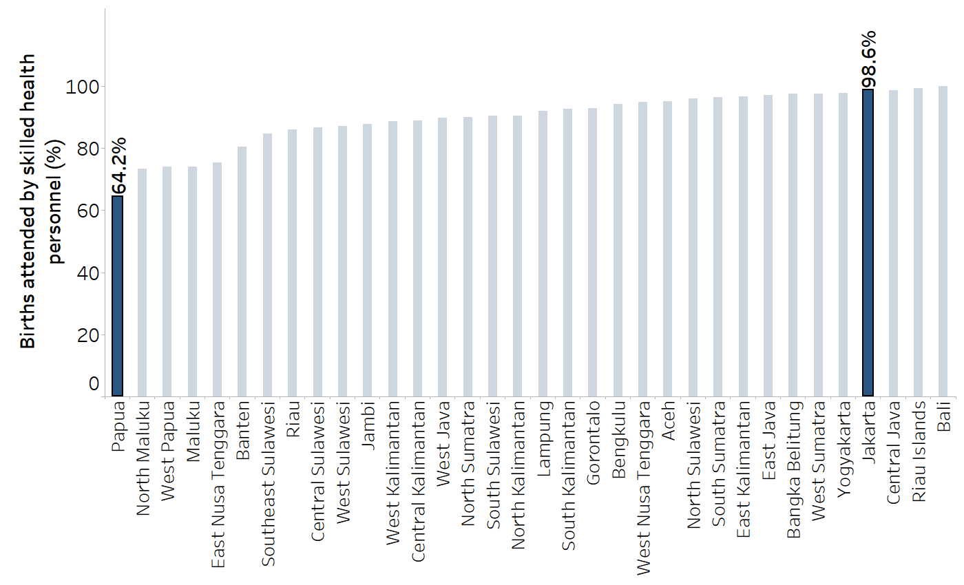
The capital city is Jakarta.
Source: derived from the WHO Health Inequality Data Repository Reproductive, Maternal, Newborn and Child Health dataset (1), with data sourced from the 2017 Demographic and Health Surveys. Data are based on three years prior to the survey.
TABLE 20.4. Calculation of difference and ratio: births attended by skilled health personnel, by subnational region, Indonesia
|
Capital city (Jakarta) estimate (%) [A] |
Region of interest (Papua) estimate (%) [B] |
Difference [A − B] |
Ratio [A / B] |
|---|---|---|---|
| 98.6 | 64.2 |
98.6 − 64.2 = 34.4 percentage points |
98.6 / 64.2 = 1.54 |
Source: derived from the WHO Health Inequality Data Repository Reproductive, Maternal, Newborn and Child Health dataset (1), with data sourced from the 2017 Demographic and Health Surveys. Data are based on three years prior to the survey.
Additional considerations
When using difference and ratio measures to make comparisons, a consistent configuration of the underlying calculations helps to identify outliers that have a different directionality of inequality. Accordingly, once the two subgroups are selected, there are two further considerations: the advantaged or disadvantaged nature of the subgroups, and the favourable or adverse nature of the health indicator.
Why is it important to make these distinctions? As summary measures, difference and ratio each express inequality using a single number, and thus the directionality of inequality needs to be stated explicitly. The finding that one subgroup has a higher indicator estimate than another subgroup tells us nothing about whether the situation is better or worse in a particular subgroup. An understanding of whether subgroups are traditionally advantaged or disadvantaged and whether an indicator is favourable or adverse makes it possible to set up calculations that promote easier interpretation of results (i.e. most often yielding positive values for difference and ratio values greater than 1).
Advantaged versus disadvantaged subgroups
Where possible, subgroups should be identified on the basis of which are socially advantaged and which are socially disadvantaged (noting that this distinction is not always possible and may be context-specific). The determination of “advantaged” or “disadvantaged” can often be deduced from historic patterns of inequity that reflect how power and resources are distributed. For example, richer people tend to fare better than poorer people, more educated people tend to fare better than less educated people, and people in urban settings tend to fare better than people in rural settings. In other cases, the situation may be more variable and require consideration of the health topic or indicator.
In cases where it is not possible to logically assign subgroups as advantaged or disadvantaged, it is recommended to construct the calculations in a consistent manner. Figure 20.3 shows the sex-related inequality in overweight prevalence among adults in 30 countries and areasin the WHO Western Pacific Region. For all countries and areas, difference is calculated as the prevalence in females minus the prevalence in males, and ratio is calculated as the prevalence in females divided by the prevalence in males. From these figures, it is apparent that most countries and areashad higher overweight prevalence among females compared with males (positive difference values and ratio values above 1, highlighted in blue), although nine countries and areashad higher overweight prevalence among males (negative difference values and ratio values between 0 and 1, highlighted in grey).
FIGURE 20.3. Difference and ratio: overweight prevalence among adults (body mass index (BMI) ≥25, age-standardized), by sex, 30 countries and areasin the WHO Western Pacific Region
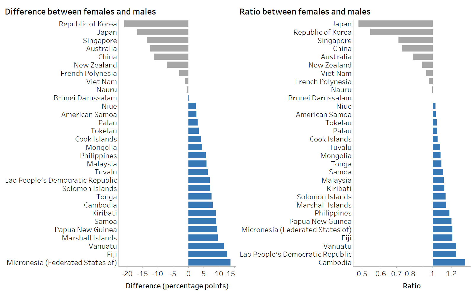
Grey shading indicates higher prevalence among males. Blue shading indicates higher prevalence among females.
Source: derived from the WHO Health Inequality Data Repository Noncommunicable Diseases and Risk Factors dataset (1), with data from 2022 sourced from the WHO Global Health Observatory.
Favourable versus adverse health indicators
Attention to the distinction between favourable versus adverse health indicators (sometimes termed the polarity of a health indicator) helps to ensure difference and ratio are calculated in a systematic manner that is intuitive to interpret. A favourable health indicator affirmatively measures a desired condition that is promoted through public health action, where the aim is to achieve a maximum level. An adverse (or unfavourable) indicator affirmatively measures an undesired condition that is detrimental to health. Public health actions aim to reduce or eliminate it. Although many health indicators can be broadly classified as favourable or adverse, certain indicators do not have an overriding positive or negative association with health and thus present a more nuanced situation. The interpretation of inequalities in such indicators is less straightforward and usually requires a benchmark or reference point. Box 20.3 illustrates examples of favourable, adverse and nuanced health indicators.
BOX 20.3. Examples of favourable, adverse and nuanced health indicators
Favourable health indicators have a positive relationship with health (i.e. higher values are generally regarded as better). For example, they may measure the use of essential services, healthy behaviours and attitudes, family and community connectedness, and positive health outcomes. Examples of favourable health indicators include births attended by skilled health personnel, HIV testing and receiving results, and life expectancy.
Adverse health indicators have an inverse relationship with health (i.e. lower values are generally regarded as better). These indicators include burden of disease, non-use of essential services, lack of knowledge, and unhealthy behaviours or attitudes. Examples of adverse indicators include mortality in children aged under five years, children with no doses of diphtheria, tetanus toxoid and pertussis (DTP) vaccine, and prevalence of tobacco use.
Nuanced health indicators do not have an overriding positive or negative association with health. The desired situation for those indicators is neither the maximum nor the minimum, but somewhere in between, depending on the context and population. Examples of nuanced indicators include fertility rate, births by caesarean section, and hospitalization rates.
The distinction between favourable, adverse and nuanced health indicators is relevant to the calculation and interpretation of difference and ratio. Generally, for a given dimension of inequality, the calculation for favourable indicators is the opposite of the calculation for adverse indicators. Annex 12 details how difference and ratio calculations are constructed for favourable and adverse health indicators using different inequality dimensions and provides examples.
In some cases, disaggregated data may be expressed as either a favourable indicator (e.g. coverage) or an adverse indicator (e.g. non-coverage). For absolute measures of inequality such as difference, the extent of inequality will remain consistent, regardless of whether the indicator is expressed as favourable or adverse, and thus the distinction is immaterial. For relative measures of inequality such as ratio, however, favourable and adverse indicators will yield different results (which are not simply a change of sign or inversion) (Box 20.4). Consequently, when calculating relative inequality, the distinction between favourable and adverse indicators matters, even for fundamentally the same health outcome (2-4). For the sake of transparency, both adverse and favourable versions of indicators should be reported, if possible and when appropriate (3). To facilitate comparisons of relative inequality across multiple health indicators, all indicators should be expressed consistently as either adverse or favourable indicators.
BOX 20.4. Example of pairwise summary measure calculations based on equivalent favourable and adverse health indicators
To contrast pairwise measures based on the use of favourable and adverse indicators, an example was constructed using complementary indicators of immunization coverage and non-coverage among children aged one year in urban and rural areas. The indicator of immunization coverage is the receipt of (at least) one dose of DTP (DTP1), and the indicator of immunization non-coverage is the receipt of no doses of DTP (zero-dose DTP).
Figure 20.4 displays hypothetical indicator data, using the equivalent situations of coverage (a favourable indicator) and non-coverage (an adverse indicator).
FIGURE 20.4. Immunization coverage with combined diphtheria, tetanus toxoid and pertussis vaccine (DTP1) and non-coverage (zero-dose DTP) in rural and urban areas
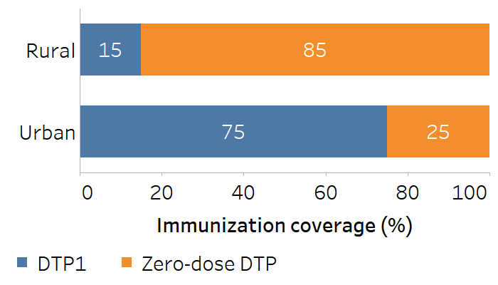
The absolute difference remains constant (±60 percentage points) for both favourable and adverse indicators, regardless of how the calculation is constructed (Table 20.5).
TABLE 20.5. Calculation of difference: immunization coverage with combined diphtheria, tetanus toxoid and pertussis vaccine (DTP1) and non-coverage (zero-dose DTP) in urban and rural areas
| Indicator | Calculation | Difference |
|---|---|---|
| DTP1 | Urban – rural (75 − 15) | 60 percentage points |
| Rural – urban (15 − 75) | −60 percentage points | |
| Zero-dose DTP | Rural – urban (85 − 25) | 60 percentage points |
| Urban – rural (25 − 85) | −60 percentage points |
The ratio values, however, are different based on the use of a favourable or adverse indicator (Table 20.6). Although these values are mathematically correlated, they may not be apparently distinct when communicating about inequalities.
TABLE 20.6. Calculation of ratio: immunization coverage with combined diphtheria, tetanus toxoid and pertussis vaccine (DTP1) and non-coverage (zero-dose DTP) in urban and rural areas
| Indicator | Calculation | Ratio |
|---|---|---|
| DTP1 | Urban / rural (75 / 15) | 5.0 |
| Rural / urban (15 / 75) | 0.20 | |
| Zero-dose DTP | Rural / urban (85 / 25) | 3.4 |
| Urban / rural (25 / 85) | 0.29 |
Strengths and limitations of pairwise summary measures
Difference and ratio tend to be straightforward to calculate, especially for binary dimensions of inequality. Although attention to the advantaged versus disadvantaged nature of the subgroups and favourable versus adverse nature of the health indicator is warranted, the interpretation of these measures is intuitive. The results can be communicated effectively through text, tables or graphs to a range of audiences with variable technical expertise.
There are two major limitations to pairwise summary measures of inequality. First, for dimensions of inequality categorized as more than two subgroups, difference and ratio ignore all but the two selected subgroups. For example, pairwise measures calculated using the most and least educated subgroups do not capture the situation in middle subgroups (Box 20.5). Similarly, pairwise measures calculated using the richest and poorest wealth quintiles do not account for quintiles 2, 3 and 4. For this reason, inspection of the underlying disaggregated data, including the middle or non-extreme subgroups, is important to get a sense of the overall patterns of inequality across all subgroups (see Chapter 18).
BOX 20.5. Limitation of using difference to show education-related inequality across three subgroups
Figure 20.5 displays the difference in births attended by skilled health personnel, calculated as coverage in the most educated subgroup (secondary school or higher) minus coverage in the least educated subgroup (no education) for 2007 and 2017. Based on this calculation, we might conclude that inequality was almost unchanged, moving from 55.1 percentage points to 52.6 percentage points. The calculation, however, ignores the situation in the subgroup with primary education. The accompanying disaggregated data demonstrate marked improvements in coverage in this subgroup, where coverage increased from 59.6% in 2007 to 81.5% in 2017 (Figure 20.6).
FIGURE 20.5. Difference: births attended by skilled health personnel, by education level, Indonesia
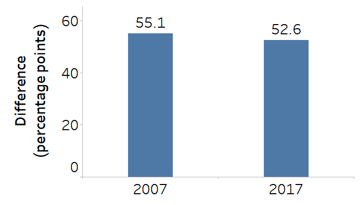
Education is categorized as three subgroups, and the difference is calculated as coverage in the most educated subgroup minus coverage in the least educated subgroup.
Source: derived from the WHO Health Inequality Data Repository Reproductive, Maternal, Newborn and Child Health dataset (1), with data sourced from the 2007 and 2017 Demographic and Health Surveys. Data are based on three years prior to the survey.
FIGURE 20.6. Births attended by skilled health personnel, by education level, Indonesia
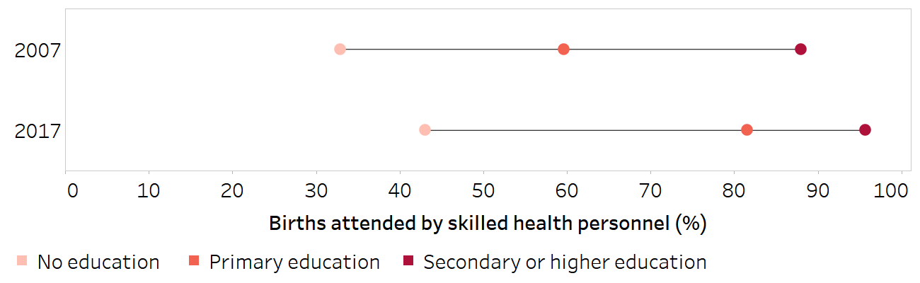
Horizontal lines show the range between the lowest and highest subgroup estimates.
Source: derived from the WHO Health Inequality Data Repository Reproductive, Maternal, Newborn and Child Health dataset (1), with data sourced from the 2007 and 2017 Demographic and Health Surveys. Data are based on three years prior to the survey.
A second major limitation to difference and ratio is that the population size of the subgroups is not taken into account – that is, the measures are unweighted. As such, difference and ratio treat the subgroups as equivalent when conveying information about the extent and direction of inequality between them. There may, however, be cases where the size of one subgroup is considerably larger than the other, or where population shift occurs over time, whereby the respective population share of the two subgroups changes. Population size can be captured through the use of a weighted complex summary measure of inequality (see Chapter 21). For more information about the interpretation of summary measures, including a discussion of the interpretation of weighted versus unweighted measures, see Chapter 22.
References
1. Health Inequality Data Repository. Geneva: World Health Organization (https://www.who.int/data/inequality-monitor/data, accessed 29 May 2024).
2. Erreygers G, Van Ourti T. Measuring socioeconomic inequality in health, health care and health financing by means of rank-dependent indices: a recipe for good practice. J Health Econ. 2011;30(4):685–694. doi:10.1016/j.jhealeco.2011.04.004.
3. Kjellsson G, Gerdtham UG, Petrie D. Lies, damned lies, and health inequality measurements. Epidemiology. 2015;26(5):673–680. doi:10.1097/EDE.0000000000000319.
4. Keppel K, Pamuk E, Lynch J, Carter-Pokras O, Kim I. Methodological issues in measuring health disparities. Vital Health Stat 2. 2005;(141):1–16.(https://pmc.ncbi.nlm.nih.gov/articles/PMC3681823/pdf/nihms312672.pdf, accessed 5 December 2024).