Chapter 22. Interpreting summary measures of health inequality
Overview
Summary measures of health inequality provide a concise way to express inequality in a single number. A comprehensive understanding of inequalities, however, often entails assessing the results derived from multiple summary measures. Furthermore, different classes of complex summary measures (pairwise measures, regression-based measures, ordered disproportionality measures, mean difference and variance measures, non-ordered disproportionality measures and impact measures) convey different types of information.
Interpreting summary measures of health inequality requires familiarity with the nuances in the underlying disaggregated data (see Chapter 18) and a basic understanding of how summary measures are calculated (see Chapters 19–21). As with any measurement, the results obtained from summary measures of health inequality are only as good as the quality and validity of the underlying data. When assessing the results of summary measures, one should consider the overall situation in the affected population (national or overall average) and the patterns evident from the underlying disaggregated data. This information, together with an awareness of any key factors in the surrounding context, promotes a more holistic understanding of the findings and their importance.
Drawing on empirical and hypothetical examples, this chapter covers some of the assumptions and considerations inherent in understanding results derived from summary measures of inequality, especially when results are compared across populations and datasets. After covering general limitations and mathematical considerations, the chapter discusses basic value judgements associated with various summary measure characteristics. This insight is a prerequisite for making decisions about reporting (see Chapter 23) and reaching conclusions and recommendations for further action (see Chapter 24).
General limitations
There are a few general limitations when interpreting the results of the summary measures of health inequality described in Chapters 20 and 21. All of these measures are descriptive – that is, they quantify the magnitude of associations between health indicators and dimensions of inequality. They are not estimates of causal effects. Summary measures cannot, per se, confirm that belonging to a subgroup with a disadvantaged socioeconomic position causes poorer health or, conversely, that poorer health is a cause of socioeconomic disadvantage. Although the associations derived from summary measures may point towards possible causal relationships between variables, other forms of evidence are required to support such assertions (see Chapter 24).
Relatedly, when assessing measures of health inequality over time, the measures covered in Chapters 20 and 21 do not imply that improving (or worsening) socioeconomic conditions are the cause of improved (or worse) health indicators. For example, moving out of poverty or achieving a higher level of education does not necessarily translate into improved health or narrowed health inequality. In particular, the use of unweighted summary measures to compare changes in inequality over time can yield confusing results because they do not capture population shifts (i.e. when the proportion of the population belonging to each subgroup changes over time). For example, if the healthiest individuals in rural areas move to urban areas, the mean level of health in rural areas may get worse, although there may be no changes in health (or even slight improvements) among individuals who remained in rural areas. Similarly, a programme oriented to improve educational attainment among individuals with poor health might result in a worse mean level of health among individuals in the more educated subgroup.
Other notable limitations have been raised in previous chapters. Briefly, the summary measures of inequality described in this book do not permit comparisons between dimensions of inequality categorized based on different numbers of subgroups due to resolution issues (see Chapter 18). For dimensions categorized as more than two subgroups, the use of pairwise measures ignores the situation in the other groups and does not account for population size (see Chapter 20). Impact measures are based on counterfactual scenarios and should be interpreted as hypothetical changes in population-level averages (see Chapter 21). Therefore, inspection of disaggregated data and calculation of multiple complex summary measures are recommended to gain a more comprehensive understanding of the state of inequality.
Mathematical considerations
Certain mathematical considerations arise in the calculation of summary measures of health inequality that should be considered in their interpretation. Insights into such issues serve as necessary background to understand the results because they relate to the value judgements inherent in selecting and reporting different measures (see below). The following sections address how summary measures are affected by the underlying disaggregated data values and the overall level of the indicator in the population (the national or overall average), and how absolute and relative measures can lead to conflicting conclusions about inequality trends. Pairwise measures of inequality (difference and ratio) are used to demonstrate these effects.
Disaggregated data values
The magnitude of absolute and relative measures of inequality is correlated with the mathematical values of the underlying disaggregated data. Generally, larger disaggregated data values will yield a lower ratio than smaller disaggregated data values. Conversely, difference will be larger when disaggregated values are larger, and smaller when values are smaller. As a simple illustration of this effect, consider the calculation of difference and ratio for different hypothetical Subgroup A and Subgroup B estimates (Table 22.1). A difference of 10 percentage points results in a lower ratio when the difference falls between larger values than smaller values (see Row 1 versus Row 2, respectively). A ratio of 1.1 corresponds to a larger difference when the disaggregated data values are larger than when the disaggregated data values are smaller (see Row 1 versus Row 3, respectively).
TABLE 22.1. Examples of difference and ratio calculations corresponding to larger and smaller disaggregated data values
| Subgroup A (%) | Subgroup B (%) | Difference (percentage points)a | Ratiob | |
|---|---|---|---|---|
| Larger disaggregated data values | ||||
| Row 1 | 100 | 90 | 10 | 1.1 |
| Smaller disaggregated data values | ||||
| Row 2 | 20 | 10 | 10 | 2.0 |
| Row 3 | 20 | 18 | 2 | 1.1 |
a Difference is calculated as Subgroup A – Subgroup B.
b Ratio is calculated as Subgroup A / Subgroup B.
Overall level of health
Subsequent to the above, the overall level of the health indicator in the population often (but not always) shows characteristic associations with the calculated magnitude of inequality. Although relative inequality measures tend to be larger at lower levels of health, absolute inequality measures tend to be low at both very low and very high overall levels (although this may not always be the case – see Box 22.1). For example, in an empirical exploration of absolute and relative summary measures applied to maternal and child health indicators, a tendency for relative inequalities in mortality rates among children aged under five years to be higher in countries with lower overall mortality rates was observed (with some exceptions of countries having low mortality rates and low relative inequality). It was noted that low levels of relative inequality alongside high mortality rates are “a necessity, not an accomplishment” because disaggregated estimates are necessarily high across all subgroups (1).
BOX 22.1. Mathematical ceilings for difference and ratio measures
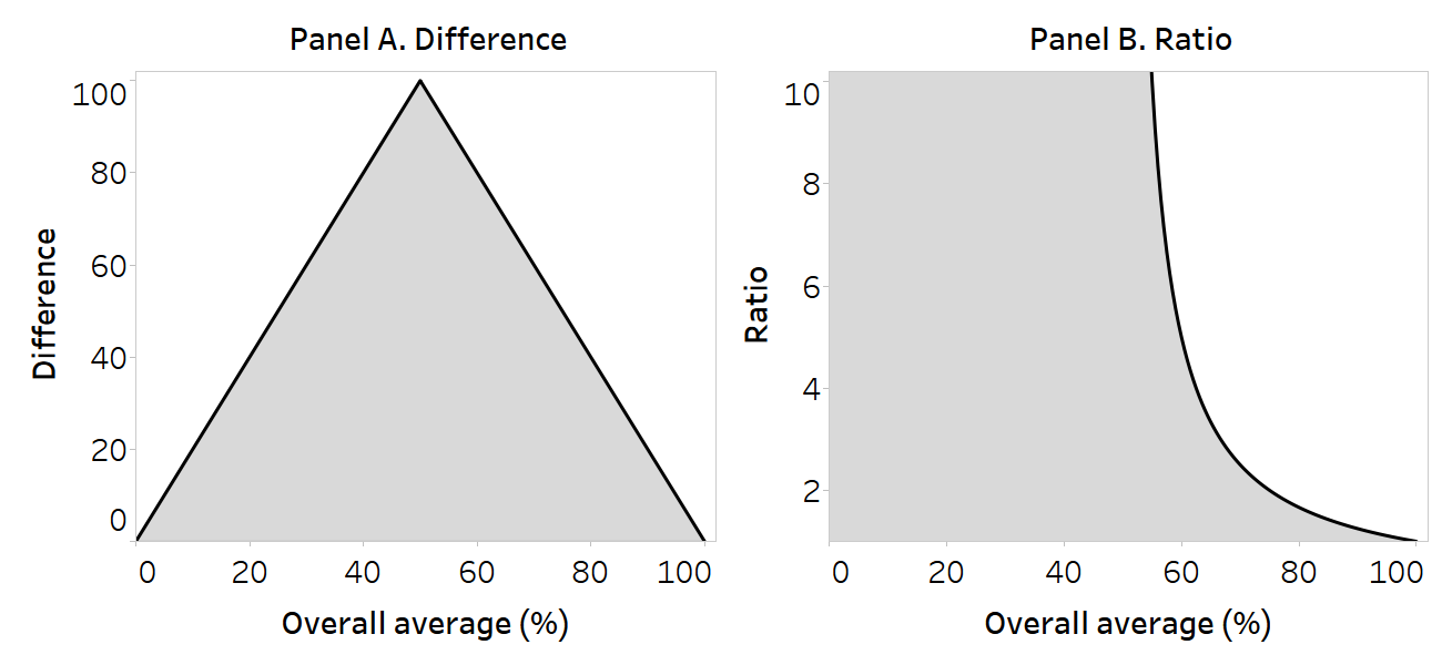
Figure 22.1 provides a simplified illustration of the maximum possible values of difference and ratio for a health indicator measured as a percentage (i.e. bounded between 0 and 100), such as use of health care. In this example, the overall average is predicated on a population comprised of two subgroups of equal size or weight (whereby the overall average is calculated as the sum of the two disaggregated data values, divided by two). The mathematical ceilings for the pairwise measures are plotted against the overall level of the indicator. The space below the inverted V shape in Panel A and to the left of the curve in Panel B contain all possible difference and ratio values, respectively, for the corresponding overall level of health.
In Panels A and B, the maximum possible values are realized when the overall average is 50%. The underlying disaggregated data values are provided in Table 22.2. For difference, the maximum possible value when the overall average is 50% is 100 percentage points. At an overall average of 0% or 100%, the only possible difference value is 0 percentage points. For ratio, the maximum possible value (infinite) may be derived at any overall average of 50% or below. As the overall level of health increases above 50%, the possible ratio values are restricted, reaching a minimum value of 1.0 when the overall average is 100%.
FIGURE 22.1. Mathematical ceilings for pairwise measures of inequality in relation to overall level of use of health care
Source: derived from Houweling et al. (1).
TABLE 22.2. Data corresponding to mathematical ceilings for pairwise measures of inequality
| Overall average (%) | Subgroup A (%) | Subgroup B (%) | Difference (percentage points)a | Ratiob |
|---|---|---|---|---|
| 0 | 0 | 0 | 0 | (Infinite) |
| 50 | 100 | 0 | 100 | (Infinite) |
| 100 | 100 | 100 | 0 | 1.0 |
a Difference is calculated as Subgroup A – Subgroup B.
b Ratio is calculated as Subgroup A / Subgroup B.
Using absolute and relative measures to assess trends
In some cases, the results derived from absolute versus relative measures of inequality can lead to conflicting conclusions about inequality trends. For example, inequality may appear to increase over time when measured using a relative measure and to decrease over time when using an absolute measure (or vice versa). The reason relates to the mathematical considerations described above, where the magnitude of absolute and relative inequality measures is associated with disaggregated data and the overall level of the indicator. This underscores that absolute and relative inequality measures are complementary, not inconsistent. When benchmarking several settings, the use of a scatterplot to display trends in absolute and relative inequality measures may provide a useful initial assessment of results (Box 22.2).
BOX 22.2. Use of scatterplots for benchmarking trends in absolute and relative inequality measures
If comparing across multiple settings, plotting the change in absolute versus relative inequality measures over time using a scatterplot can provide an initial visual representation of results. The use of a scatterplot creates four quadrants that correspond with the four possible scenarios: increased absolute and relative inequality; decreased absolute and relative inequality; increased absolute and decreased relative inequality; and decreased absolute and increased relative inequality. The use of scatterplots to assess trends in absolute and relative inequality measures has been applied, for example, to show inequality trends in maternal, newborn and child health topics (2, 3).
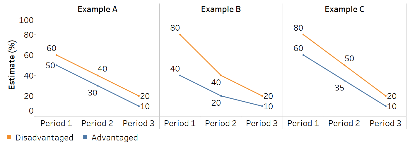
The interpretation of opposing absolute and relative inequality trends requires a close inspection of the underlying data, including national averages and disaggregated data, to assess the situation in more detail. Figure 22.2 provides examples of scenarios where conflicting trends may be observed over three time periods. In the case of pairwise measures of inequality, equal absolute decreases across both subgroup estimates yield an increased ratio but unchanged absolute inequality (Example A). Proportionally equal decreases across both subgroups will yield a decrease in absolute inequality and unchanged relative inequality (Example B). In the context of decreasing values for both subgroups, a trend of decreasing absolute inequality alongside increasing relative inequality may occur when the absolute rate of decrease is faster among the subgroup with an initially higher value (Example C). For more information about the typology of possible scenarios related to increasing, decreasing or unchanged absolute inequality, relative inequality and overall average, and their graphical presentation, see Annex 14.
FIGURE 22.2. Conflicting trends in absolute and relative inequality alongside increasing disaggregated data values
Value judgements
The measurement of health inequalities is laden with value judgements, from the initial selection of health topics, indicators and dimensions of inequality to the selection of summary measures and their subsequent calculation and reporting (4–6). This section introduces some of the value judgements inherent in the characteristics of summary measures of inequality. An understanding of these distinctions promotes a more rigorous evaluation of findings and is important for deciding which dimensions of inequality are more (or less) urgent to address. It also enables more transparent and nuanced reporting on the state of inequality because the conclusions derived from particular summary measures can be explained on normative grounds.
Absolute and relative measures of inequality
Absolute and relative measures of health inequality provide distinct information about a situation of inequality, reflecting different ways of perceiving and prioritizing the nature of inequality (5, 7). The consideration of absolute versus relative inequality raises questions surrounding the normative importance of seeking to address the absolute gap in the health indicator per se or relative to the overall population health.
Showing the magnitude of the gap between subgroups, absolute inequality focuses on the actual “performance” of the subgroups and the differences between them. An emphasis on monitoring and reducing absolute inequality prioritizes faster absolute improvements among disadvantaged subgroups. The scenario of decreasing absolute inequality alongside improved overall average (regardless of whether relative inequality decreases, remains the same or increases) is usually considered desirable because it signals improvements across disadvantaged population subgroups.
Relative measures are based on proportional comparisons, emphasizing the situation of inequality in relation to other subgroups or reference points. Strictly speaking, relative measures – and the drive to reduce relative inequality – implicitly reflect an egalitarian position, pointing to the normative significance of equality (and less on the overall performance). Because the mathematical ceiling for relative measures declines as the overall level of health increases (see above), decreasing relative measures of health inequality may imply a faster relative (but not necessarily absolute) rate of health improvement among disadvantaged groups than advantaged groups.
It is generally recommended that both absolute and relative measures are consulted and reported to provide a more comprehensive and balanced understanding of inequality than either type of measure in isolation. There are situations, however, where targets or indicators – and their reporting mechanisms – may reflect absolute or relative inequality, and different contexts and policy objectives may call for different types of measures. Box 22.3 highlights an example of the use of absolute versus relative summary measures to understand economic-related inequality in adolescent fertility in Rwanda.
BOX 22.3. Example of using absolute and relative measures to understand economic-related inequality in adolescent fertility in Rwanda
In Rwanda, the national adolescent fertility rate declined between 2015 and 2019, from 43.7 to 35.2 births per 1000 women aged 15–19 years. During this period, absolute inequality, measured as the difference between the poorest and richest quintiles, also declined (Figure 22.3). In the context of a policy aiming to lower adolescent fertility, this might suggest a desirable situation because there were decreases in both the richest and poorest subgroups, but the decrease was larger (in absolute terms) among the poorest. This is evident from an inspection of the underlying disaggregated data (Figure 22.4).
Relative inequality measured using ratio, however, increased (Figure 22.3). This indicates that the proportional decrease in adolescent fertility was slower among the poorest, and therefore the relative gap between the groups grew wider. If population-level policy actions had been targeted specifically to have an accelerated impact among people in the poorest quintile, the findings would indicate a need for further efforts.
FIGURE 22.3. Difference and ratio: adolescent fertility rate, by economic status, Rwanda
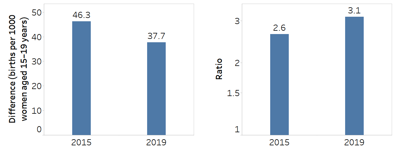
Economic status is categorized as five subgroups (quintiles), and the difference is calculated as the poorest minus the richest. Ratio is calculated as the poorest divided by the richest.
Source: derived from the WHO Health Inequality Data Repository Reproductive, Maternal, Newborn and Child Health dataset (8), with data sourced from the 2015 and 2019 Demographic and Health Surveys.
FIGURE 22.4. Adolescent fertility rate, by economic status, Rwanda
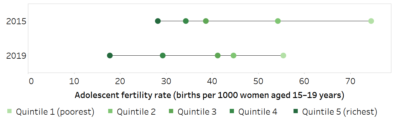
Horizontal lines show the range between the lowest and highest subgroup estimates.
Source: derived from the WHO Health Inequality Data Repository Reproductive, Maternal, Newborn and Child Health dataset (8), with data sourced from the 2015 and 2019 Demographic and Health Surveys.
Weighted and unweighted measures of inequality
A key question when selecting between and evaluating weighted and unweighted measures of inequality is whether the subgroups have importance as entities in themselves (regardless of their size) or whether their relative size matters.
Unweighted measures treat all subgroups equally. They inherently convey that the importance of the subgroup as a unit is constant because small groups are given the same emphasis as larger groups. Consider a situation where the health of a particular subgroup, such as people experiencing homelessness, is of special interest. It may be worthwhile to compare the outcomes of the population of people experiencing homelessness with the population not experiencing homelessness, even though the size of the population experiencing homelessness may be much smaller. The use of an unweighted measure avoids masking the experience of a small minority group. There are considerations when using unweighted measures to track inequalities over time, however, because they do not account for situations where the size of the subgroup changes (population shift). For example, if the size of the population experiencing homelessness doubles between two times points, this would not be captured in an unweighted summary measure. Likewise, a substantial decrease in the number of people experiencing homelessness would not be captured.
Weighted measures give greater emphasis to larger subgroups and weight all individuals equally. This approach endorses the position that disadvantage affecting larger populations is more significant than disadvantage affecting smaller populations. Weighted measures, however, capture population shift over time. They can be useful to account for upstream social policy factors that may, for example, increase people’s level of education or help people move out of poverty (and thereby decrease the population share of the associated disadvantaged subgroups). Weighted measures also capture situations where the share of certain population subgroups increases, such as migration influxes or increased unemployment. Box 22.4 provides an example of the interpretation of weighted versus unweighted measures of subnational inequality in childhood immunization in Ethiopia.
BOX 22.4. Example of using weighted versus unweighted measures to understand subnational inequality in childhood immunization in Ethiopia
Figure 22.5 shows subnational inequality in immunization coverage with a third dose of the diphtheria, tetanus toxoid and pertussis vaccine (DTP3) in Ethiopia measured using mean difference from best-performing subgroup. The weighted mean difference from the best-performing subgroup (MDBW) reflects the population distribution across regions, while the unweighted mean difference from the best-performing subgroup (MDBU) treats each region equally. In all survey years, the capital city Addis Ababa was the best-performing region.
FIGURE 22.5. Weighted and unweighted mean difference from best-performing subgroup: immunization coverage with a third dose of the diphtheria, tetanus toxoid and pertussis vaccine among children aged one year, by subnational region, Ethiopia
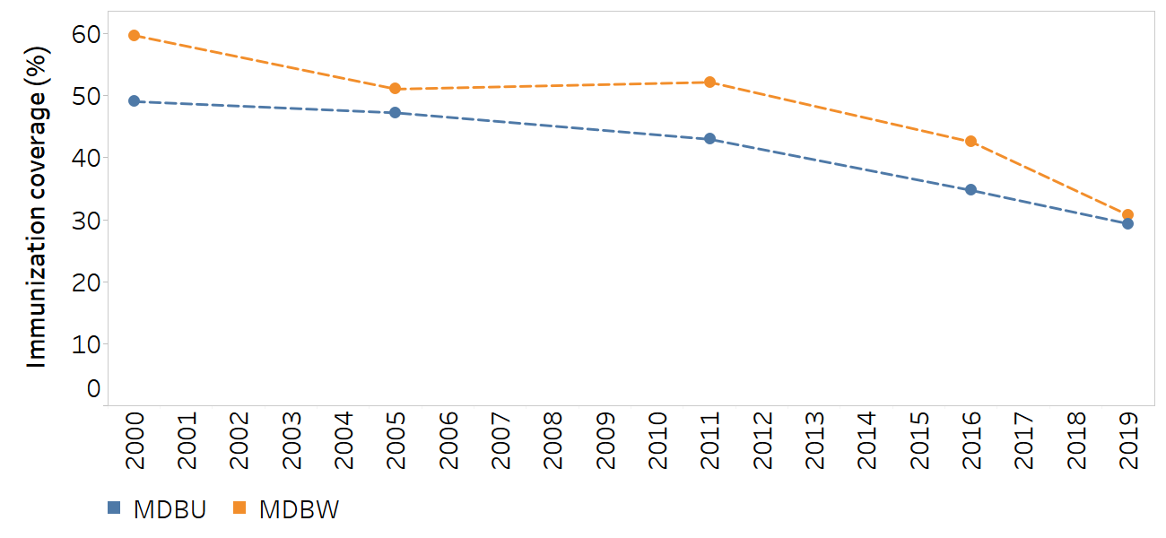
MDBU, mean difference from best-performing subgroup, unweighted; MDBW, mean difference from best-performing subgroup, weighted.
The best-performing subgroup is Addis Ababa.
Source: derived from the WHO Health Inequality Data Repository Reproductive, Maternal, Newborn and Child Health dataset (8), with data sourced from the 2000, 2005, 2011, 2016 and 2019 Demographic and Health Surveys.
Both measures are valid and correct, but they reflect different priorities and values for assessing inequality. The weighted measure (MDBW) demonstrates larger absolute inequality compared with the unweighted measure (MDBU), except in 2019, when the two measures show the same level of inequality.
The explanations and messaging behind these differing results can be understood by investigating the disaggregated data and population share across regions (Table 22.3). The weighted measure largely reflects the trends associated with the three most populated regions (Amhara, Oromia and Southern Nations, Nationalities, and Peoples’ Region), which together comprise 80–90% of the population (89% in 2000 and 80% in 2019). In 2000, for example, these regions had coverage of 21% or lower, compared with 81% in Addis Ababa, which is why a large gap between the weighted and unweighted measures can be observed. By 2019, coverage had increased in these regions to at least 54% (with 82% coverage in Amhara), compared with 93% in Addis Ababa, leading to a decrease in MDBW. The unweighted measure, by comparison, gives greater emphasis to the level of coverage in less populated regions. In 2000, 2005 and 2011, the majority of regions that accounted for less than 20% of the population share reported higher levels of immunization coverage than the three most populated regions.
TABLE 22.3. Immunization coverage with a third dose of the diphtheria, tetanus toxoid and pertussis vaccine among children aged one year and population share, by subnational region, Ethiopia
| Region | DHS 2000 | DHS 2005 | DHS 2011 | DHS 2016 | DHS 2019 | |||||
|---|---|---|---|---|---|---|---|---|---|---|
| Estimate (%) | Population share (%) | Estimate (%) | Population share (%) | Estimate (%) | Population share (%) | Estimate (%) | Population share (%) | Estimate (%) | Population share (%) | |
| Addis Ababa | 80.9 | 1.5 | 83.8 | 1.7 | 89.2 | 2.2 | 95.7 | 2.6 | 93.1 | 3.3 |
| Affar | 1.1 | 0.9 | 4.6 | 1.0 | 11.6 | 0.9 | 20.1 | 1.0 | 27.0 | 1.5 |
| Amhara | 20.6 | 26.3 | 32.1 | 25.7 | 39.4 | 23.1 | 63.8 | 18.2 | 82.2 | 21.2 |
| Benishangul-Gumuz | 16.7 | 0.9 | 30.7 | 0.9 | 42.9 | 1.2 | 76.2 | 1.0 | 80.5 | 1.0 |
| Dire Dawa | 52.4 | 0.3 | 62.5 | 0.4 | 76.1 | 0.4 | 84.9 | 0.5 | 74.5 | 0.6 |
| Gambela | 12.7 | 0.2 | 20.3 | 0.3 | 29.4 | 0.4 | 54.8 | 0.3 | 69.0 | 0.4 |
| Harari | 50.7 | 0.2 | 45.8 | 0.2 | 54.4 | 0.3 | 58.7 | 0.2 | 54.9 | 0.2 |
| Oromia | 16.6 | 42.2 | 28.8 | 36.8 | 27.1 | 42.0 | 39.9 | 44.0 | 53.6 | 39.4 |
| Somali | 24.4 | 1.1 | 5.6 | 4.2 | 25.8 | 2.6 | 36.3 | 3.8 | 26.2 | 5.4 |
| Southern Nations, Nationalities, and Peoples’ Region | 16.9 | 20.6 | 35.6 | 21.7 | 38.5 | 20.2 | 59.0 | 20.9 | 56.3 | 19.4 |
| Tigray | 56.8 | 5.7 | 52.1 | 7.2 | 74.3 | 6.7 | 81.4 | 7.6 | 84.4 | 7.5 |
DHS, Demographic and Health Surveys.
Source: derived from the WHO Health Inequality Data Repository Reproductive, Maternal, Newborn and Child Health dataset (8), with data sourced from the 2000, 2005, 2011, 2016 and 2019 DHS.
Choice of reference point
For some summary measures, the reference point is implicit. Others require the explicit selection of a reference point as a benchmark for comparison, with several possible choices. Common reference points include the best-performing subgroup, a subgroup with special significance (e.g. a capital city), the overall average and a target level (see Chapter 19). The selection of a reference point has implications for how the calculation of these measures is done, but moreover for how the results derived from the measure are applied.
The best-performing subgroup, subgroups with special significance and overall average are all dynamic reference points because their values may fluctuate over time or across populations. This emphasizes the importance of lowered inequality per se. The choice of the best-performing subgroup puts importance on levelling up among all other subgroups. The implication of this selection is that all subgroups aim to reach the level of the best-performing subgroup. The selection of the overall average as a reference point signals a tolerance for a certain amount of levelling down among the subgroups that are above average; the same may be the case in the selection of a subgroup with special significance. In these cases, a redistribution may be plausible when proposing remedial actions such as resource allocation.
The use of a target as a reference point provides a fixed value that may remain constant over time and across populations (provided the target remains unchanged). This places emphasis on all subgroups achieving a stated reference value and may be particularly resonant, for example, when multiple countries are reporting on their progress towards high-level goals. A drawback of using a fixed target as a reference point, however, is that it is less responsive to the actual situation in a monitoring context, and the level at which the target is set must be justified. If all subgroups are far from the target – or, conversely, if all subgroups have already surpassed a target – the results may be less meaningful. Box 22.5 provides an example of the calculation of measures of subnational inequality in mortality among children aged under five years in Nepal using different reference points.
BOX 22.5. Example of measuring inequality using different reference points
Figure 22.6 demonstrates the use of different reference points to assess subnational inequality in mortality rates among children aged under five years in Nepal between 2010 and 2019. The unweighted version of the mean difference from the best-performing district (MDBU) uses the best-performing district as a point of reference (this was the district of Bhaktapur in the region of Bagmati in all years – although given the nature of the reference point, it could have been a different district in each year). The unweighted mean difference from a reference point (MDRU) measure uses the top 5% of district estimates as the reference point. The unweighted mean difference from the mean measure (MDMU) uses the national average as the reference point.
FIGURE 22.6. Mean difference measures: mortality rate among children aged under five years, by subnational region, Nepal
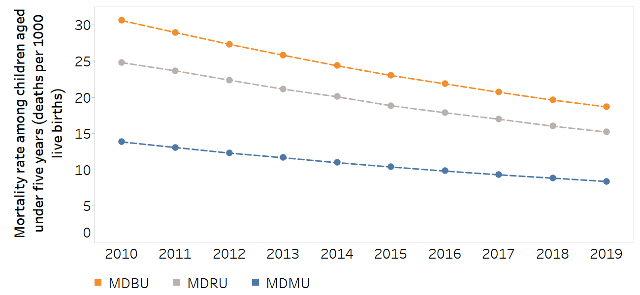
MDBU, unweighted mean difference from best-performing subgroup; MDMU, unweighted mean difference from mean; MDRU, unweighted mean difference from reference point.
The subnational regions were 77 districts (second administrative level). For MDBU, the best performing subgroup was the district of Bhaktapur in the region of Bagmati in all years. The top 5% of district estimates were used as the reference point for MDRU.
Source: derived from the WHO Health Inequality Data Repository Under-five Mortality dataset (8), with data from 2010–2019 sourced from the United Nations Inter-agency Group for Child Mortality Estimation.
MDBU indicates a consistently higher level of absolute inequality than MDMU and MDRU. The selection of the best-performing district as the reference point implies that every other district has the potential to achieve the same level of mortality among children aged under five years, and therefore encourages a focus on lowering mortality in all districts to the level of mortality in that district. Selecting the top 5% of districts as the reference point results in a slightly lower magnitude of inequality (since a group of districts will already have mortality rates similar to that point of reference) and emphasizes the reduction of mortality in the other 95% of districts. On the other hand, selecting the mean as the reference point means that inequality could be reduced in several ways, including decreasing mortality in some districts, and maintaining low levels of mortality in others.
Distributional sensitivity
Distributional sensitivity, in the context of measuring inequality, refers to the responsiveness of an inequality measure to changes in the distribution of a health indicator among a population. Such sensitivity might be warranted if improving a health indicator within a particular disadvantaged group (e.g. the poorest, least educated, homeless, unemployed or refugee populations) is of higher concern than improving it in others. Under this principle, if a single “healthier” subgroup becomes less healthy and the health of a previously “less healthy” subgroup improves, but the health of all other groups remains the same, the extent of inequality should decrease. Distributional sensitivity may also be important to help policy-makers understand whether interventions targeted to specific groups had the intended impact. Not all inequality measures, however, are able to reflect this. Some measures are more able than others to reflect a nuanced assessment of distributional shifts (Box 22.6).
BOX 22.6. Comparison of distributional sensitivity of various summary measures
This example uses two hypothetical scenarios of coverage increases to demonstrate the distributional sensitivity of four summary measures. In Scenario A, coverage increases by five percentage points in the most disadvantaged Subgroup 4. In Scenario B, coverage increases by five percentage points in Subgroup 3 (Figure 22.7). All subgroups are assumed to have the same population size.
FIGURE 22.7. Distributional sensitivity: two scenarios of coverage increase between two periods
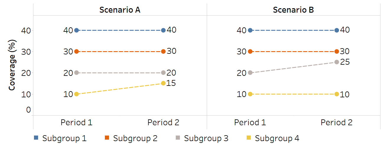
Inequality is assessed and compared using four summary measures of inequality, which all show narrowing inequality between the two periods, with variable distributional sensitivity (Table 22.4). The first two measures are the mean difference from mean (MDM), which measures absolute inequality, and the index of disparity (IDIS), which measures relative inequality. For both measures, the extent of the decline in inequality in Scenario A and Scenario B is identical: MDM reduces by 1.3 in both scenarios, and IDIS reduces by 6.7 in both scenarios. They do not differentiate between an improvement in Subgroup 3 and Subgroup 4. This is because the weighted mean and the absolute difference between estimates and the weighted mean, which are key inputs into the calculation of MDM and IDIS, are the same.
The use of the Theil index (TI) and mean log deviation (MLD), however, yield different results for Scenarios A and B. They each suggest a greater reduction in inequality in Scenario A than in Scenario B. This is because TI and MLD take into account the proportion of each subgroup, or their share, of the coverage indicator; therefore, a change in the coverage of any subgroup is reflected in TI and MLD.
TABLE 22.4. Complex summary measure calculations corresponding to illustration of distributional sensitivity
| Measure | Absolute or relative | Scenario A | Scenario B | ||||
|---|---|---|---|---|---|---|---|
| Period 1 | Period 2 |
Difference (Period 2 − Period 1) |
Period 1 | Period 2 |
Difference (Period 2 − Period 1) |
||
| Mean difference from mean | Absolute | 10.0 | 8.7 | −1.3 | 10.0 | 8.7 | −1.3 |
| Index of disparity | Relative | 40.0 | 33.3 | −6.7 | 40.0 | 33.3 | −6.7 |
| Theil index | Relative | 106.4 | 66.9 | −39.6 | 106.4 | 95.1 | −11.4 |
| Mean log deviation | Relative | 121.8 | 69.2 | −52.6 | 121.8 | 114.8 | −7.0 |
Sensitivity to outliers
Outliers are subgroups with health indicator values at the extreme high or low ends of a distribution. Depending on the monitoring purpose, sensitivity to outliers may be an advantage. An inequality measure that is highly sensitive to outliers will overemphasize the impact of extreme values, which might be useful if the aim of monitoring is to highlight subgroups being left behind or subgroups that are unfairly disadvantaged. If the monitoring purpose is to achieve a general understanding of the state of inequality, sensitivity to outliers can distract from the situation in the majority of the population – particularly if the population sizes of the outlier subgroups are small. Understanding how certain summary measures account for outlier estimates provides a stronger basis for meaningfully evaluating their findings. Box 22.7 compares sensitivity to outliers of selected variance and mean difference summary measures.
BOX 22.7. Assessing sensitivity to outlier estimates among variance and mean difference summary measures
Scenarios A and B show hypothetical situations where a health indicator increases in one subgroup while remaining the same in others (Figure 22.8). All subgroups are assumed to have the same population size. The extent of the increase is greater in Scenario B than in Scenario A, such that the outlier in Scenario B is more extreme.
Figure 22.8. Sensitivity to outliers: two scenarios of coverage increase between two periods
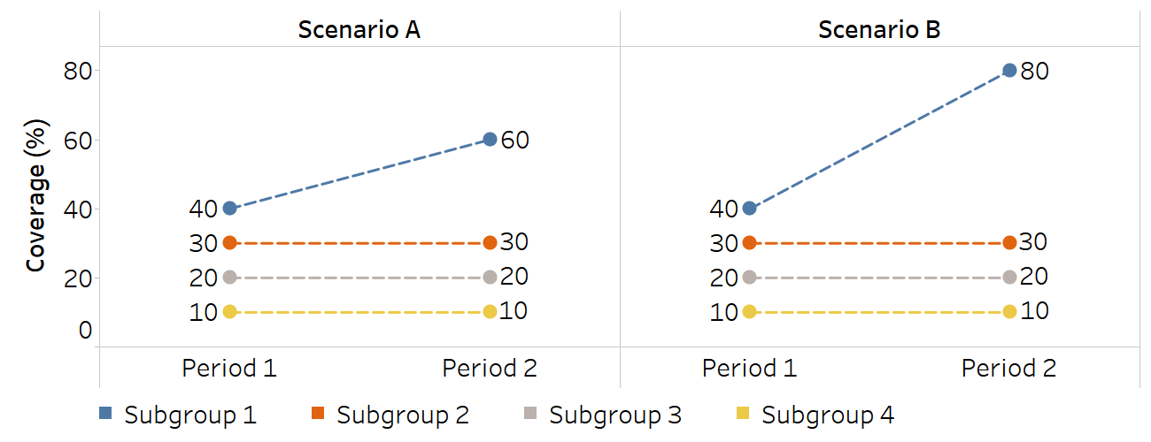
Two summary measures were calculated to demonstrate sensitivity to outlier estimates: between-group variance (BGV) and MDM. BGV is sensitive to the outlier estimate because it gives more weight to estimates that are further away from the overall average (by squaring the differences between each estimate and the setting average). In Scenario A, where there is an outlier with the value of 60, inequality measured using BGV in Period 2 is 2.8 times higher than in Period 1, while inequality measured using MDM was 1.5 times higher (Table 22.5). In Scenario B, which features a more extreme outlier with the value of 80, inequality measured by BGV increased 5.8 times, while it increased 2.3 times using MDM. Therefore, MDM is less sensitive to the outlier effect than BGV.
TABLE 22.5. Comparison of between-group variance (BGV) and mean difference from mean (MDM) in terms of sensitivity to outliers
| Scenario A | Scenario B | |||||
|---|---|---|---|---|---|---|
| Period 1 | Period 2 |
Ratio (Period 2 / Period 1) |
Period 1 | Period 2 |
Ratio (Period 2 / Period 1) |
|
| BGV | 125.0 squared percentage points | 350.0 squared percentage points | 2.8 | 125.0 squared percentage points | 725.0 squared percentage points | 5.8 |
| MDM | 10.0 percentage points | 15.0 percentage points | 1.5 | 10.0 percentage points | 22.5 percentage points | 2.3 |
Ratios are compared because BGV and MDM have different units.
References
1. Houweling TA, Kunst AE, Huisman M, Mackenbach JP. Using relative and absolute measures for monitoring health inequalities: experiences from cross-national analyses on maternal and child health. Int J Equity Health. 2007;6:15. doi:10.1186/1475-9276-6-15.
2. Barros AJ, Victora CG. Measuring coverage in MNCH: determining and interpreting inequalities in coverage of maternal, newborn, and child health interventions. PLoS Med. 2013;10(5):e1001390. doi:10.1371/journal.pmed.1001390.
3. Restrepo-Méndez MC, Barros AJ, Black RE, Victora CG. Time trends in socio-economic inequalities in stunting prevalence: analyses of repeated national surveys. Public Health Nutr. 2015;18(12):2097–2104. doi:10.1017/S1368980014002924.
4. Asada Y. On the choice of absolute or relative inequality measures. Milbank Q. 2010;88(4):616–622. doi:10.1111/j.1468-0009.2010.00614.x.
5. Harper S, King NB, Meersman SC, Reichman ME, Breen N, Lynch J. Implicit value judgments in the measurement of health inequalities. Milbank Q. 2010;88(1):4–29. doi:10.1111/j.1468-0009.2010.00587.x.
6. Asada Y. Health inequality: mortality and measurement. Toronto: University of Toronto Press; 2007.
7. Kjellsson G, Gerdtham UG, Petrie D. Lies, damned lies, and health inequality measurements. Epidemiology. 2015;26(5):673–680. doi:10.1097/EDE.0000000000000319.
8. Health Inequality Data Repository. Geneva: World Health Organization (https://www.who.int/data/inequality-monitor/data, accessed 29 May 2024).