Chapter 18. Interpreting disaggregated health data
Overview
Disaggregated health data, which present health data by population subgroups, serve as a starting point for understanding the patterns and trends of inequalities in populations. The visual inspection of disaggregated data provides a cursory way to get a sense of the direction and magnitude of inequalities for a given indicator and time point. This can be done readily for binary dimensions of inequality groupings to identify which subgroup is performing better and which is performing worse, and to assess the extent of the gap between the two. When data are available for a large number of subgroups, displaying data graphically can facilitate the process of data inspection, because it can reveal patterns more easily than trying to make sense of multiple data points across columns and rows of a table.
Disaggregated data can convey information about inequalities in a straightforward and transparent manner, although certain issues related to their interpretation emerge upon close inspection. How can patterns in disaggregated data be described? With what degree of certainty do estimates represent their respective subgroups? When are the disaggregated estimates significantly different? What share of the population is captured in each subgroup – and what are the implications when the population share is uneven across subgroups? What considerations are required when comparing sets of disaggregated data across health topics, between populations (as part of benchmarking), and over time (as part of assessing inequality trends)? Consideration of these questions lends more robust insights into the data and nuances their interpretation.
This chapter presents strategies and fundamental considerations for interpreting disaggregated data. The objective is to facilitate a rigorous understanding of the conclusions derived from inspecting and comparing disaggregated data. It includes discussions on describing characteristic patterns in disaggregated data, accounting for underlying qualities and issues related to subgroup data, and generating valid comparisons of disaggregated data. A detailed understanding of the preparation of disaggregated data and their interpretation (covered in Chapter 17 and in this chapter, respectively) is a helpful precursor for the use of summary measures of health inequality (see Chapter 19-22). Reporting disaggregated data and summary measures is covered in Chapter 23.
Characteristic patterns in disaggregated data
For subgroups that are ordered (i.e. where they can be logically ranked, such as with age, economic status or education), describing characteristic patterns across disaggregated data can be a compelling way to assess and report disaggregated health data (1). Alongside each of these patterns, a corresponding response or intervention can also be proposed as a general starting point for further action (see Annex 10). See Chapter 8 for more about equity-oriented policy-making.
Figure 18.1 demonstrates four patterns of inequality in a health service coverage indicator (measured as percentage) across wealth quintiles, using hypothetical data. In this type of figure (known as an equiplot), the health indicator estimate is plotted on the bottom axis, and the subgroups are represented by coloured circles. The four characteristic patterns are labelled to the left. The top row shows complete coverage. All quintiles have around 100% coverage, indicating universal coverage of this health service with almost no inequality. A response to this situation is continued monitoring to ensure coverage remains high for all. The second row demonstrates a pattern of marginal exclusion, where the poorest quintile has much lower coverage than the four richer quintiles. An appropriate response here may involve targeting the poorest subgroup. The third row is a queuing or linear pattern, whereby there are increases in coverage across each of the quintiles. A combination (or gradient) approach, with differentiated targeting across the population subgroups may be warranted. The bottom row illustrates the mass deprivation pattern, where most of the population – that is, all but the richest quintile – has low levels of coverage. In this scenario, a population-level response may be required to reach all or most of the population. For examples of these characteristic patterns of inequality in countries, see Box 18.1.
FIGURE 18.1. Illustration of patterns of inequality in health service coverage across wealth quintiles
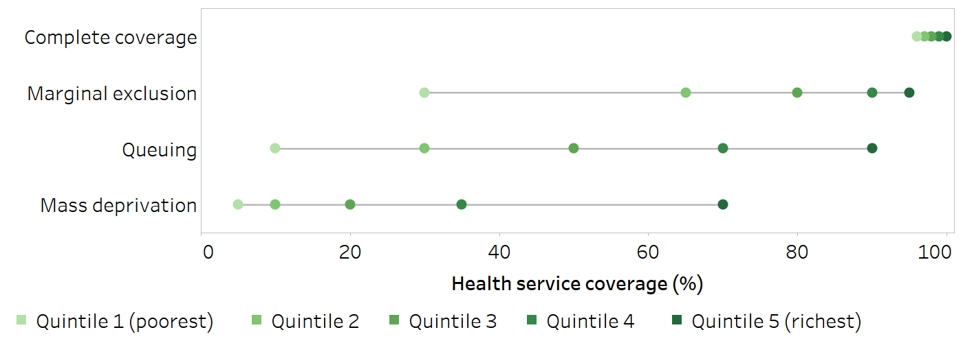
Horizontal lines show the range between the lowest and highest subgroup estimates.
BOX 18.1. Examples of characteristic patterns of inequality in disaggregated data
The following example shows characteristic patterns of inequality observed across wealth quintiles for deliveries in a health facility for nine selected countries in the WHO African Region with Demographic and Health Surveys (DHS) or Multiple Indicator Cluster Surveys (MICS) data available from 2019 or 2020 (Figure 18.2).
A queuing pattern was evident in the Central African Republic and Ethiopia, where the percentage of deliveries in a health facility increased in a stepwise pattern across wealth quintiles. Senegal and Zimbabwe demonstrated a marginal exclusion pattern, where the percentage of health facility deliveries was considerably lower in the poorest quintile compared with the four richer quintiles. Mass deprivation was observed in Chad and Guinea-Bissau, with a considerably higher percentage of health facility deliveries in the richest quintile compared with the four poorer quintiles. A universal pattern of high percentage of health facility deliveries was reported in Algeria, Malawi and Sao Tome and Principe.
FIGURE 18.2. Deliveries in a health facility, by economic status, nine selected countries in the WHO African Region
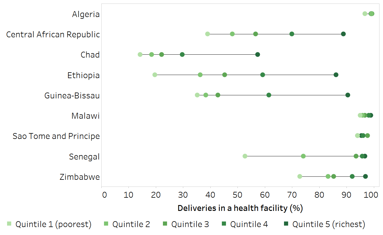
Horizontal lines show the range between the lowest and highest subgroup estimates.
Source: derived from the WHO Health Inequality Data Repository Reproductive, Maternal, Newborn and Child Health dataset (2), with data sourced from the Demographic and Health Surveys in 2019 (Ethiopia, Senegal) and from Multiple Indicator Cluster Surveys in 2019 (Algeria, Central African Republic, Chad, Guinea-Bissau, Sao Tome and Principe, Zimbabwe) and 2020 (Malawi).
Measures of uncertainty and significance
Measures of uncertainty for point estimates derived from surveys, such as 95% confidence intervals or standard errors, provide information about the reliability of the estimate. They can also be used to assess whether there are statistically significant differences between population subgroups and to help determine whether the results are meaningful. Figure 18.3, for example, shows 2016 estimates for stunting prevalence in children aged under five years in Paraguay disaggregated by wealth quintiles, with corresponding 95% confidence intervals (indicated by horizontal lines). Taking 95% confidence intervals into account, the data show a marginal exclusion pattern. The highest stunting prevalence was in the poorest quintile, with a large overlap in the 95% confidence intervals for the three middle quintiles (quintiles 2–4), and minimal overlap for the two richest quintiles (quintiles 4 and 5).
FIGURE 18.3. Stunting prevalence in children aged under five years, by economic status, Paraguay
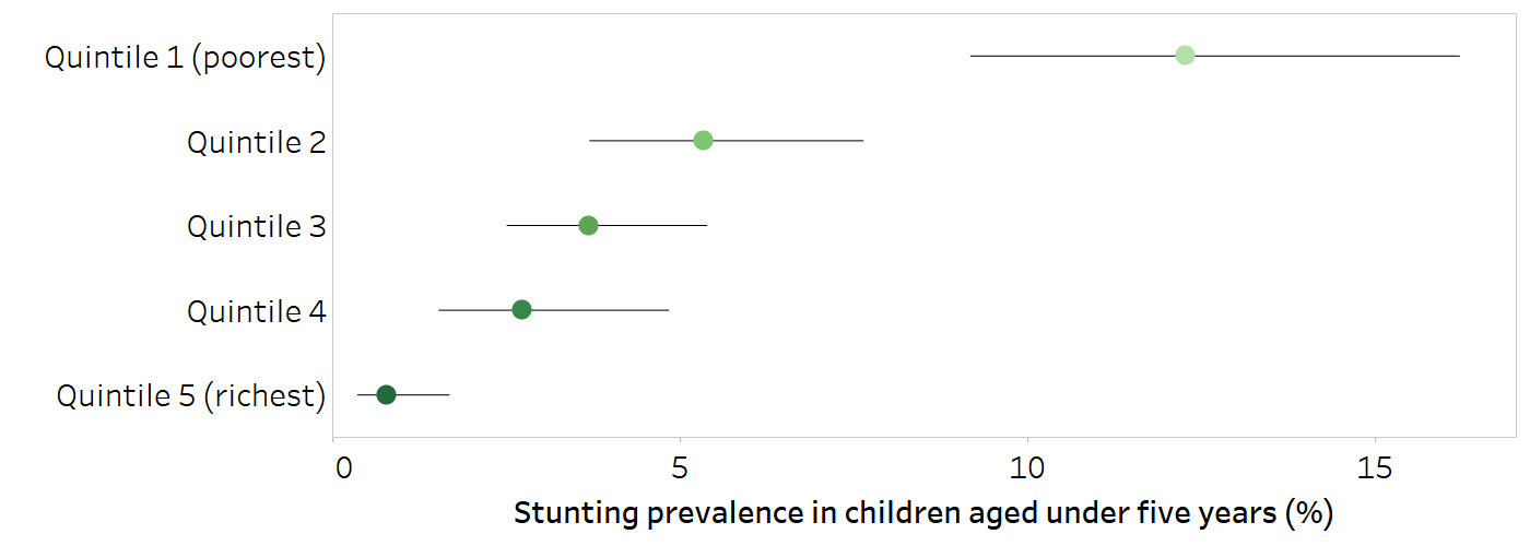
Horizontal lines show 95% confidence intervals around the point estimates.
Source: derived from the WHO Health Inequality Data Repository Child Malnutrition dataset (2), with data sourced from the 2016 Multiple Indicator Cluster Surveys.
The mathematical calculation of measures of uncertainty takes survey sample size into account. Subgroup estimates based on smaller sample sizes tend to have more uncertainty, whereas estimates based on larger sample sizes tend to demonstrate lower uncertainty.
The level of uncertainty surrounding an estimate considers whether a comparison between two values is statistically significant (e.g. measured using a P value). Subgroup estimates based on larger sample sizes are more likely to yield statistically significant results. There may be cases where small differences in disaggregated estimates show statistical significance solely because they are based on a large sample size.
When inspecting and interpreting point estimates, a distinction can be made between statistical significance and public health significance. Estimates derived from large samples may prove to be statistically different mathematically, but in public health this difference may not be meaningful. For example, the 2020 DHS in India reported a statistical difference between demand for family planning satisfied (use of modern and traditional methods) in urban and rural areas. The coverage in urban areas was 89.2% (95% confidence interval (CI) 88.8–89.5%), and the coverage in rural areas was 86.9% (95% CI 86.7–87.1%) (2). In terms of public health policies, programmes and practices, however, the difference of 2.3 percentage points likely bears little importance. Nevertheless, this does not mean that sample size and uncertainty measures should be ignored when reporting data. Rather, there is a need to ensure point estimates do not lead to false conclusions and misinformed policy. This includes considering whether the confidence intervals of the point estimates are narrow enough to allow for meaningful conclusions about inequality. In cases where no meaningful conclusions can be drawn, point estimates for indicators in population subgroups should be presented with the necessary caveats to avoid confusion and misinformation. See Chapter 23 for more discussion about reporting the results of health inequality monitoring.
Ecological fallacy
An ecological fallacy is a misinterpretation that occurs because the characteristics of a group are attributed to an individual. Health indicators and dimensions of inequality measured at an aggregate level, such as by district or household, do not necessarily reflect the situation for all individuals within the group. For instance, if richer districts are found to have a higher prevalence of road traffic injuries than poorer districts, it would be erroneous to use these data to draw the conclusion that road traffic injuries are more prevalent among richer individuals – although the data could be used to help inform targeted interventions in richer districts.
An ecological fallacy refers to an erroneous inference that may occur because an association observed between variables on an aggregate level does not necessarily represent or reflect the association that exists at an individual level (3).
Household measures can mask inequalities within households. Care should be taken to avoid drawing conclusions that rely on the extrapolation of characteristics about individuals from household-level data. For example, for the purposes of health inequality monitoring, economic status is commonly measured as household wealth using asset-based indices. Household members, however, may not have equal access to assets and income due to their age, gender or other factors. An interpretation of data disaggregated by household wealth, therefore, would be more accurately expressed as “women from richer households are more likely to access health services” than “rich women are more likely to access health services”.
Population share and population shift
Population share refers to the percentage of the total affected population included in a given population subgroup. (The total affected population may not encompass the entire population in an area. For example, for certain indicators, it may consist of all women of reproductive age or all children aged under five years.) Population share can be expressed as the population size (i.e. the absolute number of affected people represented by each population subgroup), although the relative value (share) is often easier to interpret. Awareness of the population share (or size) associated with a disaggregated estimate lends greater understanding of the context of the situation and underlying population.
For example, consider a hypothetical population consisting of 50% urban residents and 50% rural residents (Figure 18.4, Scenario A). Disaggregated estimates for rural and urban areas each represent the situation for half the population. In a different scenario where the population share is 90% urban and 10% rural (Figure 18.4, Scenario B), the disaggregated estimate for urban areas corresponds to a much higher proportion of the population than the estimate for rural areas. It is not necessarily the case that disadvantage reported by a subgroup with a smaller population share is less important: inequality monitoring is often concerned with situations of disadvantage that affect small subgroups. Instead, knowledge about population share helps in understanding more fully how the estimates represent the population and how to accurately contextualize the results.
FIGURE 18.4. Illustration of two hypothetical population share scenarios
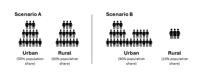
Population shifts occur when the distribution of the population across subgroups (i.e. the population share of the subgroups) changes over time. This is a pertinent consideration when making comparisons over time, because population shifts can help to explain why disaggregated estimates may (or may not) have changed. In the hypothetical scenarios illustrated in Figure 18.4, Scenario A might represent an earlier time point before urbanization, and Scenario B might represent a later time point after large-scale migration from rural to urban settlements. In this example, suppose the disaggregated estimates for health service coverage were as follows:
Pre-urbanization (Scenario A) coverage was 90% in urban areas and 20% in rural areas.
Post-urbanization (Scenario B) coverage was 70% in urban areas and 30% in rural areas.
Without corresponding information about population share, it is apparent only that coverage in urban areas declined over time while coverage in rural areas increased. The patterns in the disaggregated estimates provide little indication of why these changes might have occurred. If information about the population share is provided, however, the complexity of the situation becomes apparent. The increase of the urban population share from 50% to 90% between the two time points (and corresponding decrease of the rural population share from 50% to 10%) is suggestive of urbanization. Given this information, it is clear that the composition of the subgroups has shifted over time, and the disaggregated estimates are capturing different subgroup populations in Scenario A versus Scenario B. More information is required about the migrant coverage levels to interpret the data accurately. For example, one possible explanation for the observed coverage decline in urban areas is that the rural populations that moved to urban areas may have lower levels of coverage than the pre-urbanization urban populations. For more discussion and examples regarding population shift and the use of weighted versus unweighted summary measures of health inequality, see Chapters 19 and 22. For more about urbanization and health inequality, see Annex 6.
Resolution issues
Resolution issues arise when interpreting and comparing between sets of disaggregated data based on variable numbers of subgroups. A larger number of groupings will usually capture more heterogeneity (i.e. variation), especially when comparing between subgroups that reflect the extreme ends of an ordered inequality dimension (4, 5). Conversely, a smaller number of subgroups for a dimension of inequality will generally capture less heterogeneity between the subgroups.
To illustrate this issue, consider the case of economic status. This dimension of inequality is commonly categorized using deciles, quintiles or two subgroups:
Deciles (10 subgroups) each contain about 10% of the population.
Quintiles (five subgroups) each contain about 20% of the population.
Two subgroups may be formed from the richest 60% and the poorest 40%, or the richest 10% and the poorest 40% (known as the Palma ratio).
For a given population, observing disaggregated data and making comparisons between the two subgroups at the extremes – the richest and the poorest – leads to different conclusions about inequality, depending on the number of subgroups. Dividing the population into deciles means the comparisons are made between the richest 10% and the poorest 10%. Having 10 subgroups of economic status captures more of the extreme wealth and extreme poverty than having five subgroups (quintiles, where comparisons capture the richest 20% and the poorest 20%) or two subgroups (where comparisons capture the richest 60% and the poorest 40%). Box 18.2 demonstrates the use of economic status deciles versus quintiles to show inequality in births attended by skilled health personnel in Bangladesh.
BOX 18.2. Applying economic status deciles versus quintiles
Figure 18.5 shows data from Bangladesh about the percentage of births attended by skilled health personnel, disaggregated by economic status. Each of the green dots represents one subgroup. On the top, economic status is categorized as deciles. The coverage is 26% in the poorest subgroup and 92% in the richest subgroup. On the bottom, economic status is categorized as quintiles, each consisting of 20% of the population. Here, the range of coverage between the poorest and richest is smaller – 32% coverage in the poorest subgroup and 86% in the richest subgroup. The range of values, therefore, is larger when economic status is categorized as 10 rather than five subgroups.
Figure 18.5. Births attended by skilled health personnel, by economic status, Bangladesh
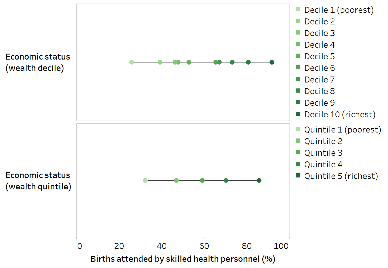
Horizontal lines show the range between the lowest and highest subgroup estimates.
Source: derived from the WHO Health Inequality Data Repository Reproductive, Maternal, Newborn and Child Health dataset (2), with data sourced from the 2019 Multiple Indicator Cluster Surveys. Data are based on two years prior to the survey.
The numbers of subgroup categories should be harmonized when comparing between situations of inequality.
Due to resolution issues, comparisons between dimensions of inequality that are categorized based on variable numbers of subgroups can be misleading and generally should be avoided. Similarly, attention to resolution issues is required when comparing between different dimensions of inequality for a given indicator, comparing disaggregated estimates over time, and comparing between countries. It would not be valid to make comparisons of within-country inequality if economic status is categorized as quintiles in one country and as deciles in another country. When benchmarking across countries, it may be valid, however, to compare within-country wealth-related inequality if economic status is categorized consistently in all countries.
References
1. Victora CG, Joseph G, Silva ICM, Maia FS, Vaughan JP, Barros FC, et al. The inverse equity hypothesis: analyses of institutional deliveries in 286 national surveys. Am J Public Health. 2018;108(4):464–471. doi:10.2105/AJPH.2017.304277.
2. Health Inequality Data Repository. Geneva: World Health Organization (https://www.who.int/data/inequality-monitor/data, accessed 15 September 2024).
3. Porta M. A dictionary of epidemiology. Oxford: Oxford University Press; 2016.
4. Wong KLM, Restrepo-Méndez MC, Barros AJD, Victora CG. Socioeconomic inequalities in skilled birth attendance and child stunting in selected low and middle income countries: wealth quintiles or deciles? PLoS One. 2017;12(5):e0174823. doi:10.1371/journal.pone.0174823.
5. Flores-Quispe MDP, Restrepo-Méndez MC, Maia MFS, Ferreira LZ, Wehrmeister FC. Trends in socioeconomic inequalities in stunting prevalence in Latin America and the Caribbean countries: differences between quintiles and deciles. Int J Equity Health. 2019;18(1):156. doi:10.1186/s12939-019-1046-7.