Chapter 21. Complex summary measures of health inequality
Overview
Complex summary measures of health inequality are calculated using information on all subgroups of a population. They are termed “complex” not because they are overly complicated but because, in contrast to pairwise measures, their calculation accounts for complexities in the underlying disaggregated data. They can be applied to dimensions of inequality comprised of more than two subgroups that are ordered or non-ordered; they may measure absolute or relative inequality; they may be weighted or unweighted; and they may incorporate reference points (see Chapter 19). Similarly to pairwise summary measures, the calculation and interpretation of some complex measures may vary depending on whether the health indicator is favourable or adverse (see Chapter 20).
Having a good understanding of the characteristics of different summary measures and the underlying data requirements is essential to select suitable measures for the inequality analysis and accurately interpret and present results. The objective of this chapter is to describe several complex summary measures and provide detailed information about the calculation and interpretation of selected measures. Where applicable, it features both absolute and relative versions of measures. In these cases, a key difference between the relative and absolute versions of summary measures is that the relative versions normalize the difference in health by the population mean (i.e. the mean is in the denominator), whereas the absolute versions do not.
The calculation of many of the summary measures discussed in this chapter involves the use of the setting average, which is defined as the overall indicator average for the setting of interest. If the disaggregated data are at the national level, then this is the national average; if the disaggregated data pertain to a specific subnational region, then this is the average for that region.
The summary measures discussed in this chapter are shown using disaggregated data for subgroups, although many can also be calculated using individual data. The calculation of inequality measures using individual data is addressed in Chapter 25.
Initial considerations
The two main types of complex measures are ordered measures (appropriate for use with ordered dimensions of inequality such as education) and non-ordered measures (appropriate for use with non-ordered dimensions such as subnational region). A third type – impact measures – can be calculated for both ordered and non-ordered dimensions, and for binary dimensions (e.g. rural or urban place of residence). Figure 21.1 provides an overview of the complex summary measures of inequality covered in this chapter, noting that pairwise measures are addressed in Chapter 20. Key characteristics of summary measures are summarized in Annex 11. Software applications, statistical codes and additional readings are available to facilitate the calculation of complex summary measures (Box 21.1).
FIGURE 21.1. Overview of complex summary measures of health inequality
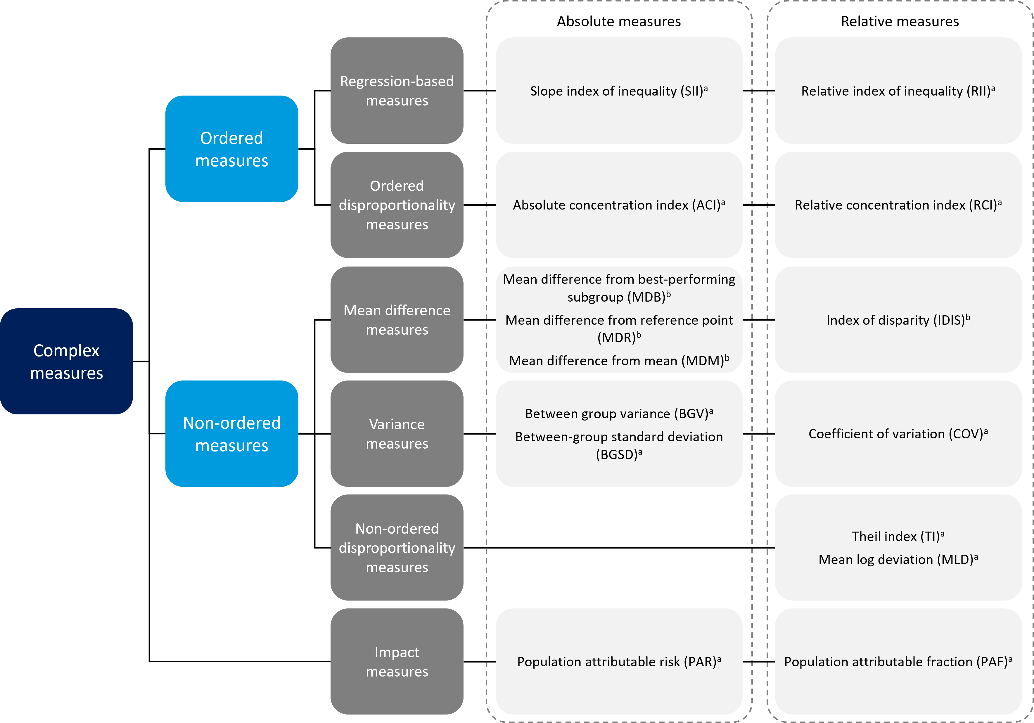
\(^a\) Weighted measure.
\(^b\) Weighted or unweighted measure.
Pairwise measures of inequality (see Chapter 20) are not included in this figure.
BOX 21.1. Tools and resources to facilitate calculation of complex summary measures of health inequality
The WHO Health Equity Assessment Toolkit (HEAT and HEAT Plus) is a specialized software application that facilitates the assessment of health inequalities and calculates a range of summary measures based on disaggregated data (1, 2). HEAT, Built-in Database Edition, comes with preinstalled datasets consisting of all disaggregated data in the WHO Health Inequality Data Repository (1). HEAT Plus, Upload Database Edition, enables users to upload and work with their own databases of disaggregated data. Both HEAT and HEAT Plus automatically calculate suitable summary measures based on the underlying disaggregated data. The software also uses data visualizations to show summary measures, enabling users to assess the change in inequality over time and compare inequality across indicators and settings.
Statistical codes for the calculation of summary measures (and their 95% confidence intervals, where possible) using Excel, Stata and R are available via the WHO Health Inequality Monitor (3). Two Excel resources are available: a step-by-step workbook that takes users through the calculation of summary measures, and an automated workbook that calculates these measures for a user-inputted dataset. (Note that the automated workbook is designed to support small datasets. For datasets containing more than 200 rows of data, R or Stata is recommended.) Stata resources include do-files for each summary measure, a step-by-step guide, and an ado command “healthequal” that calculates measures using a disaggregated dataset. An R package, “healthequal”, also calculates summary measures using a disaggregated dataset and is accompanied by supporting documentation.
A review article overviews existing summary measures of health inequality, including their definition, calculation, interpretation and application. It also discusses their respective strengths and weaknesses (4).
An article demonstrates the application of statistical codes in R and Stata to assess the state of inequality in childhood immunization indicators in low- and middle-income countries (5).
The HEAT and HEAT Plus technical notes provide information about the data presented in the software, including a general introduction to the summary measures calculated in HEAT and HEAT Plus (1).
Additional guidance for the calculation of concentration index and slope index of inequality is available from the International Center for Equity in Health (6).
The following sections detail several complex summary measures, accompanied by examples pertaining to maternal and child health in Indonesia. The main text of the chapter highlights education- and subnational-related inequality because this demonstrates how certain complex summary measures can be applied to account for the population share of each subgroup. Annex 13 contains a comprehensive example of the application of summary measures in an expanded selection of maternal and child health indicators and dimensions of inequality in Indonesia.
Summary measures based on ordered inequality dimensions
Ordered summary measures, which are calculated for inequality dimensions where subgroups have an inherent ordering, such as economic status or education, include regression-based measures (slope index of inequality (SII) and relative index of inequality (RII)) and disproportionality measures (absolute concentration index (ACI) and relative concentration index (RCI)) (Box 21.2). These measures are weighted by population size and have absolute and relative versions. Regression-based measures consider the situation in all population subgroups using an appropriate regression model. Disproportionality measures indicate the extent to which the distribution of health differs from a hypothetical line of equality – that is, the extent to which an indicator is concentrated among disadvantaged or advantaged subgroups.
BOX 21.2. Relationship between regression-based indices of inequality and concentration indices
Sometimes different disciplines apply similar methods using different names to describe variations in measures. This is the case for regression-based indices and concentration indices measuring inequality because there is a close mathematical correspondence between the two sets of measures. Public health scientists tend to favour regression-based indices of inequality because they have a more intuitive measurement unit and interpretation for public health purposes, but economists often prefer concentration indices.
For example, ACI and SII are both measured using the unit of the health indicator, such as percentage points. SII may have a more intuitive interpretation because it is the percentage point difference between the most advantaged and most disadvantaged subgroups. The value of ACI indicates the degree of concentration away from the mean, and therefore the unit of measurement is less important.
Regression-based measures
Regression-based complex summary measures of inequality include SII (an absolute measure) and RII (a relative measure). These measures are based on the association between the subgroup’s relative position and their corresponding health indicator status: each step up with regard to the ordered dimension of inequality results in a gain or loss in terms of the health indicator (7).
For both measures, a weighted sample of the whole population is ranked from the most disadvantaged subgroup (at rank 0) to the most advantaged subgroup (at rank 1). This ranking is weighted, accounting for the proportional distribution of the population within each subgroup. The population of each subgroup is then considered in terms of its range in the cumulative population distribution, and the midpoint of this range, also known as the relative or fractional rank. The relative rank is calculated as:
\[X_j = \sum_{i=1}^{j} p_i - 0.5(p_j)\]
The relative rank is visualized in Figure 21.2. The value of the indicator of interest is regressed against this midpoint value for each subgroup using an appropriate regression model (Box 21.3), and the predicted values of the indicator are calculated for the two extremes (rank 1 and rank 0).
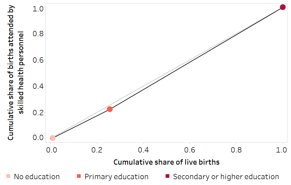
FIGURE 21.2. Cumulative share of live births (relative rank) across subgroups: births attended by skilled health personnel, by education level, Indonesia
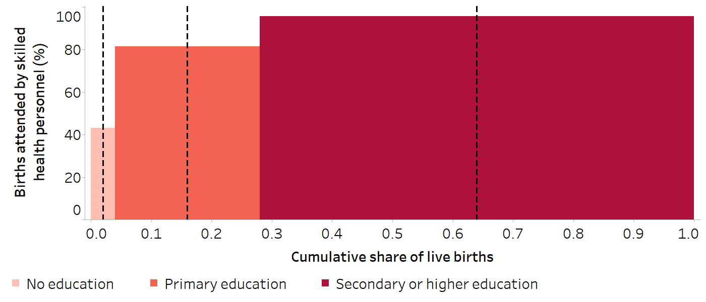
The dashed black vertical lines indicate the midpoint of the range of the cumulative population share (relative rank) for each education subgroup.
Source: derived from the WHO Health Inequality Data Repository Reproductive, Maternal, Newborn and Child Health dataset (1), with data sourced from the 2017 Demographic and Health Surveys. Data are based on three years prior to the survey.
BOX 21.3: Selection of regression models
Regression-based summary measures of health inequality make use of an appropriate regression model. The indicator value for each subgroup is regressed against the subgroup’s relative (or fractional) rank. Because the data are grouped (by subgroup), each observation needs to be weighted by the subgroup’s population size. The indicator values can be scaled to a 0–1 scale (i.e. all values falling between 0 and 1). A linear regression model could be used, but this has the limitation that it assumes a linear relationship between the health indicator and the subgroup relative rank (which is not always the case) and can result in estimated values outside of a 0–1 or 0–100% interval since there are no lower and upper limits (which is inaccurate for some indicators, particularly those measured as percentages). Using logistic regression can sometimes solve these problems. In logistic regression, the relationship between the health indicator and the subgroup rank is not assumed to be linear and, due to a logit transformation of the health indicator (i.e. a logit link), the estimated values from the regression model will be bounded between 0 and 1.
Figure 21.3 visualizes the calculation of regression-based measures to assess education-related inequality in births attended by skilled health personnel in Indonesia in 2017. Table 21.1 illustrates the steps for arriving at the x-axis and y-axis values for the three education subgroups shown in Figure 21.3 (shaded in the table).
FIGURE 21.3. Calculation of regression-based measures: births attended by skilled health personnel, by education level, Indonesia
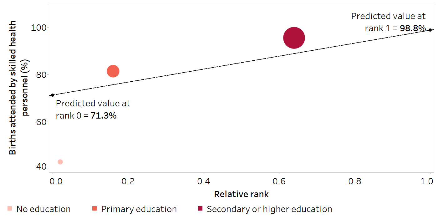
The size of the data points on the graph reflects the population share of live births of the education subgroups. The graph represents a simplified use of a linear regression model, while a log transformation is used in the calculations in the text.
Source: derived from the WHO Health Inequality Data Repository Reproductive, Maternal, Newborn and Child Health dataset (1), with data sourced from the 2017 Demographic and Health Surveys. Data are based on three years prior to the survey.
TABLE 21.1. Preliminary steps to calculate regression-based measures: births attended by skilled health personnel, by education level, Indonesia
| Education level | Live births | Proportion of births attended by skilled health personnel | |||||
|---|---|---|---|---|---|---|---|
|
Number [A] |
Population share [C = A / B] |
Cumulative population share [D] |
Range of cumulative population share |
Midpoint of range (relative rank) [X = D − (0.5 × C)] |
Estimate (%) [Y] |
||
| No education | 111 | 0.011 | 0.011 | 0.000–0.011 | 0.006 | 43.0 | |
| Primary education | 2479 | 0.245 | 0.256 | 0.011–0.256 | 0.134 | 81.5 | |
| Secondary or higher education | 7515 | 0.744 | 1.000 | 0.256–1.000 | 0.628 | 95.6 | |
| Total | 10 105 [B] | 1.000 | |||||
The shaded columns indicate the data points plotted on Figure 21.3.
Source: derived from the WHO Health Inequality Data Repository Reproductive, Maternal, Newborn and Child Health dataset (1), with data sourced from the 2017 Demographic and Health Surveys. Data are based on three years prior to the survey.
Slope index of inequality
SII is an absolute measure of inequality that represents the difference in predicted values of an indicator between the most advantaged and most disadvantaged subgroups, obtained by fitting a regression model (see above). It is calculated as the difference between the predicted values at rank 1 (\(\hat{v}_1\)) and rank 0 (\(\hat{v}_0\)) (covering the entire distribution):
\[SII = \hat{v}_1 - \hat{v}_0\]
In the example in Figure 21.3, SII is calculated as:
98.8 − 71.3 = 27.5 percentage points
There was a difference of 27.5 percentage points in the proportion of births attended by skilled health personnel between the most and least educated subgroups.
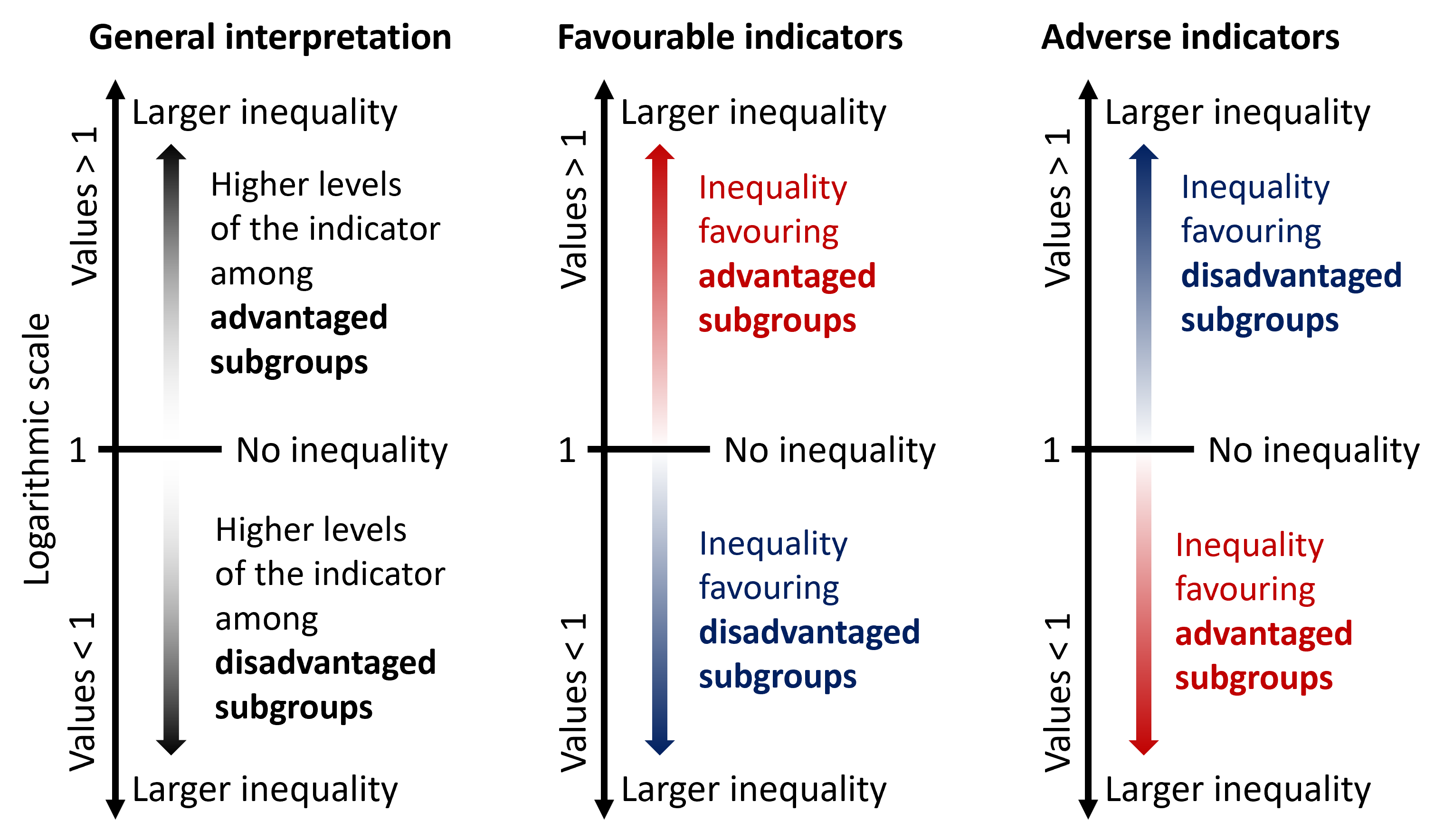
If there is no inequality, SII takes the value of 0. Greater absolute values indicate higher levels of inequality. Positive values indicate that the level of the indicator is higher among advantaged subgroups, while negative values indicate that the level of the indicator is higher among disadvantaged subgroups (Figure 21.4). Note that this results in different interpretations for favourable and adverse indicators.
FIGURE 21.4. Interpreting the results of the slope index of inequality

Relative index of inequality
RII uses similar logic as SII, but on a relative scale. RII represents the ratio between the predicted values of an indicator between the most advantaged and most disadvantaged subgroups derived from the regression model. It is calculated as the ratio of the predicted values at rank 1 (\(\hat{v}_1\)) to rank 0 (\(\hat{v}_0\)):
\[RII = \hat{v}_1 / \hat{v}_0\]
In the example in Figure 21.3, RII is calculated as:
98.8 / 71.3 = 1.4
The proportion of births attended by skilled health personnel was 1.4 times higher in the most educated subgroup compared with the least educated subgroup.
The approach to calculating RII presented here is sometimes called the Kunst–Mackenbach relative index. There are also other approaches to calculating this measure (8, 9).
RII takes only positive values. If there is no inequality, RII has the value of 1. Values larger than 1 indicate the level of the indicator is higher among advantaged subgroups, and values lower than 1 indicate the level of the indicator is higher among disadvantaged subgroups (Figure 21.5). Like SII, interpretation differs for favourable and adverse indicators. Regardless of the indicator type, the further the value of RII from 1, the higher the level of inequality.
RII is a multiplicative measure and therefore results should be displayed on a logarithmic scale. Values larger than 1 are equivalent in magnitude to their reciprocal values smaller than 1 (e.g. a value of 2 is equivalent in magnitude to a value of 0.5). See Chapter 23 for more about reporting summary measures of inequality.
FIGURE 21.5. Interpreting the results of the relative index of inequality
Ordered disproportionality measures
Ordered disproportionality measures include ACI and RCI. These measures have an implied reference group of the general population because they express the burden or excess level of health indicator in subgroups relative to a reference equal distribution across the population (7, 10).
This section presents a general approach to calculating ACI and RCI. Box 21.4 describes an alternative method of calculating ACI and RCI using a regression model, as well as additional technical issues that warrant consideration.
BOX 21.4. Alternative approaches and additional considerations for calculating concentration indices
The ACI and RCI can also be calculated as the covariance between the health indicator and the relative rank. For example, the calculation of RCI can be expressed as:
\[RCI = \frac{2cov(y_j, X_j)}{\mu}\]
where \(y_j\) is the health estimate for Subgroup j, \(X_j\) is the relative rank of Subgroup j, \(\mu\) is the setting average, and \(cov\) is the covariance between the health estimate and the relative rank.
Since the slope coefficient of a simple least squares regression is the covariance divided by the variance of the regressor, ACI and RCI can also be obtained from a regression of the health indicator estimates against the relative rank.
The calculation of the concentration indices can be shown using a concentration curve. To plot the concentration curve, the cumulative proportion of the population ranked by the ordered social category (the cumulative population share) is plotted on the x-axis and the cumulative proportion of the health indicator (the cumulative health share) is plotted on the y-axis. In a situation where there is no systematic difference in health according to the inequality dimension, the concentration curve would run along the 45-degree diagonal line. The further away from the line, the greater the inequality in health.
Returning to the example from Indonesia, Table 21.2 illustrates the step-by-step calculations that yield the two components (shaded in the table) required for the visual display of the concentration curve (Figure 21.6). An additional example is provided in Figure 21.7 to visualize concentration curves using wealth deciles (which tend to yield a smoother concentration curve than inequality dimensions categorized as fewer subgroups) and both adverse and favourable indicators (to show the concentration curve in different directions).
TABLE 21.2. Steps to visualize the concentration curve and calculate the concentration indices: births attended by skilled health personnel, by education level, Indonesia
| Education level | Live births | Births attended by skilled health personnel | Proportion of births attended by skilled health personnel | Concentration indices calculations | ||||||
|---|---|---|---|---|---|---|---|---|---|---|
|
Number [A] |
Population share [C = A / B] |
Cumulative population share [D] |
Range of cumulative population share |
Midpoint of range (relative rank) [X = D − (0.5 × C)] |
Number [E] |
Health indicator share [G = E / F] |
Cumulative health share [Y] |
Estimate (%) [H] |
[J = C x (2 x X − 1) X H] | |
| No education | 111 | 0.011 | 0.011 | 0.000–0.011 | 0.006 | 48 | 0.005 | 0.005 | 43.0 | -0.5 |
| Primary education | 2479 | 0.245 | 0.256 | 0.011–0.256 | 0.134 | 2020 | 0.218 | 0.223 | 81.5 | -14.6 |
| Secondary or higher education | 7515 | 0.744 | 1.000 | 0.256–1.000 | 0.628 | 7187 | 0.777 | 1.000 | 95.6 | 18.2 |
| Total | 10 105 [B] | 1.000 | 9255 [F] | 1.000 | ACI = 3.1 percentage points | |||||
| National average = 91.6 [I] |
RCI = [ACI / I x 100] = 3.4 |
|||||||||
ACI, absolute concentration index; RCI, relative concentration index.
The shaded columns indicate the data points plotted on the concentration curve in Figure 21.6.
Source: derived from the WHO Health Inequality Data Repository Reproductive, Maternal, Newborn and Child Health dataset (1), with data sourced from the 2017 Demographic and Health Surveys. Data are based on three years prior to the survey.
FIGURE 21.6. Concentration curve visualizing the calculation of disproportionality measures: births attended by skilled health personnel, by education level, Indonesia
The grey line shows the hypothetical line of equality. The black line is the concentration curve.
Source: derived from the WHO Health Inequality Data Repository Reproductive, Maternal, Newborn and Child Health dataset (1), with data sourced from the 2007 Demographic and Health Surveys. Data are based on three years prior to the survey.
FIGURE 21.7. Concentration curves visualizing the calculation of disproportionality measures: births attended by skilled health personnel and children aged one year who did not receive any doses of the diphtheria, tetanus toxoid and pertussis (DTP) vaccine, by economic status, Indonesia
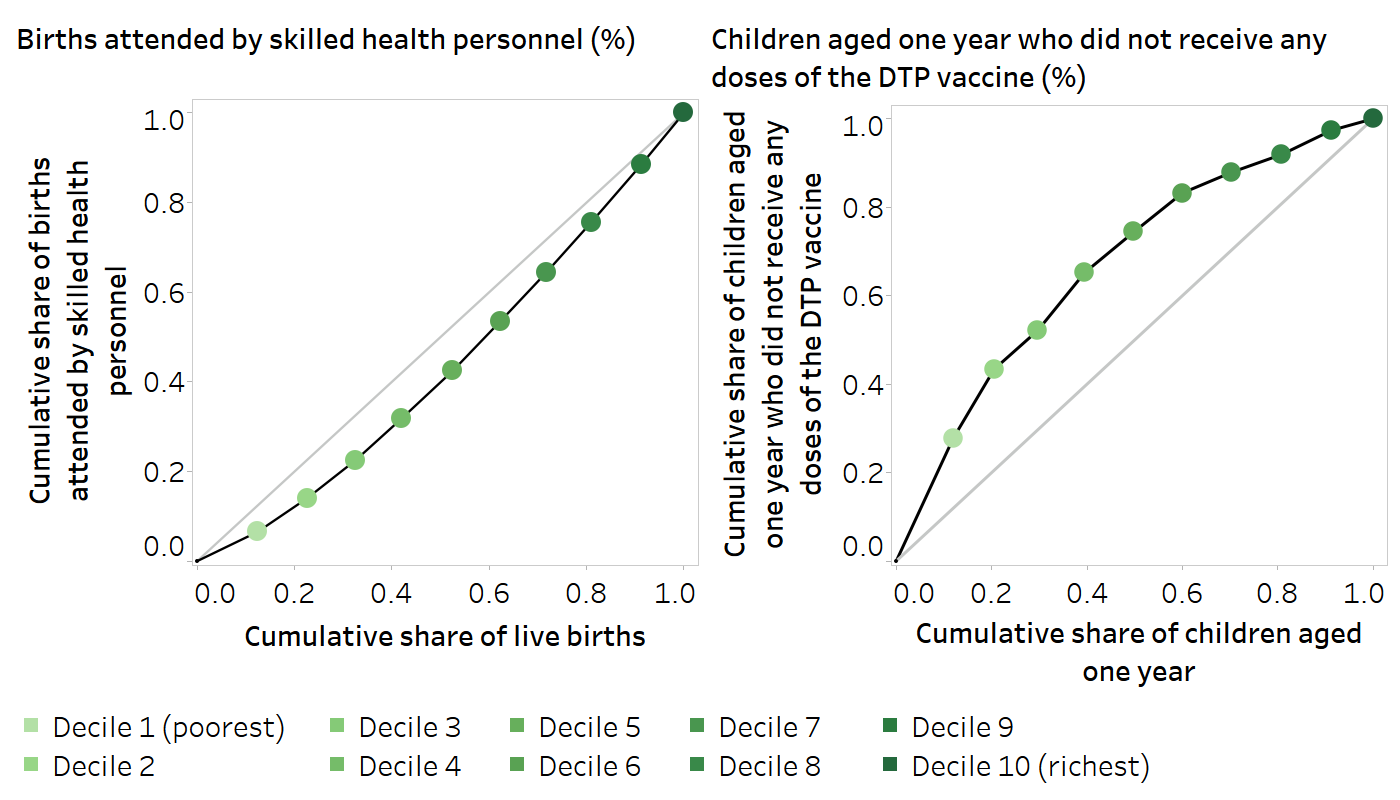
The grey lines show the hypothetical lines of equality. The black lines are the concentration curves.
Source: derived from the WHO Health Inequality Data Repository Reproductive, Maternal, Newborn and Child Health dataset (1), with data sourced from the 2007 Demographic and Health Surveys. Data are based on three years prior to the survey.
The interpretation of ordered disproportionality measures reflects the distribution of health according to the inherent ordering of the inequality dimension (e.g. a queuing pattern across wealth quintiles, as described in Chapter 18). As a result, if the level of health does not follow the subgroup ordering, the measures might suggest minimal or low inequality.
Absolute concentration index
ACI is calculated as twice the area between the hypothetical line of equality and the concentration curve. ACI can be calculated as:
\[ACI = \sum_j p_j(2X_j - 1)y_j\]
where \(y_j\) indicates the health estimate for Subgroup j, \(p_j\) is the population share of Subgroup j, and \(X_j\) is the relative rank of Subgroup j (see “Regression-based measures” above for the definition and calculation of the relative rank).
In the example in Table 21.2, ACI is calculated as the total of the values in the right-most column = 3.1 percentage points.
This result indicates a concentration of skilled birth attendance among mothers with higher education.
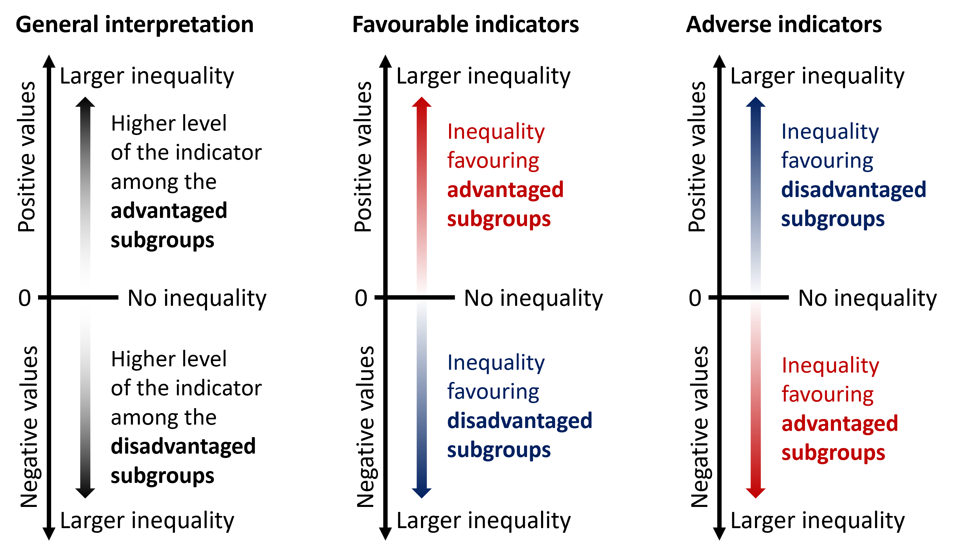
If there is no inequality, ACI takes the value of 0. Positive values indicate a concentration of the indicator among advantaged subgroups, and negative values indicate a concentration of the indicator among disadvantaged subgroups (Figure 21.8). Greater absolute values of ACI describe higher levels of inequality.
FIGURE 21.8. Interpreting the results of the absolute concentration index
Relative concentration index
RCI is the relative counterpart to ACI, showing the gradient across population subgroups on a relative scale. RCI is calculated by dividing ACI by the setting average μ. For the sake of interpretability, it can then be multiplied by 100.
\[RCI = \frac{ACI}{\mu} \times 100\]
In the example in Table 21.2, RCI is calculated as ACI divided by the national average and multiplied by 100:
3.1 / 91.6 × 100 = 3.4
This result indicates a concentration of skilled birth attendance among mothers with higher education.
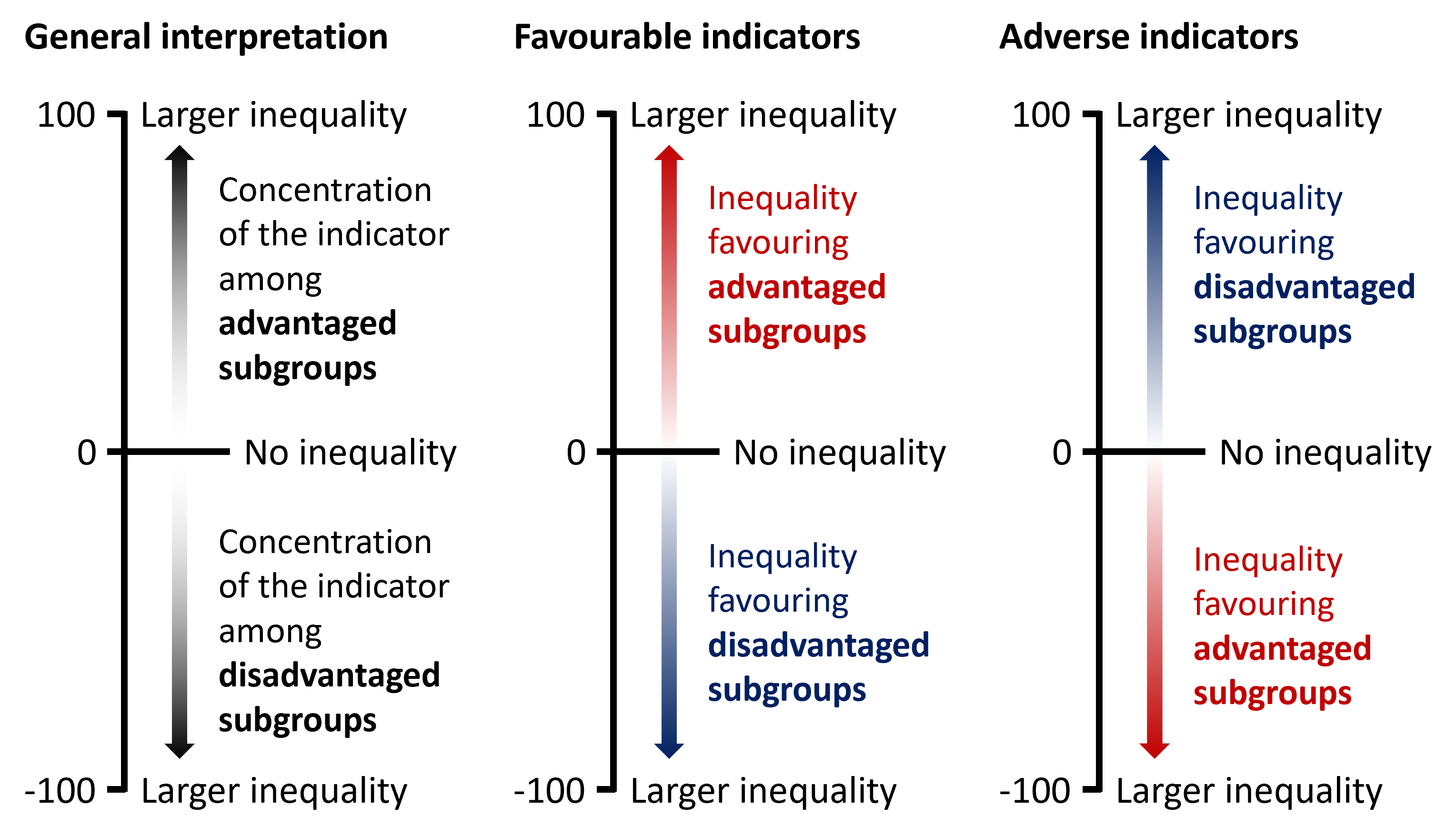
RCI is bounded between −1 and +1 (note, however, that if multiplied by 100 in the calculation, the range is −100 to +100). If there is no inequality, RCI equals 0. Larger absolute values of RCI indicate higher levels of inequality. Positive values indicate a concentration of the indicator among advantaged subgroups, and negative values indicate a concentration of the indicator among disadvantaged subgroups (Figure 21.9).
FIGURE 21.9. Interpreting the results of the relative concentration index
Summary measures based on non-ordered inequality dimensions
Non-ordered summary measures can be calculated for dimensions with subgroups that do not have a natural ordering, such as subnational regions. There are two main groups of non-ordered measures: mean difference and variance measures, and disproportionality measures. The interpretation is the same for all measures (Figure 21.10). Non-ordered summary measures take only positive values, with larger values indicating higher levels of inequality. The measures equal 0 if there is no inequality.
FIGURE 21.10. Interpreting the results of non-ordered summary measures

Mean difference and variance measures
Mean difference and variance measures quantify how much subgroup values tend to spread out (or deviate) from the overall average or another reference point. Mean difference measures answer questions such as the following:
Mean difference from best-performing subgroup (MDB): how much, on average, does the level of the health indicator in the subgroups fall short of the best-performing subgroup?
Mean difference from reference point (MDR): how much, on average, does the level of the health indicator in the subgroups differ from a defined reference subgroup or target?
Mean difference from mean (MDM): how much, on average, does the level of the health indicator in the subgroups differ from the population average?
Index of disparity (IDIS): by what proportion does the level of health indicator in the subgroups differ from the population average?
If making comparisons between mean difference measures over time, the stability of the reference group value may be a consideration. A best-performing subgroup may change over time (especially if it is one of several subnational regions, for example), but the use of the population average, the best 5–10% performing subgroups or a predefined target would likely provide a more stable reference point over time.
Variance measures summarize the squared differences of each subgroup estimate from the setting average (such as the national average). Variance measures include between-group variance (BGV), between-group standard deviation (BGSD) and the coefficient of variation (COV). Compared with mean difference measures, variance measures are more sensitive to outlier estimates because they give more influence to estimates that are further from the setting average.
Mean difference measures
Table 21.3 contains an example dataset used to illustrate the calculation of mean difference measures. All mean difference measures can be calculated as unweighted or weighted measures. For the unweighted version, all subgroups are weighted equally. For the weighted version, subgroups are weighted according to their population share. For comparisons over time, consider that the reference points (i.e. the value of the best-performing subgroup, the reference subgroup, or the population average) are subject to shift. In the case of MDB, the subgroup that performs best may also fluctuate. MDM and IDIS are calculated using the absolute differences between the subgroup estimate and overall average, and therefore they provide more insight into the extent of inequality than its directionality (noting that the directionality of MDB is necessarily constant). The calculations are detailed in the following text.
TABLE 21.3. Steps to calculate mean difference measures: births attended by skilled health personnel, by subnational region, Indonesia
|
Subnational region (n = 34) |
Proportion of births attended by skilled health personnel | Live births | Mean difference measures | ||||||
|---|---|---|---|---|---|---|---|---|---|
|
Estimate (%) [A] |
Number [E] |
Population share [G = E / F] |
Unweighted absolute difference from best-performing subgroup [H = |A − B|] |
Weighted absolute difference from best-performing subgroup [J = H x G] |
Unweighted absolute difference from reference point [K = |A − C|] |
Weighted absolute difference from reference point [M = K x G] |
Unweighted absolute difference from mean [N = |A − D|] |
Weighted absolute difference from mean [P = N x G] |
|
| Aceh | 95.1 | 230 | 0.023 | 4.9 | 0.11 | 3.4 | 0.08 | 3.5 | 0.08 |
| Bali a |
100.0 [B] |
149 | 0.015 | 0.0 | 0.00 | 1.4 | 0.02 | 8.4 | 0.12 |
| Bangka Belitung | 97.4 | 56 | 0.006 | 2.6 | 0.01 | 1.1 | 0.01 | 5.8 | 0.03 |
| Banten | 80.4 | 451 | 0.045 | 19.6 | 0.88 | 18.2 | 0.81 | 11.2 | 0.50 |
| Bengkulu | 94.3 | 70 | 0.007 | 5.7 | 0.04 | 4.6 | 0.17 | 2.7 | 0.02 |
| Central Java | 98.6 | 1222 | 0.121 | 1.4 | 0.17 | 0.0 | 0.00 | 7.0 | 0.84 |
| Central Kalimantan | 88.9 | 92 | 0.009 | 11.1 | 0.10 | 9.6 | 0.09 | 2.6 | 0.02 |
| Central Sulawesi | 86.7 | 125 | 0.012 | 13.3 | 0.16 | 11.9 | 0.15 | 4.9 | 0.06 |
| East Java | 97.1 | 1257 | 0.124 | 2.9 | 0.36 | 1.5 | 0.18 | 5.5 | 0.68 |
| East Kalimantan | 96.6 | 138 | 0.014 | 3.4 | 0.05 | 2.0 | 0.03 | 5.0 | 0.07 |
| East Nusa Tenggara | 75.4 | 252 | 0.025 | 24.6 | 0.61 | 23.1 | 0.58 | 16.2 | 0.40 |
| Gorontalo | 92.8 | 47 | 0.005 | 7.2 | 0.03 | 5.7 | 0.03 | 1.2 | 0.01 |
| Jakarta b |
98.6 [C] |
365 | 0.036 | 1.4 | 0.05 | 0.0 | 0.00 | 7.0 | 0.25 |
| Jambi | 87.8 | 136 | 0.013 | 12.2 | 0.16 | 10.7 | 0.14 | 3.8 | 0.05 |
| Lampung | 91.9 | 304 | 0.030 | 8.1 | 0.24 | 6.7 | 0.20 | 0.3 | 0.01 |
| Maluku | 74.1 | 85 | 0.008 | 25.9 | 0.22 | 24.4 | 0.21 | 17.5 | 0.15 |
| North Kalimantan | 90.5 | 26 | 0.003 | 9.5 | 0.02 | 8.0 | 0.02 | 1.1 | 0.00 |
| North Maluku | 73.4 | 52 | 0.005 | 26.6 | 0.14 | 25.2 | 0.13 | 18.2 | 0.09 |
| North Sulawesi | 96.0 | 75 | 0.007 | 4.0 | 0.03 | 2.5 | 0.02 | 4.4 | 0.03 |
| North Sumatra | 90.0 | 617 | 0.061 | 10.0 | 0.61 | 8.6 | 0.52 | 1.6 | 0.10 |
| Papua | 64.2 | 180 | 0.018 | 35.8 | 0.64 | 34.4 | 0.61 | 27.4 | 0.49 |
| Riau | 86.0 | 308 | 0.031 | 14.0 | 0.43 | 12.6 | 0.38 | 5.6 | 0.17 |
| Riau Islands | 99.4 | 77 | 0.008 | 0.6 | 0.00 | 0.8 | 0.01 | 7.8 | 0.06 |
| South Kalimantan | 92.6 | 164 | 0.016 | 7.4 | 0.12 | 5.9 | 0.10 | 1.0 | 0.02 |
| South Sulawesi | 90.4 | 309 | 0.031 | 9.6 | 0.29 | 8.2 | 0.25 | 1.2 | 0.04 |
| South Sumatra | 96.4 | 355 | 0.035 | 3.6 | 0.13 | 2.1 | 0.07 | 4.8 | 0.17 |
| Southeast Sulawesi | 84.7 | 120 | 0.012 | 15.3 | 0.18 | 13.9 | 0.16 | 6.9 | 0.08 |
| West Java | 89.8 | 1980 | 0.196 | 10.2 | 1.99 | 8.7 | 1.71 | 1.8 | 0.34 |
| West Kalimantan | 88.6 | 212 | 0.021 | 11.4 | 0.24 | 10.0 | 0.21 | 3.0 | 0.06 |
| West Nusa Tenggara | 94.8 | 224 | 0.022 | 5.2 | 0.12 | 3.8 | 0.08 | 3.2 | 0.07 |
| West Papua | 74.0 | 39 | 0.004 | 26.0 | 0.10 | 24.5 | 0.09 | 17.5 | 0.07 |
| West Sulawesi | 87.0 | 56 | 0.006 | 13.0 | 0.07 | 11.6 | 0.06 | 4.6 | 0.03 |
| West Sumatra | 97.6 | 195 | 0.019 | 2.4 | 0.05 | 0.9 | 0.02 | 6.0 | 0.12 |
| Yogyakarta | 97.7 | 133 | 0.013 | 2.3 | 0.03 | 0.8 | 0.01 | 6.1 | 0.08 |
| Total |
10 105 [F] |
1.000 |
351.1 [I] |
MDBW = 8.4 percentage points |
306.6 [L] |
MDRW = 7.0 percentage points |
224.9 [O] |
MDMW = 5.3 percentage points |
|
|
National average = 91.6 [D] |
MDBU = [I / n] = 10.3 percentage points |
MDRU = [L / n] = 9.0 percentage points |
MDMU = [O / n] = 6.6 percentage points |
||||||
IDISU, index of disparity (unweighted); IDISW, index of disparity (weighted); MDBU, mean difference from best-performing subgroup (unweighted); MDBW, mean difference from best-performing subgroup (weighted); MDMU, mean difference from mean (unweighted); MDMW, mean difference from mean (weighted); MDRU, mean difference from reference point (unweighted); MDRW, mean difference from reference point (weighted).
\(^a\) Best-performing region (Bali).
\(^b\) Reference point (Jakarta).
Source: derived from the WHO Health Inequality Data Repository Reproductive, Maternal, Newborn and Child Health dataset (1), with data sourced from the 2017 Demographic and Health Surveys. Data are based on three years prior to the survey.
Mean difference from best-performing subgroup
MDB is an absolute measure of inequality that shows the mean difference between each population subgroup and the best performing subgroup (i.e. the subgroup with the highest value in the case of favourable health indicators and the subgroup with the lowest value in the case of adverse health indicators). MDB can be calculated as an unweighted or weighted measure.
The unweighted version (MDBU) is calculated as the sum of absolute differences between the subgroup estimates \(y_j\) and the estimate for the best-performing subgroup \(y_{best}\), divided by the number of subgroups \(n\):
\[MDBU = \frac{1}{n} \times \sum_j |y_j - y_{best}|\]
In the example in Table 21.3, MDBU is calculated as the sum of the unweighted differences (I) divided by the number of regions (\(n\)):
351.1 / 34 = 10.3 percentage points
On average, the proportion of births attended by skilled health personnel in regions differed from the best-performing subgroup (Bali) by 10.3 percentage points (when unweighted).
The weighted version (MDBW) is calculated as the weighted sum of absolute differences between the subgroup estimates \(y_j\) and the estimate for the best-performing subgroup \(y_{best}\). Absolute differences are weighted by each subgroup’s population share \(p_j\):
\[MDBW = \sum_j p_j |y_j - y_{best}|\]
where \(y_{best}\) is the subgroup with the highest estimate in the case of favourable indicators and the subgroup with the lowest estimate in the case of adverse indicators.
In the example in Table 21.3, MDBW is calculated as the sum of weighted differences (total of column J) = 8.4 percentage points. On average, the proportion of births attended by skilled health personnel in regions differed from the best performing subgroup (Bali) by 8.4 percentage points (when weighted).
Mean difference from reference point
MDR is an absolute measure of inequality that shows the mean difference between each population subgroup and a defined reference subgroup (e.g., the capital city or region for data disaggregated by subnational regions) or target. MDR can be calculated as an unweighted or weighted measure.
The unweighted version (MDRU) is calculated as the sum of absolute differences between the subgroup estimates \(y_j\) and the estimate for the reference point \(y_{ref}\), divided by the number of subgroups \(n\):
\[MDRU = \frac{1}{n} \times \sum_j |y_j - y_{ref}|\]
In the example in Table 21.3, MDRU is calculated as the sum of the unweighted differences (L) divided by the number of regions (\(n\)):
306.6 / 34 = 9.0 percentage points
On average, the proportion of births attended by skilled health personnel in regions differed from the reference subgroup (Jakarta) by 9.0 percentage points (when unweighted).
The weighted version (MDRW) is calculated as the weighted average of absolute differences between the subgroup estimates \(y_j\) and the estimate for the reference point \(y_{ref}\). Absolute differences are weighted by each subgroup’s population share \(p_j\):
\[MDRW = \sum_j p_j |y_j - y_{ref}|\]
In the example in Table 21.3, MDRW is calculated as the sum of weighted differences (total of column M) = 7.0 percentage points.
On average, the proportion of births attended by skilled health personnel in regions differed from the reference subgroup (Jakarta) by 7.0 percentage points (when weighted).
Mean difference from mean
MDM is an absolute measure of inequality that shows the mean difference between each subgroup and the mean (e.g. the national average). MDM can be calculated as an unweighted or weighted measure. The unweighted version (MDMU) is calculated as the sum of the absolute differences between the subgroup estimates \(y_j\) and the setting average \(\mu\), divided by the number of subgroups \(n\):
\[MDMU = \frac{1}{n} \times \sum_j |y_j - \mu|\]
In the example in Table 21.3, MDMU is calculated as the sum of unweighted differences (O) divided by the number of regions (\(n\)):
224.9 / 34 = 6.6 percentage points
On average, the proportion of births attended by skilled health personnel in regions differed from the national average by 6.6 percentage points (when unweighted).
The weighted version (MDMW) is calculated as the weighted average of absolute differences between the subgroup estimates \(y_j\) and the setting average \(\mu\). Absolute differences are weighted by each subgroup’s population share \(p_j\):
\[MDMW = \sum_j p_j |y_j - \mu|\]
In the example in Table 21.3, MDMW is calculated as the sum of the weighted differences (total of Column P) = 5.3 percentage points.
On average, the proportion of births attended by skilled health personnel in regions differed from the national average by 5.3 percentage points (when weighted).
Index of disparity
IDIS is the relative version of MDM, showing the mean difference between each subgroup and the setting average, on a relative scale. IDIS can be calculated as an unweighted or weighted measure.
The unweighted version (IDISU) is calculated by dividing MDMU by the setting average \(\mu\) and multiplying the fraction by 100:
\[IDISU = \frac{MDMU}{\mu} \times 100\]
In the example in Table 21.3, IDISU is calculated as MDMU divided by the national average (D) multiplied by 100:
6.6 / 91.6 × 100 = 7.2%
On average, the proportion of births attended by skilled health personnel in regions differed from the national average by 7.2% (when unweighted).
The weighted version (IDISW) is calculated by dividing MDMW by the setting average \(\mu\) and multiplying the fraction by 100:
\[IDISW = \frac{MDMW}{\mu} \times 100\]
In the example in Table 21.3, IDISW is calculated as MDMW divided by the national average multiplied by 100:
5.3 / 91.6 × 100 = 5.8%
On average, the proportion of births attended by skilled health personnel in regions differed from the national average by 5.8% (when weighted).
Variance measures
Variance measures are indicative of uncertainty of an estimate produced from a dataset. More specifically, they capture the level of dispersion of a distribution, meaning the extent to which observation values (or data points) are likely to vary from an average value, and thus from every other observation value in the data set. Table 21.4 contains an example dataset used to illustrate the calculation of variance measures. The calculations are detailed in the following text.
TABLE 21.4. Steps to calculate variance measures: births attended by skilled health personnel, by subnational region, Indonesia
|
Subnational region (n = 34) |
Proportion of births attended by skilled health personnel | Live births | Variance measures | ||
|---|---|---|---|---|---|
|
Estimate (%) [A] |
Number [C] |
Population share [E = C / D] |
Squared difference from mean [F = (A − B)2] |
Weighted squared difference from mean [G = F x E] |
|
| Aceh | 95.1 | 230 | 0.023 | 12.4 | 0.28 |
| Bali | 100.0 | 149 | 0.015 | 70.6 | 1.04 |
| Bangka Belitung | 97.4 | 56 | 0.006 | 33.8 | 0.19 |
| Banten | 80.4 | 451 | 0.045 | 126.3 | 5.64 |
| Bengkulu | 94.3 | 70 | 0.007 | 7.1 | 0.05 |
| Central Java | 98.6 | 1222 | 0.121 | 48.5 | 5.87 |
| Central Kalimantan | 88.9 | 92 | 0.009 | 7.0 | 0.06 |
| Central Sulawesi | 86.7 | 125 | 0.012 | 24.3 | 0.30 |
| East Java | 97.1 | 1257 | 0.124 | 30.3 | 3.77 |
| East Kalimantan | 96.6 | 138 | 0.014 | 25.0 | 0.34 |
| East Nusa Tenggara | 75.4 | 252 | 0.025 | 261.3 | 6.52 |
| Gorontalo | 92.8 | 47 | 0.005 | 1.5 | 0.01 |
| Jakarta | 98.6 | 365 | 0.036 | 48.5 | 1.75 |
| Jambi | 87.8 | 136 | 0.013 | 14.1 | 0.19 |
| Lampung | 91.9 | 304 | 0.030 | 0.1 | 0.00 |
| Maluku | 74.1 | 85 | 0.008 | 305.3 | 2.57 |
| North Kalimantan | 90.5 | 26 | 0.003 | 1.1 | 0.00 |
| North Maluku | 73.4 | 52 | 0.005 | 332.0 | 1.71 |
| North Sulawesi | 96.0 | 75 | 0.007 | 19.6 | 0.14 |
| North Sumatra | 90.0 | 617 | 0.061 | 2.6 | 0.16 |
| Papua | 64.2 | 180 | 0.018 | 750.8 | 13.41 |
| Riau | 86.0 | 308 | 0.031 | 31.8 | 0.97 |
| Riau Islands | 99.4 | 77 | 0.008 | 60.9 | 0.47 |
| South Kalimantan | 92.6 | 164 | 0.016 | 1.0 | 0.02 |
| South Sulawesi | 90.4 | 309 | 0.031 | 1.4 | 0.04 |
| South Sumatra | 96.4 | 355 | 0.035 | 23.5 | 0.83 |
| Southeast Sulawesi | 84.7 | 120 | 0.012 | 48.1 | 0.57 |
| West Java | 89.8 | 1980 | 0.196 | 3.1 | 0.61 |
| West Kalimantan | 88.6 | 212 | 0.021 | 9.0 | 0.19 |
| West Nusa Tenggara | 94.8 | 224 | 0.022 | 10.1 | 0.22 |
| West Papua | 74.0 | 39 | 0.004 | 307.9 | 1.19 |
| West Sulawesi | 87.0 | 56 | 0.006 | 21.1 | 0.12 |
| West Sumatra | 97.6 | 195 | 0.019 | 36.4 | 0.70 |
| Yogyakarta | 97.7 | 133 | 0.013 | 37.4 | 0.49 |
| Total |
10 105 [D] |
1.000 |
BGV = 50.4 percentage points |
||
|
National average = 91.6 [B] |
BGSD [√BGV] = 7.1 percentage points |
||||
|
COV [BGSD / B x 100] = 7.8% |
|||||
BGSD, between-group standard deviation; BGV, between-group variance; COV, coefficient of variation.
Source: derived from the WHO Health Inequality Data Repository Reproductive, Maternal, Newborn and Child Health dataset (1), with data sourced from the 2017 Demographic and Health Surveys. Data are based on three years prior to the survey.
Between-group variance
BGV is an absolute measure of inequality that considers all population subgroups. Subgroups are weighted according to their population share. BGV is reported as the squared unit of the health indicator. BGV is calculated as the weighted average of squared differences between the subgroup estimates \(y_j\) and the setting average \(\mu\). Squared differences are weighted by each subgroup’s population share \(p_j\):
\[BGV = \sum_j p_j(y_j - \mu)^2\]
In the example in Table 21.4, BGV is calculated as the sum of weighted squared differences (total of Column G) = 50.4 squared percentage points.
On average, the proportion of births attended by skilled health personnel in regions differed from the national average by 50.4 squared percentage points.
Between-group standard deviation
Like BGV, BGSD is an absolute measure of inequality that considers all population subgroups. Subgroups are weighted according to their population share. BGSD is calculated as the square root of BGV:
\[BGSD = \sqrt{BGV}\]
Since BGSD is the square root of BGV, it is reported in the unit of the health indicator, which may be more easily interpretable than BGV and will not be as sensitive to outliers.
In the example in Table 21.4, BGSD is calculated as the square root of BGV:
\(\sqrt{50.4}\) = 7.1 percentage points
On average, the proportion of births attended by skilled health personnel in regions differed from the national average by 7.1 percentage points.
Coefficient of variation
COV is a relative measure of inequality that considers all population subgroups. Subgroups are weighted according to their population share. COV is calculated by dividing BGSD by the setting average \(\mu\) and multiplying the fraction by 100:
\[COV = \frac{BGSD}{\mu} \times 100\]
In the example in Table 21.4, COV is calculated as BGSD divided by the national average multiplied by 100:
7.1 / 91.6 × 100 = 7.8%
The standard deviation of the proportion of births attended by skilled health personnel in regions is 7.8% of the national average.
Non-ordered disproportionality measures
Non-ordered disproportionality measures express inequality as a function of how the share of the health indicator compares with the share of the population. They include the two relative measures, Theil index (TI) and mean log deviation (MLD). These measures were originally developed for measuring economic inequality, where the resource in question (wealth) is subject to redistribution.
To promote easier interpretation of the results, TI and MLD values are multiplied by 1000. This aligns with how these measures are calculated in WHO health inequality monitoring resources, including the Health Equity Assessment Toolkit (2) and statistical codes (3).
Table 21.5 contains an example dataset used to illustrate the calculation of non-ordered disproportionality measures. The calculations are detailed in the corresponding subsections below.
TABLE 21.5. Steps to calculate non-ordered disproportionality measures: births attended by skilled health personnel, by subnational region, Indonesia
|
Subnational region (n = 34) |
Proportion of births attended by skilled health personnel | Live births | Non-ordered disproportionality measures | |||
|---|---|---|---|---|---|---|
|
Estimate (%) [A] |
Number [C] |
Population share [E = C / D] |
Indicator share [F = A / B] |
Product of indicator share, natural logarithm of indicator share and population share [G = F × ln(F) × E] |
Product of negative natural logarithm of indicator share and population share [I = −ln(F) × E] |
|
| Aceh | 95.1 | 230 | 0.023 | 1.04 | 0.0009 | −0.0009 |
| Bali | 100.0 | 149 | 0.015 | 1.09 | 0.0014 | −0.0013 |
| Bangka Belitung | 97.4 | 56 | 0.006 | 1.06 | 0.0004 | −0.0003 |
| Banten | 80.4 | 451 | 0.045 | 0.88 | −0.0051 | 0.0058 |
| Bengkulu | 94.3 | 70 | 0.007 | 1.03 | 0.0002 | −0.0002 |
| Central Java | 98.6 | 1222 | 0.121 | 1.08 | 0.0095 | −0.0089 |
| Central Kalimantan | 88.9 | 92 | 0.009 | 0.97 | −0.0003 | 0.0003 |
| Central Sulawesi | 86.7 | 125 | 0.012 | 0.95 | −0.0006 | 0.0007 |
| East Java | 97.1 | 1257 | 0.124 | 1.06 | 0.0077 | −0.0073 |
| East Kalimantan | 96.6 | 138 | 0.014 | 1.05 | 0.0008 | −0.0007 |
| East Nusa Tenggara | 75.4 | 252 | 0.025 | 0.82 | −0.0040 | 0.0048 |
| Gorontalo | 92.8 | 47 | 0.005 | 1.01 | 0.0001 | −0.0001 |
| Jakarta | 98.6 | 365 | 0.036 | 1.08 | 0.0028 | −0.0026 |
| Jambi | 87.8 | 136 | 0.013 | 0.96 | −0.0005 | 0.0006 |
| Lampung | 91.9 | 304 | 0.030 | 1.00 | 0.0001 | −0.0001 |
| Maluku | 74.1 | 85 | 0.008 | 0.81 | −0.0014 | 0.0018 |
| North Kalimantan | 90.5 | 26 | 0.003 | 0.99 | 0.0000 | 0.0000 |
| North Maluku | 73.4 | 52 | 0.005 | 0.80 | −0.0009 | 0.0011 |
| North Sulawesi | 96.0 | 75 | 0.007 | 1.05 | 0.0004 | −0.0003 |
| North Sumatra | 90.0 | 617 | 0.061 | 0.98 | −0.0011 | 0.0011 |
| Papua | 64.2 | 180 | 0.018 | 0.70 | −0.0045 | 0.0063 |
| Riau | 86.0 | 308 | 0.031 | 0.94 | −0.0018 | 0.0019 |
| Riau Islands | 99.4 | 77 | 0.008 | 1.09 | 0.0007 | −0.0006 |
| South Kalimantan | 92.6 | 164 | 0.016 | 1.01 | 0.0002 | −0.0002 |
| South Sulawesi | 90.4 | 309 | 0.031 | 0.99 | −0.0004 | 0.0004 |
| South Sumatra | 96.4 | 355 | 0.035 | 1.05 | 0.0019 | −0.0018 |
| Southeast Sulawesi | 84.7 | 120 | 0.012 | 0.92 | −0.0009 | 0.0009 |
| West Java | 89.8 | 1980 | 0.196 | 0.98 | −0.0037 | 0.0038 |
| West Kalimantan | 88.6 | 212 | 0.021 | 0.97 | −0.0007 | 0.0007 |
| West Nusa Tenggara | 94.8 | 224 | 0.022 | 1.03 | 0.0008 | −0.0008 |
| West Papua | 74.0 | 39 | 0.004 | 0.81 | −0.0007 | 0.0008 |
| West Sulawesi | 87.0 | 56 | 0.006 | 0.95 | −0.0003 | 0.0003 |
| West Sumatra | 97.6 | 195 | 0.019 | 1.07 | 0.0013 | −0.0012 |
| Yogyakarta | 97.7 | 133 | 0.013 | 1.07 | 0.0009 | −0.0009 |
| Total |
10 105 [D] |
1.000 |
0.0031 [H] |
0.0033 [j] |
||
|
National average = 91.6 [B] |
TI [H x 1000] = 3.1 |
MLD [J x 1000] = 3.3 |
||||
MLD, mean log deviation; TI, Theil index.
Source: derived from the WHO Health Inequality Data Repository Reproductive, Maternal, Newborn and Child Health dataset (1), with data sourced from the 2017 Demographic and Health Surveys. Data are based on three years prior to the survey.
Theil index
TI is a relative measure of inequality that considers all population subgroups. Subgroups are weighted according to their population share. TI is calculated as the sum of products of the natural logarithm of the share of the indicator of each subgroup (\(\ln(\frac{y_j}{\mu})\)), the share of the indicator of each subgroup (\(\frac{y_j}{\mu}\)), and the population share of each subgroup (\(p_j\)). TI may be more easily interpreted when multiplied by 1000:
\[TI = \sum_j p_j \frac{y_j}{\mu} \ln(\frac{y_j}{\mu}) \times 1000\]
where \(y_j\) indicates the estimate for Subgroup j, \(p_j\) is the population share of Subgroup j, and \(\mu\) is the setting average.
In the example in Table 21.5, TI is calculated as the total of Column G (H) multiplied by 1000:
0.0031 × 1000 = 3.1
Mean log deviation
MLD is a relative measure of inequality that considers all population subgroups. Subgroups are weighted according to their population share. MLD is calculated as the sum of products between the negative natural logarithm of the share of the indicator of each subgroup (\(-\ln(\frac{y_j}{\mu})\)) and the population share of each subgroup (\(p_j\)). MLD may be more easily interpreted when multiplied by 1000.
\[MLD = \sum_j p_j (-\ln(\frac{y_j}{\mu})) \times 1000\]
where \(y_j\) indicates the estimate for Subgroup j, \(p_j\) is the population share of Subgroup j, and \(\mu\) is the setting average.
In the example in Table 21.5, MLD is calculated as the total of Column I (J) multiplied by 1000:
0.0033 × 1000 = 3.3
Impact measures
Impact measures show the improvement in the health of the total population that would be achieved if all subgroups had the same level of health indicator as the selected reference group. Impact measures, including population attributable risk (PAR) and its equivalent relative measure, population attributable fraction (PAF), reflect the differences between each subgroup’s level of health and the health of the reference group. The population impact number (PIN) is another absolute impact measure (Box 21.5). Impact measures can serve as “an empirical expression of a common argument for reducing health inequalities” and may be used to quantify the population impact of inequalities with the goal of informing population-level policy actions (7). Given that they are based on a hypothetical scenario and tend to be presented with a causal interpretation, care is required to ensure results are adequately contextualized.
BOX 21.5. Population impact number
The PIN is an impact measure that expresses the potential improvement in health using absolute counts. Applied to disease cases, for example, the PIN yields the reduction in the number of cases across the whole population, if everyone had the same rate as the reference group (11, 12). For more on how the PIN has been used to report health inequalities in Canada, see Key health inequalities in Canada: a national portrait (13) and Trends in income-related health in Canada (14).
These measures can be used with all types of dimensions of inequality, including ordered and non-ordered dimensions and binary dimensions. They consider all population subgroups and are weighted by population share. The interpretation of these measures tends to be straightforward, expressing the potential improvement by eliminating inequality. For these reasons, they may be particularly resonant with decision-makers.
Impact measures take positive values for favourable indicators and negative values for adverse indicators (Figure 21.11). The larger the absolute value of the measure, the higher the level of inequality. Impact measures equal 0 if no further improvement can be achieved – that is, if all subgroups have reached the same level of the indicator as the reference point or surpassed that level.
FIGURE 21.11. Interpreting the results of impact measures

Table 21.6 contains an example dataset used to illustrate the calculation of PAR and PAF for three dimensions of inequality. The calculations are detailed in the following text.
TABLE 21.6. Steps to calculate impact measures: births attended by skilled health personnel, by education level, place of residence and subnational region, Indonesia
| Dimension of inequality | Reference subgroup |
Reference subgroup estimate (%) [A] |
Setting average (%) [B] |
PAR (percentage points) [C = A − B] |
PAF (%) [D = C / B × 100] |
|---|---|---|---|---|---|
| Place of residence | Urban | 96.2 | 91.6 | 4.6 | 5.0 |
| Education level | Secondary or higher education | 95.6 | 91.6 | 4.0 | 4.4 |
| Subnational region | Bali | 100.0 | 91.6 | 8.4 | 9.2 |
PAF, population attributable fraction; PAR, population attributable risk.
Source: derived from the WHO Health Inequality Data Repository Reproductive, Maternal, Newborn and Child Health dataset (1), with data sourced from the 2017 Demographic and Health Surveys. Data are based on three years prior to the survey.
Population attributable risk
PAR shows the absolute improvement in a setting average (such as national average) that could be achieved if all population subgroups had the same level of health as a reference point. PAR is calculated as the difference between the reference point \(y_{ref}\) and the setting average \(\mu\):
\[PAR = y_{ref} - \mu\]
where refers to the most advantaged subgroup or, if it is not possible to identify an advantaged subgroup, the best-performing subgroup (i.e. the subgroup with the highest estimate in the case of favourable indicators and the subgroup with the lowest estimate in the case of adverse indicators).
In the example in Table 21.6, PAR is calculated as:
96.2 − 91.6 = 4.6 percentage points for place of residence
95.6 − 91.6 = 4.0 percentage points for education
100.0 − 91.6 = 8.4 percentage points for subnational region
These results suggest that if all subgroups had the same level of coverage as the most advantaged subgroup, the national average coverage would improve by 4.6 percentage points (eliminating place of residence-related inequality), by 4.0 percentage points (eliminating education-related inequality), or by 8.4 percentage points (eliminating inequality between subnational regions).
Population attributable fraction
PAF expresses the same information as PAR in relative terms – that is, the relative improvement in a setting average (such as national average) that could be achieved if all population subgroups had the same level of health as a reference point. PAF is calculated by dividing PAR by the setting average and multiplying the fraction by 100:
\[PAF = \frac{PAR}{\mu} \times 100\]
In the example in Table 21.6, PAF is calculated as:
4.6 / 91.6 × 100 = 5.0% for place of residence
4.0 / 91.6 × 100 = 4.4% for education
8.4 / 91.6 × 100 = 9.2% for subnational region
These results suggest that if all subgroups had the same level of coverage as the most advantaged subgroup, the national average coverage would increase by 5.0% (eliminating place of residence-related inequality), by 4.4% (eliminating education-related inequality), or by 9.2% (eliminating inequality between subnational regions).
Strengths and limitations of complex summary measures
The complex summary measures presented in this chapter have different strengths and limitations. When considered together, multiple summary measures can promote a well-rounded perspective on the state of inequality. Compared with pairwise summary measures, they consider the situation in all population subgroups and may account for the population share of each subgroup. They are inherently more challenging to calculate and interpret, although the evolution of user-friendly analysis and reporting software has reduced this barrier. Selecting appropriate complex measures for analysis and reporting requires a thorough understanding of the characteristics of the underlying data and the application and limitations of the complex measures. It also requires consideration of value judgements inherent to the characteristics of the measure. Communicating the results of complex summary measures may be challenging and not appropriate for all audiences. Further information about the interpretation of summary measures is provided in Chapter 22. Chapter 23 focuses on reporting and communication of results.
References
1. Health Inequality Data Repository. Geneva: World Health Organization (https://www.who.int/data/inequality-monitor/data, accessed 29 May 2024).
2. Health Equity Assessment Toolkit. Geneva: World Health Organization https://www.who.int/data/inequality-monitor/assessment_toolkit, accessed 29 May 2024).
3. Statistical codes for health inequality analysis. Geneva: World Health Organization (https://www.who.int/data/inequality-monitor/tools-resources/statistical_codes, accessed 28 May 2024).
4. Schlotheuber A, Hosseinpoor AR. Summary measures of health inequality: a review of existing measures and their application. Int J Environ Res Public Health. 2022;19(6):3697. doi:10.3390/ijerph19063697.
5. Kirkby K, Antiporta D, Schlotheuber A, Menendez P, Danovaro-Holliday MC, Hosseinpoor A. Quantifying inequalities in childhood immunization using summary measures of health inequality: an application of WHO Stata and R ”healthequal” packages. Vaccines. 2024; 12(12):1324. doi: 10.3390/vaccines12121324.
6. Absolute and relative measures of inequality. Pelotas, Brazil: International Center for Equity in Health (https://equidade.org/ineq-measures, accessed 29 May 2024).
7. Harper S, Lynch J. Measuring health inequalities. In: Oakes JM, Kaufman JS, editors. Methods in social epidemiology. San Francisco, CA: Jossey-Bass; 2006:134–168.
8. Ahn J, Harper S, Yu M, Feuer EJ, Liu B, Luta G. Variance estimation and confidence intervals for 11 commonly used health disparity measures. JCO Clin Cancer Inform. 2018;2:1–19. doi:10.1200/CCI.18.00031.
9. Pamuk E. Social class inequality in mortality from 1921 to 1972 in England and Wales. Popul Stud (Camb). 1985;39(1):17–31. doi:10.1080/0032472031000141256.
10. Contoyannis P, Hurley J, Walli-Attaei M. When the technical is also normative: a critical assessment of measuring health inequalities using the concentration index-based indices. Popul Health Metr. 2022;20(1):21. doi:10.1186/s12963-022-00299-y.
11. Public Health Agency of Canada, Pan-Canadian Public Health Network, Statistics Canada, Canadian Institute of Health Information. Pan-Canadian health inequalities reporting initiative: summary measures. Ottawa: Public Health Agency of Canada; 2017 (https://health-infobase.canada.ca/health-inequalities/inequality-measures, accessed 29 May 2024).
12. Heller RF, Dobson A, Attia J, Page J. Impact numbers: measures of risk factor impact on the whole population from case–control and cohort studies. J Epidemiol Community Health. 2002;56:606–610. doi:10.1136/jech.56.8.606.
13. Public Health Agency of Canada, Pan-Canadian Public Health Network. Key health inequalities in Canada: a national portrait. Ottawa: Public Health Agency of Canada; 2018 (https://www.canada.ca/content/dam/phac-aspc/documents/services/publications/science-research/key-health-inequalities-canada-national-portrait-executive-summary/key_health_inequalities_full_report-eng.pdf, accessed 29 May 2024).
14. Trends in income-related health inequalities in Canada: technical report – revised July 2016. Ottawa: Canadian Institute for Health Information; 2016 (https://secure.cihi.ca/free_products/trends_in_income_related_inequalities_in_canada_2015_en.pdf, accessed 29 May 2024).